Wolves football club unveils new visual identity featuring 3D wolf head
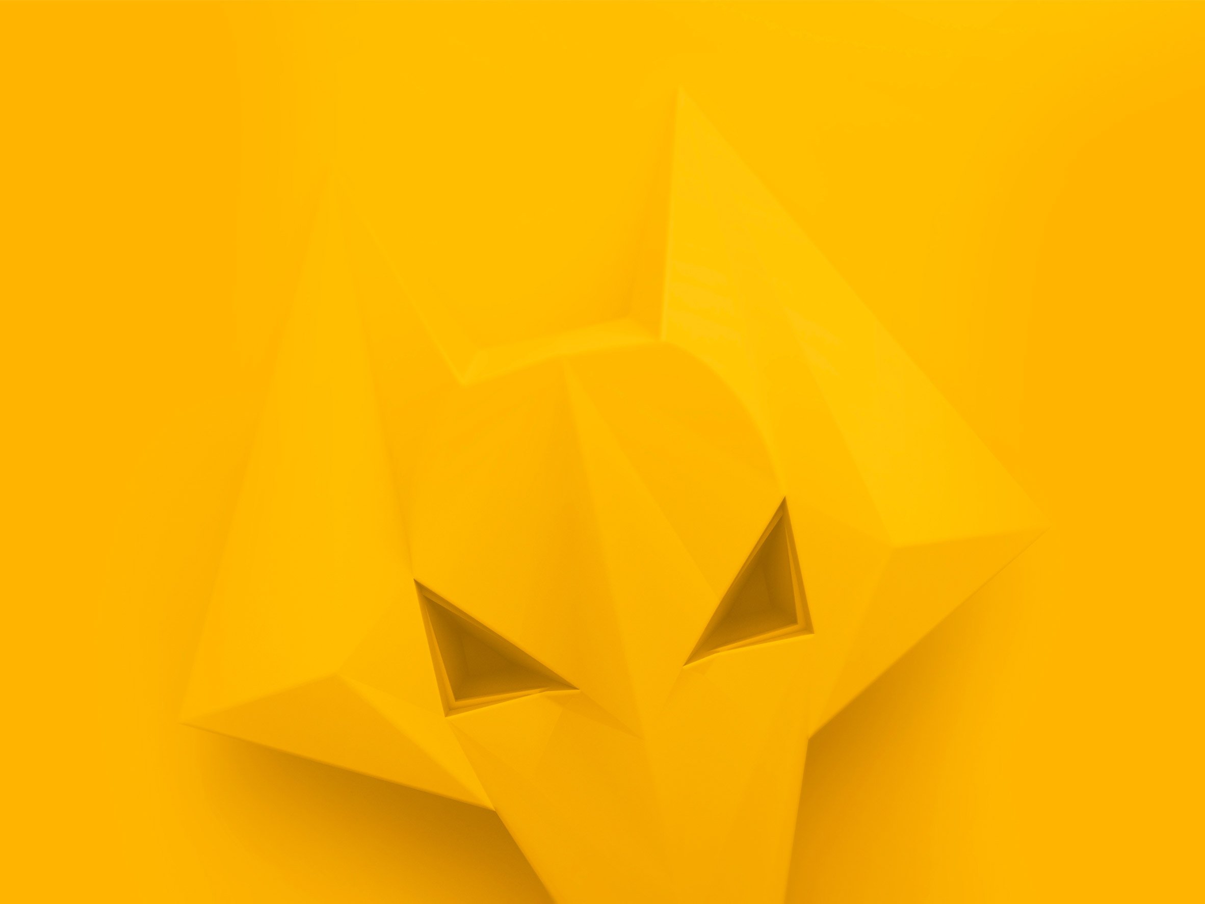
September 15, 2018The new visual identity for Premier League football team Wolverhampton Wanderers, better known as Wolves, centres around a 3D version of its wolf badge.
Creative studio SomeOne created the new branding for the English football club, which is owned by Chinese organisation Fosun Group, to feature across its physical and online platforms.
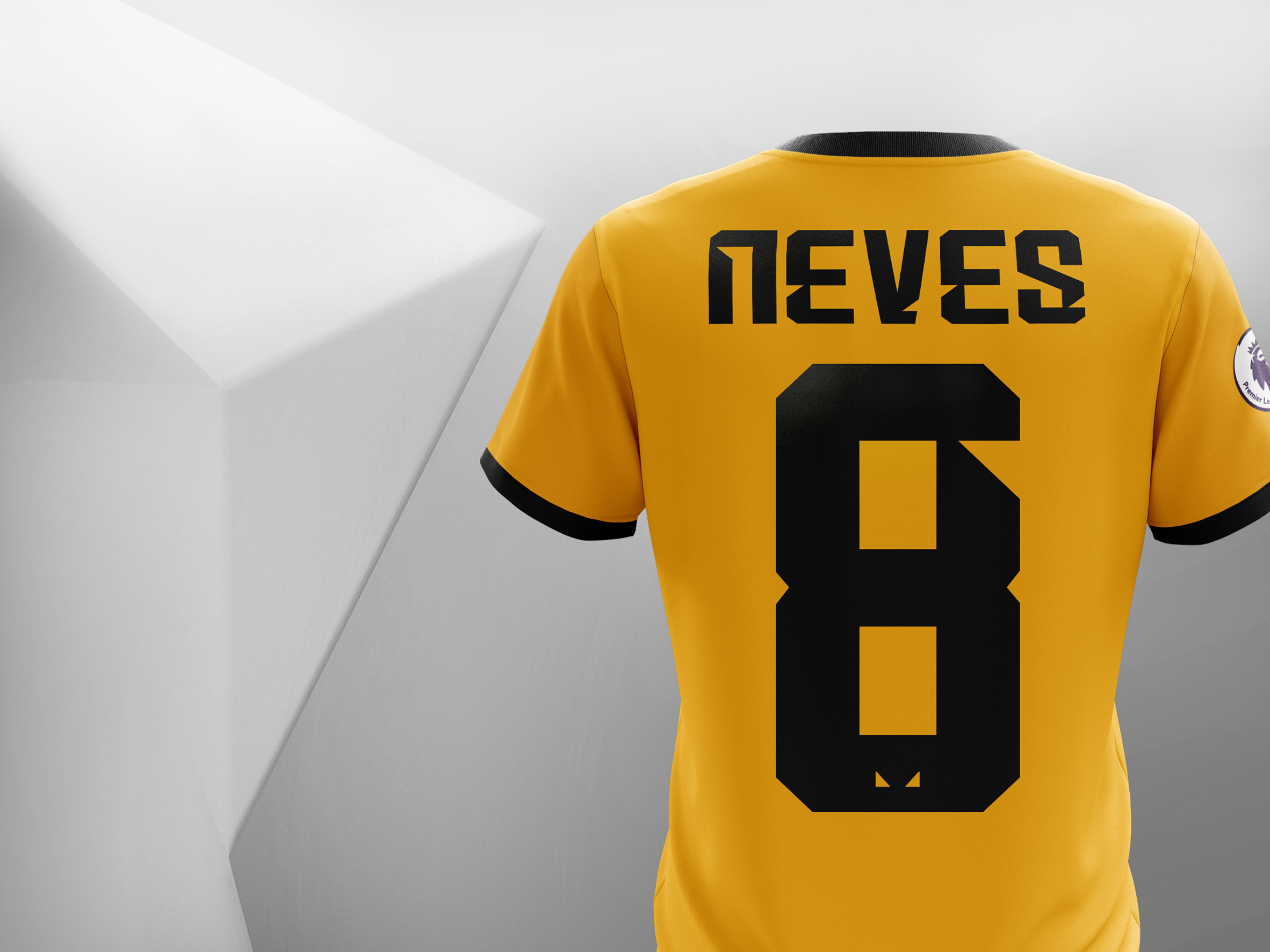
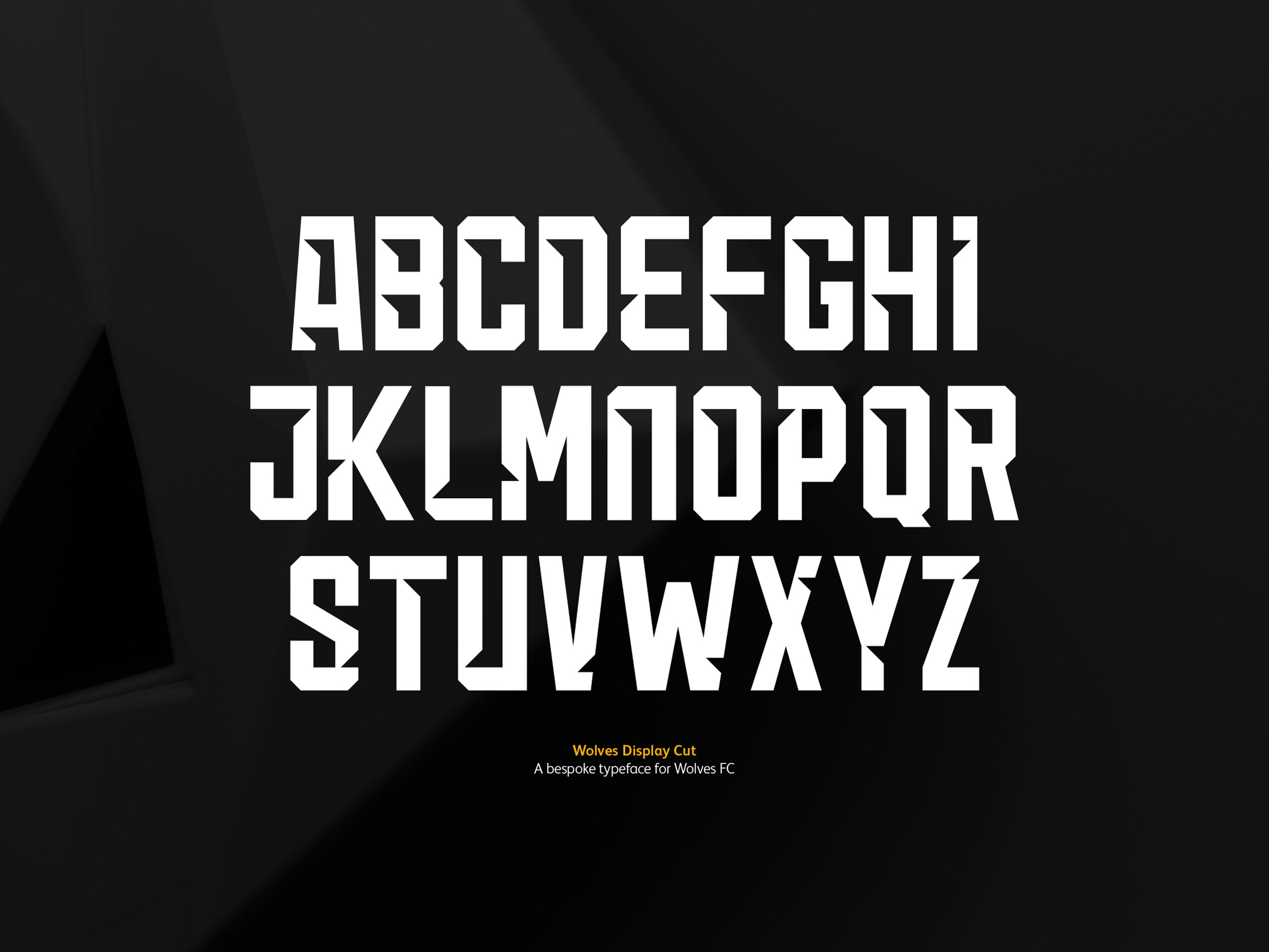
As well as the 3D wolf, it features a vibrant yellow and black colour palette, and a typeface with tooth-like details.
Wolves were promoted to the Premier League last season following a six-year absence, after winning the Championship with a record number of points.
The brief given to SomeOne was to help "extend the brand" to appeal to a global audience, but to also respect the long history of the club, which was a founding member of the English Football League in 1888, and a champion in 1974 and 1980.
"Wolves are entering a new exciting era, both on and off the pitch – all under the leadership of the Fosun Group. This dynamic, exciting future needed to be re-positioned to fans through our narrative and identity," said Russell Jones, head of marketing at Wolves.
"Whilst we had an existing brand style in place, we have been working closely with the team at SomeOne to re-define our messaging and produce a set of modern assets that have refreshed our brand," he explained.
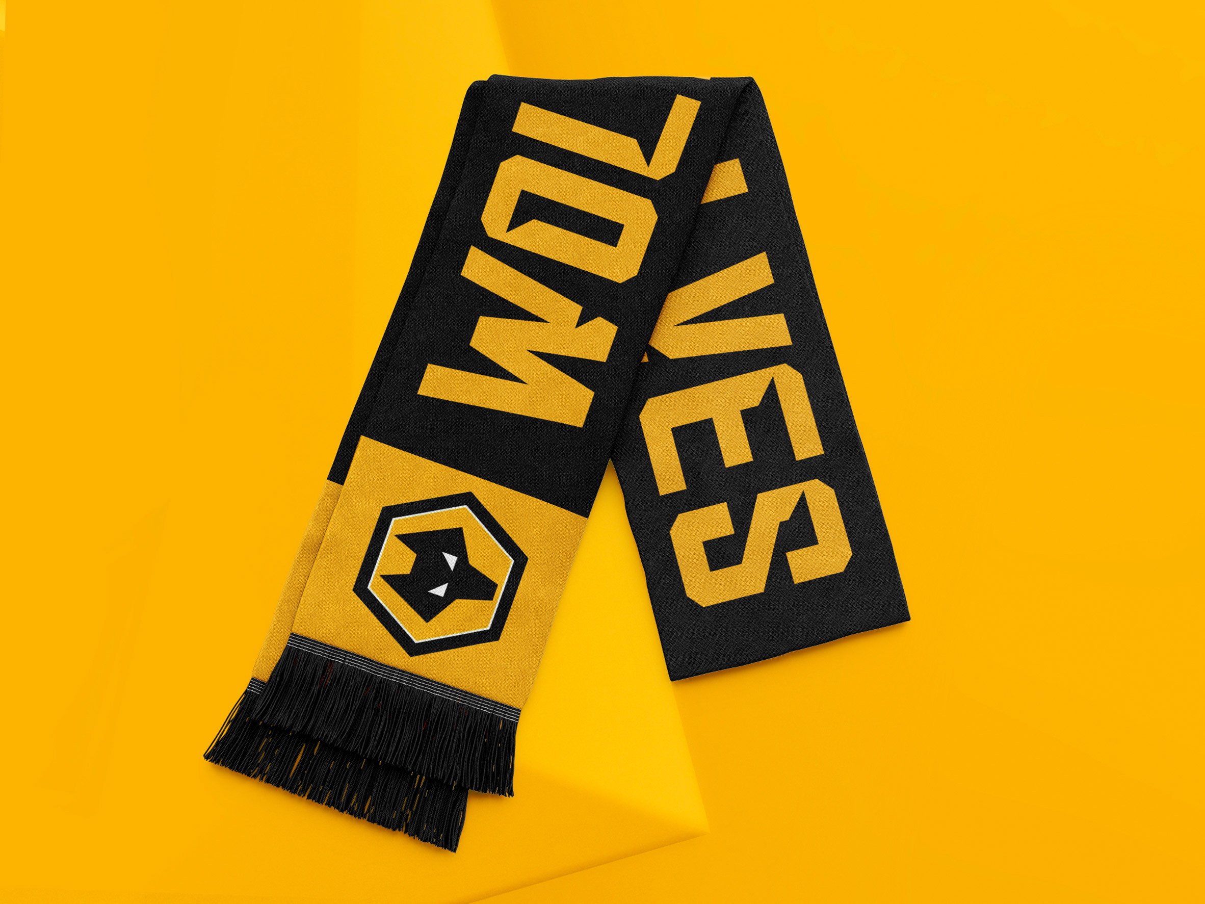
When designing the new brand identity, SomeOne knew not to touch the club's "iconic" logo of a wolf's head on a yellow hexagon with a black border. Instead, the designers used it as inspiration for a new three-dimensional brand property.
Influenced by Wolverhampton’s heritage of steel and ironmongering, the new imagery features a tonal illustration of a wolf's head with triangular eyes, which looks as if it could be forged from metal.
"The depth of the three-dimensional wolf adds a dynamic, competitive spirit that can't be reflected in flat vector forms," said Simon Manchipp, founder of SomeOne.
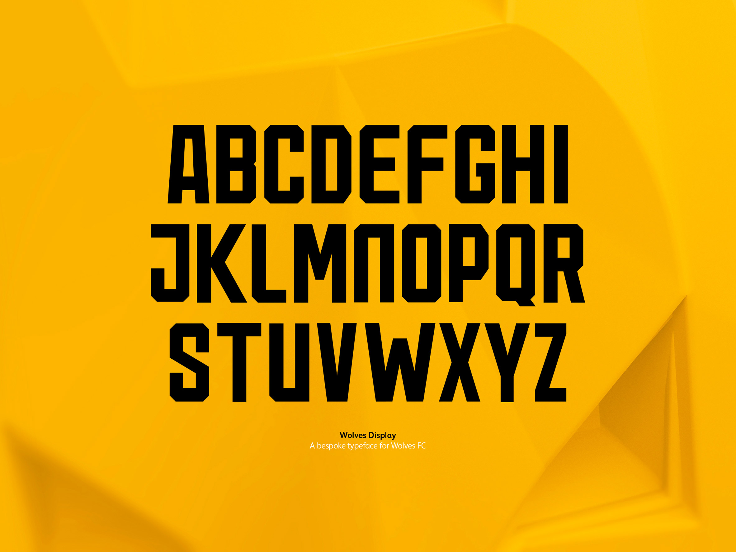
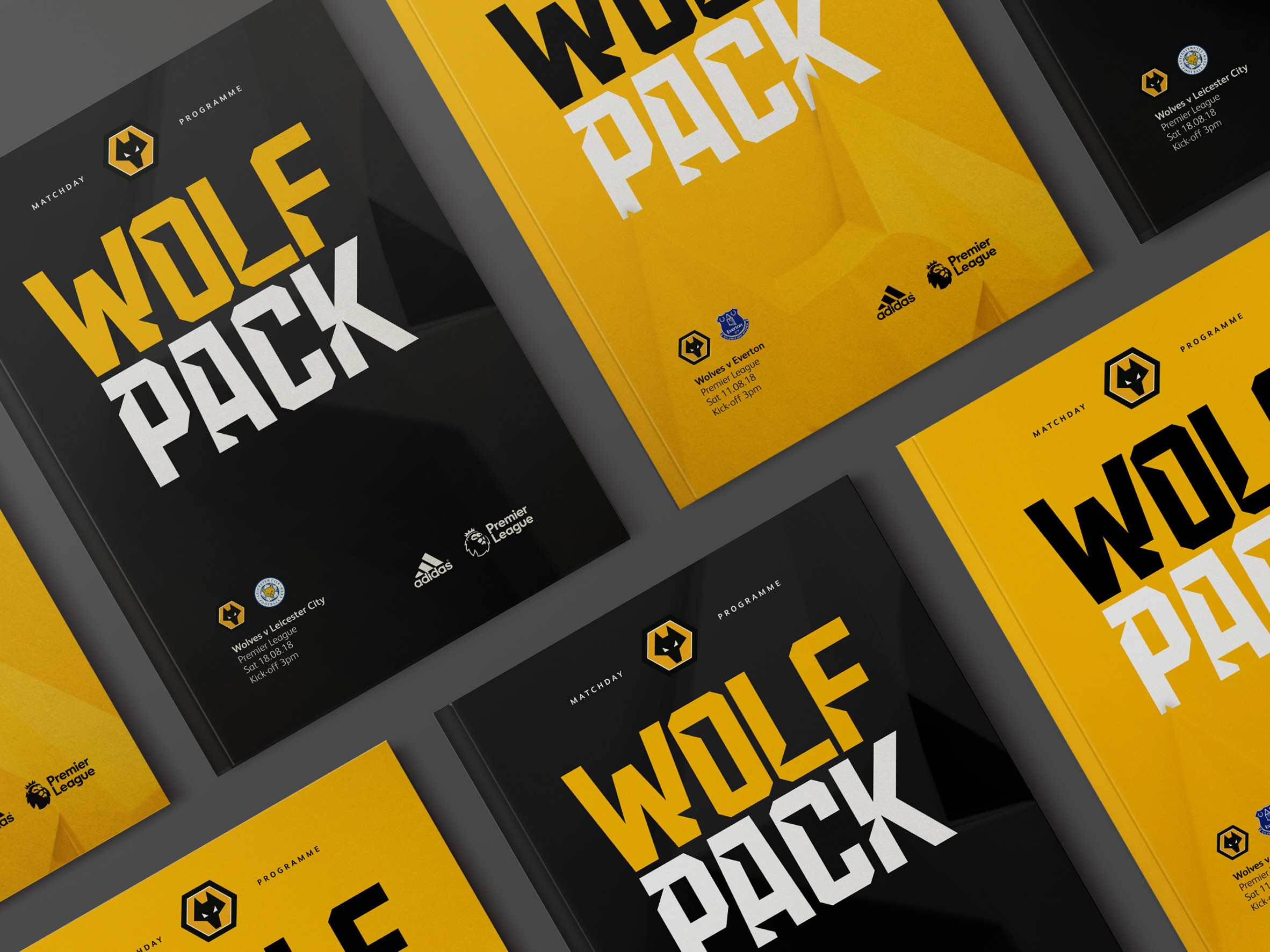
Accompanying the imagery are two new sans-serif fonts, Wolves Display Cut and Wolves Display, which feature a "bold and condensed style". The triangles of the wolf's eyes were used to apply cuts and angles to the lettering.
The club's original colour palette of orange and black was tweaked to a brighter shade of yellow. The phrase "wolf pack" is also made prominent throughout the brand identity.
According to Wolves, the rebrand has been "well received both internally and externally".
"The strategy, values, and ethos encompass everything the club stands for, from its passion and progression to its consideration for heritage and engagement," said SomeOne.
"By using the geometric forms of the eyes, we began removing cuts and angles from the letterforms. Moving forward, this allows the club to speak in a distinctive and ownable voice, without relying too heavily on the badge."
Also this year, Leeds United Football Club revealed a new logo, only to withdraw it after complaints from fans led to more than 50,000 people signing a petition urging for it not to be used.
Footballer David Beckham has recently also revealed new crest designs for his new Miami football team named Internacional Club de Fútbol Miami, which features a round pink and black badge.
The post Wolves football club unveils new visual identity featuring 3D wolf head appeared first on Dezeen.
from Dezeen https://ift.tt/2MApGQc
via IFTTT
0 comments