Pentagram evokes speed with branding for online car shop Vroom
October 08, 2018The silhouettes and movement of speeding racing cars influenced the slanted lettering of this wordmark, designed by Pentagram's New York office as part of a rebrand for an online auto trader.
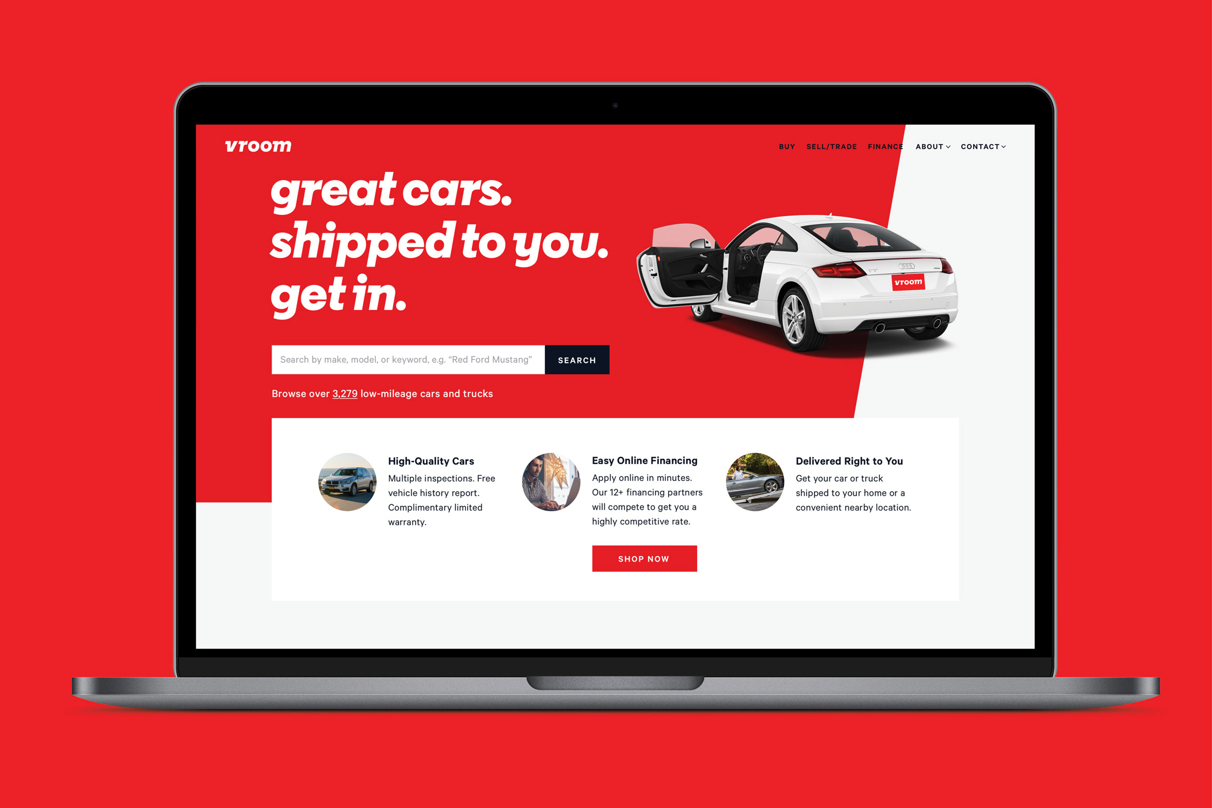
Pentagram graphic designer Michael Bierut led the team that rebranded Vroom, an online retailer for buying, selling or trading-in vehicles.
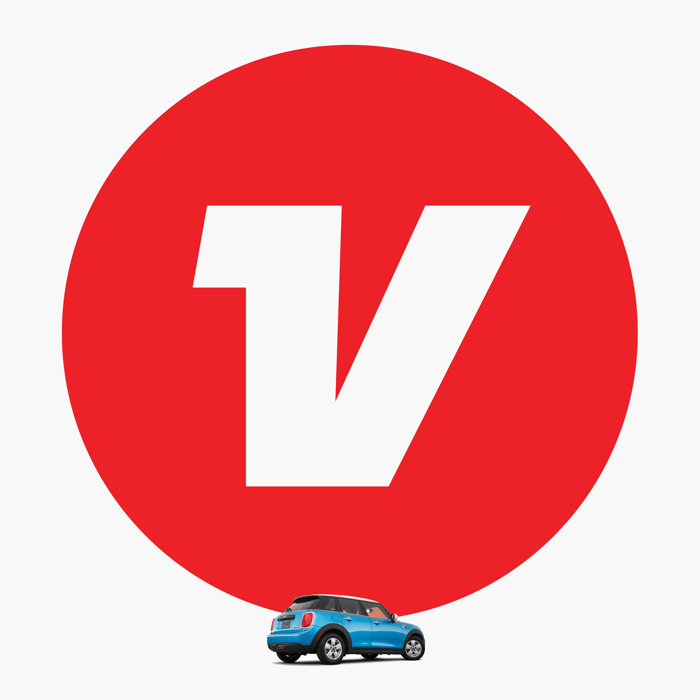
The designers wanted to let the company's onomatopoeic name "do the work", rather than using imagery of cars or driving. They therefore created a new white and red logo intended "to evoke a feeling of forward motion and driving a car".
Set against a "sporty" red backdrop, the name is written in a white using thick, italicised lettering in a typeface called Vroom Sans.
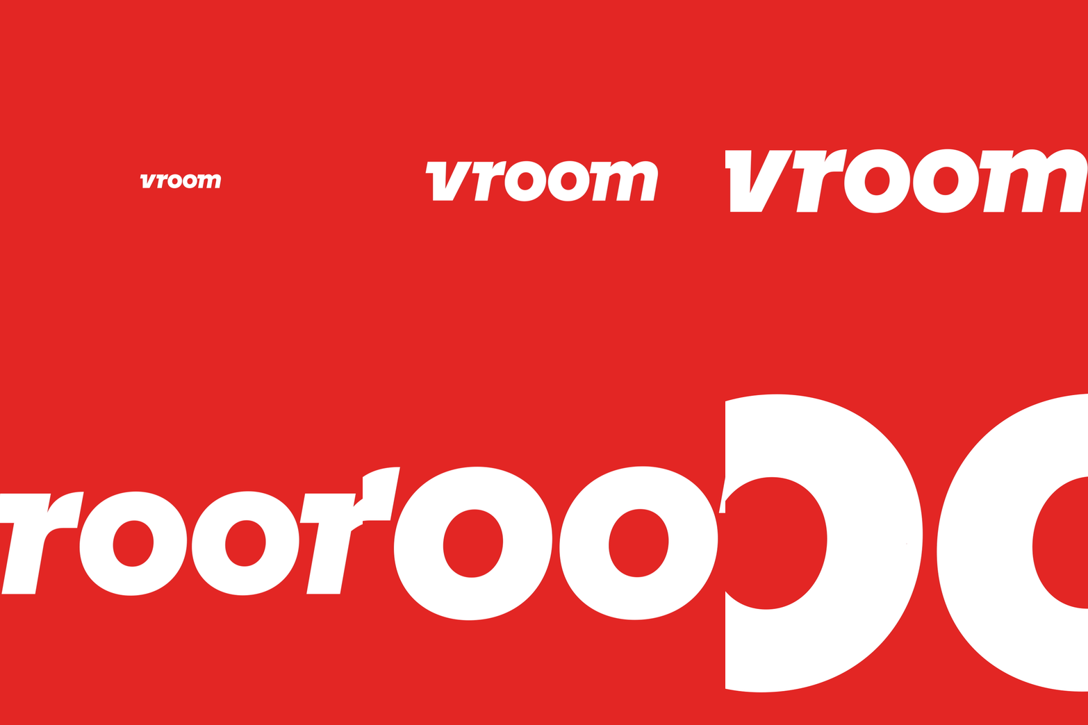
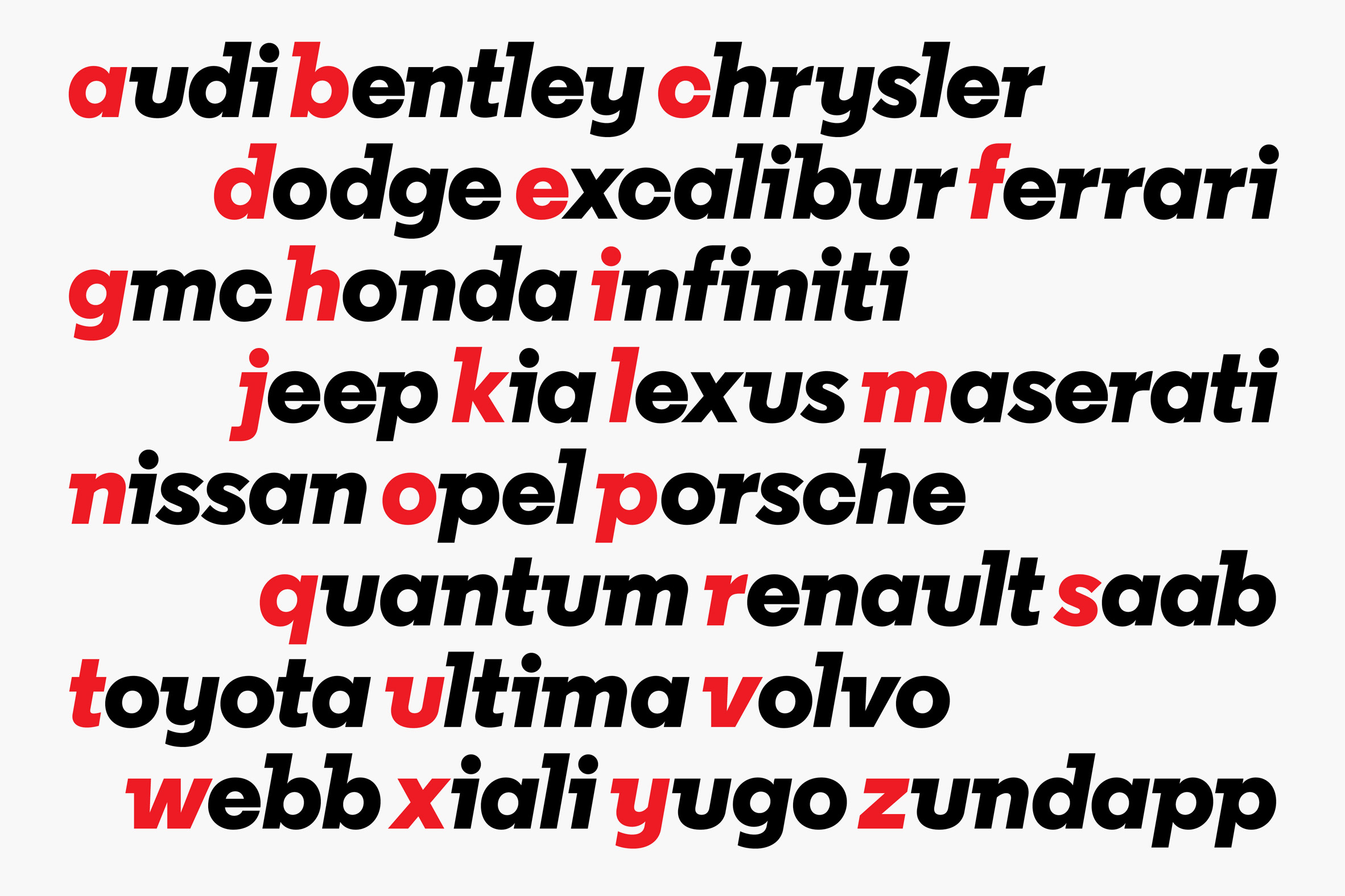
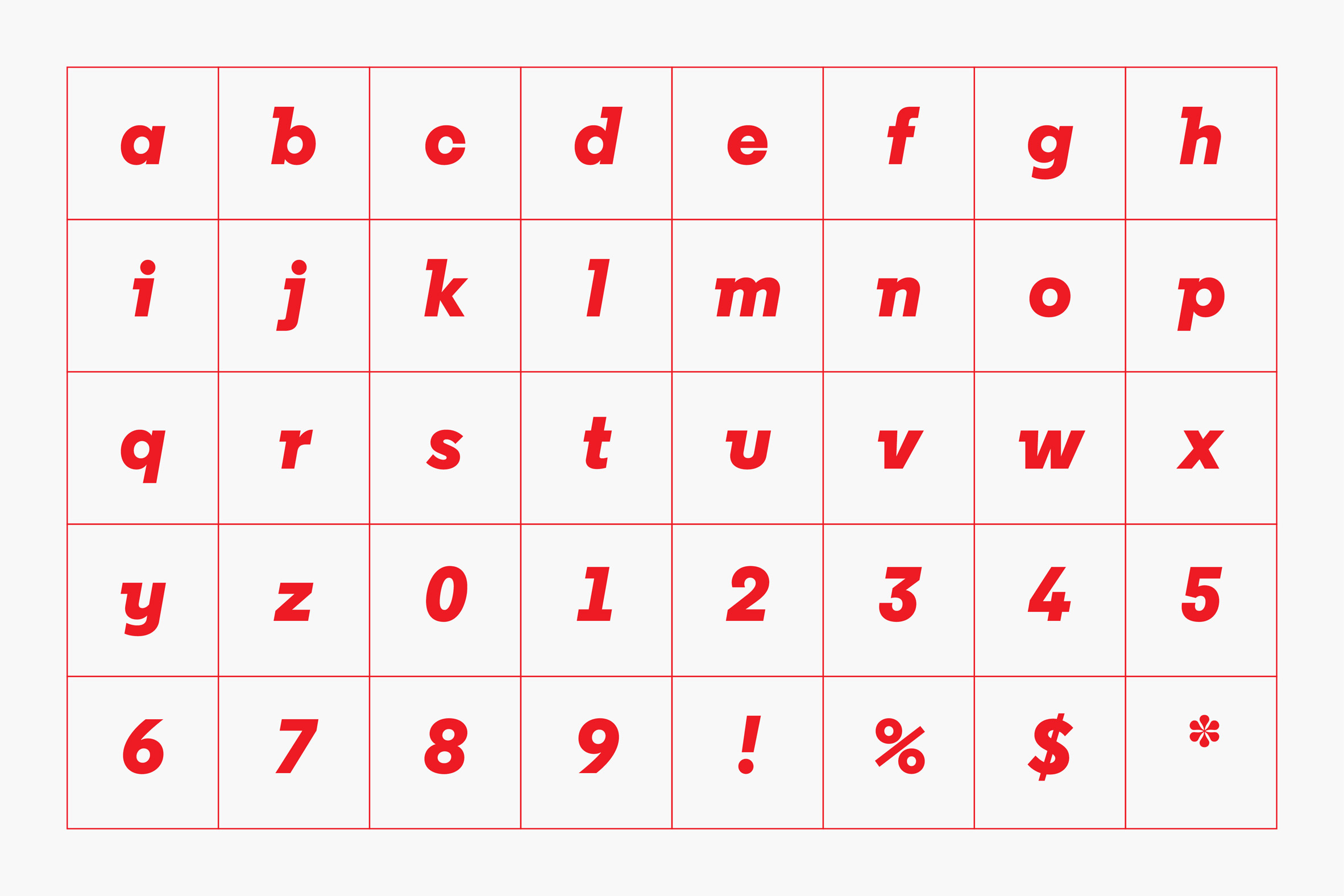
London-based type foundry A2-Type adapted its Regular Extrabold Italic typeface specifically for the project.
Letters are placed at a slant and feature curving descenders – the parts of the letters that drop below the base line – to suggest motion. Other new flourishes are the trailing slab serifs that Pentagram likens to the fins of racing cars.
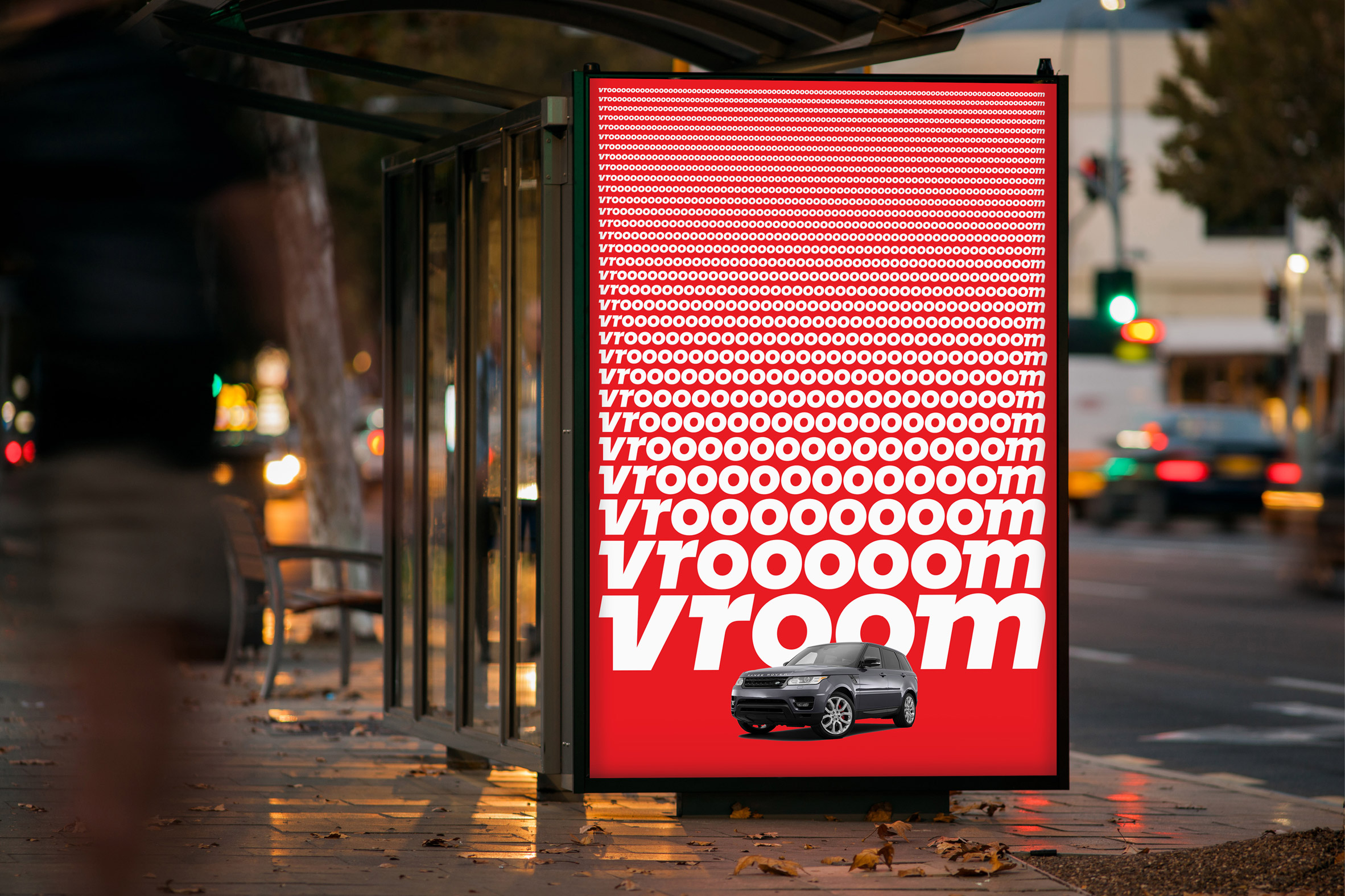
"We liked the sturdy weight, which was right for a commerce company where the product isn't a bottle of shampoo but a few thousand pounds of steel," Bierut told Dezeen. "And the italic balances that weight by evoking speed."
"We did some sketches that added some partial serif elements to the verticals – we called them 'fins' – that further exaggerated the sense of speed," he added.
Pentagram, which recently rebranded the US Library of Congress with a logo modelled on bookends, also created a monogram to accompany the wordmark that features a lowercase white "v" in a red circle.
Other car-related aspects of the branding include icons that resemble dashboard symbols. These are coloured in white, blue and yellow stripes as a reference to speedway racing flags.
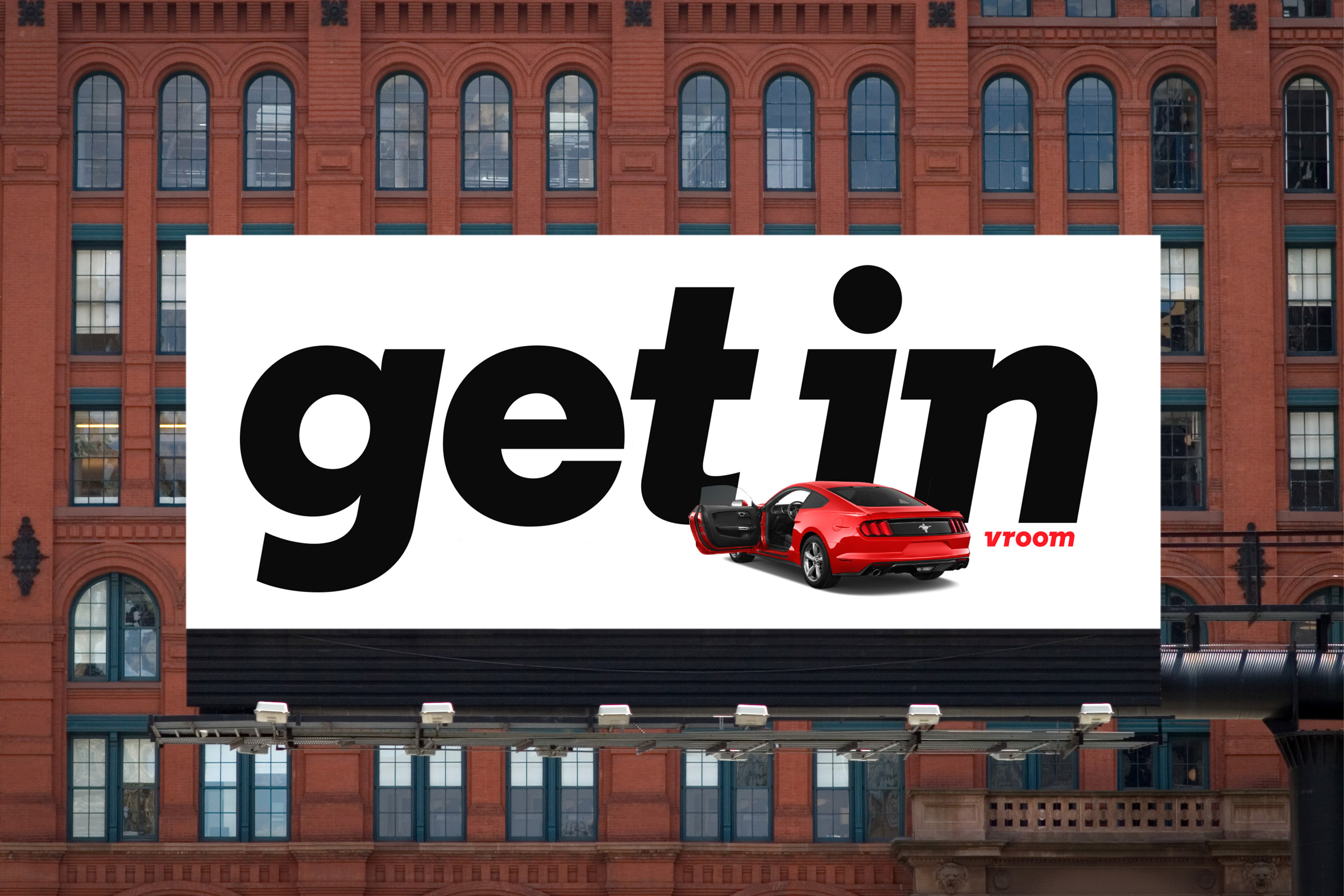
Vroom Sans also features throughout the retailer's new advertising materials, which Pentagram developed with Vroom's agency Anomaly. It includes a series of posters that feature red cars, the name of the brand, and the slogan "get in", set against a mix of red, white and black backdrops.
"The cars are the stars in crisp, clean treatments that make the automobiles the focus, sharply silhouetted on white, a riff on the minimalism of classic Volkswagen ads," said Pentagram in a project statement.
The simple three-toned colour palette also adorns the company's website, and is intended to reflect its fuss-free nature of the company, which offers easy search functions and free delivery.

Pentagram was established in 1972 and is now one of the best-known graphic design agencies in the world. In addition to the New York office that worked on this redesign, the company operates several more globally, including San Francisco, Berlin and London.
It also has a location in Austin, Texas, which recently rebranded a Nashville art museum with a 1930s-influenced logo.
The post Pentagram evokes speed with branding for online car shop Vroom appeared first on Dezeen.
from Dezeen https://ift.tt/2ymTCKy
via IFTTT
0 comments