Ace & Tate opens "voyeuristic" glasses store in central London's Soho
November 12, 2018A pair of neon eyes stare out from the back of eyewear brand Ace & Tate's new Soho store, which creative agency Anyways have designed in reference to the area's risqué past.
The two-storey store is located along Brewer Street and is one of two branches that Ace & Tate has opened in the city this year as part of their UK expansion scheme, joining another base in Whitechapel.

Soho is now populated by a host of eateries and trendy streetwear boutiques, but throughout the 20th-century it was largely dominated by sex shops and nightclubs.
The area's history – or, as described by the brand, its "reputation for voyeurism" – is what informed the design of the store, which has been developed by creative agency Anyways.

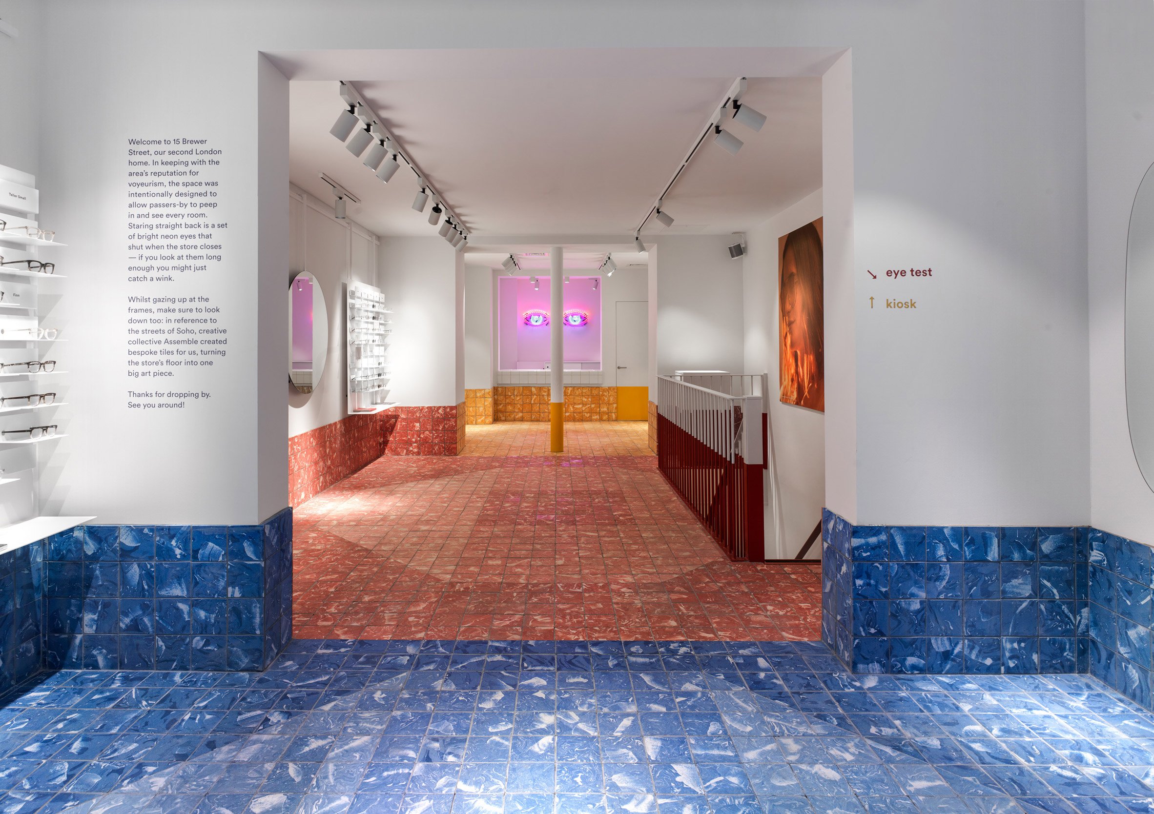
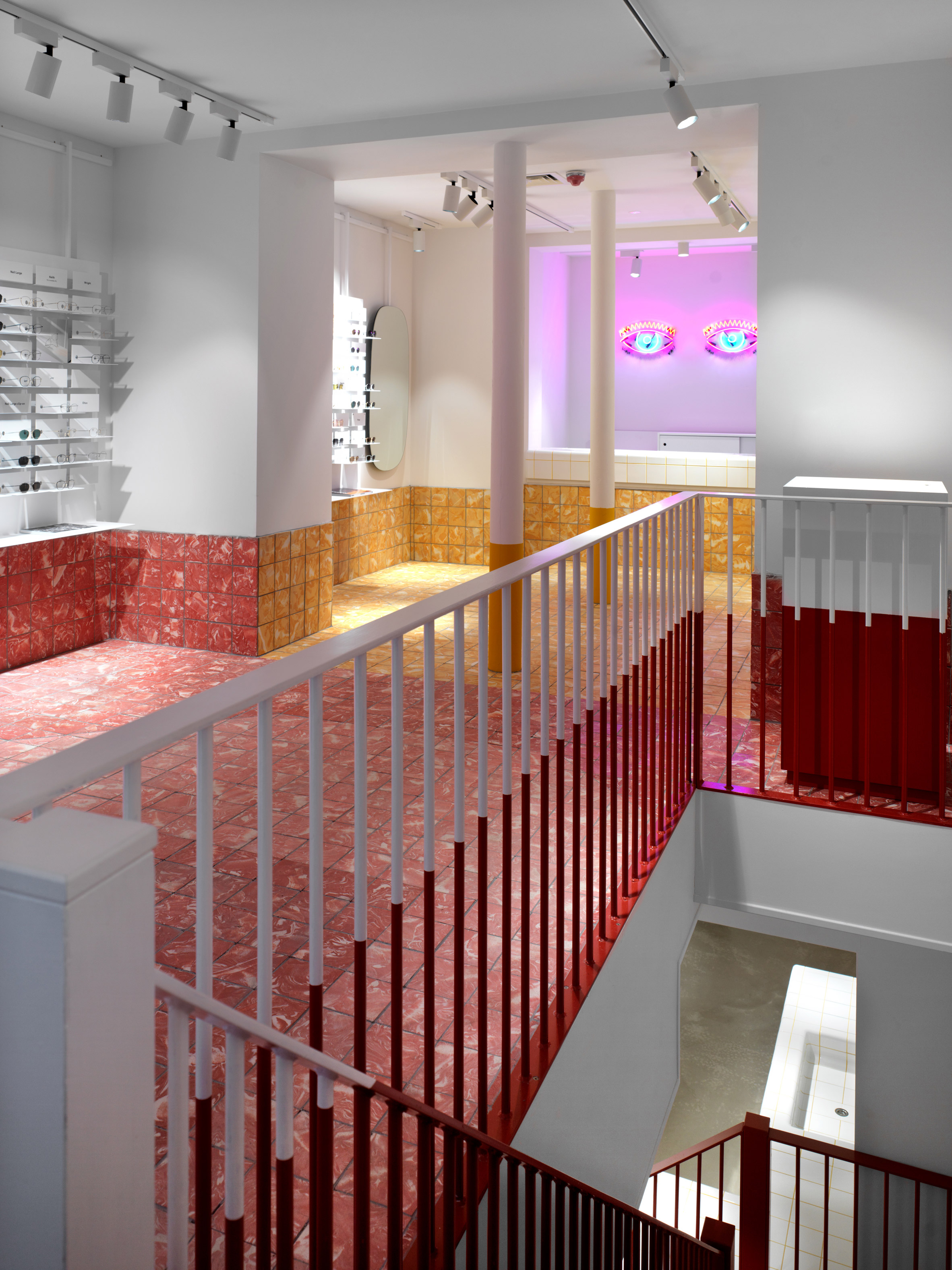
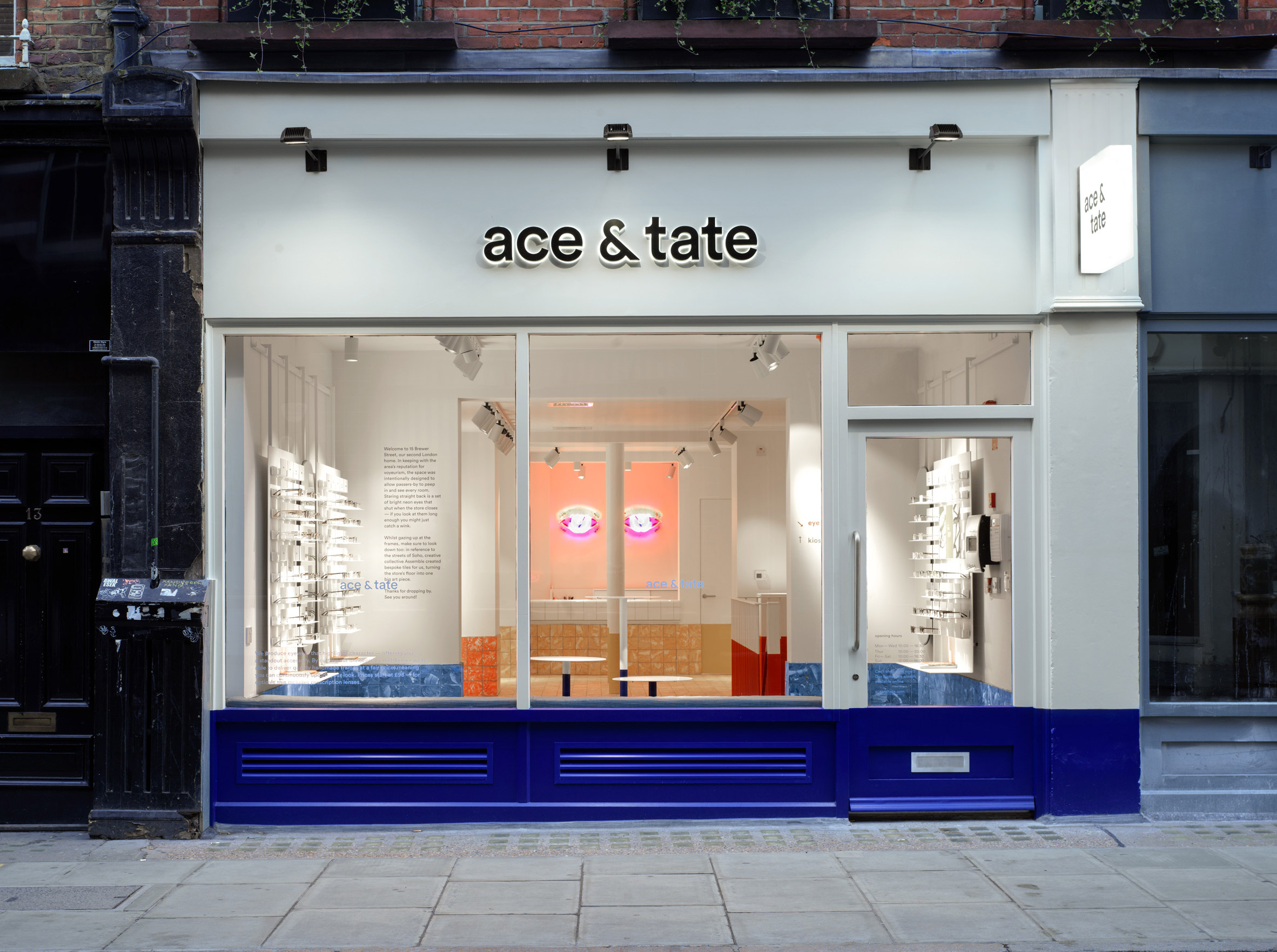
Huge panels of glazing have been installed in its front facade to encourage passers-by to "peep-in" and observe the store's inner rooms. A pair of neon eyes have then been installed on the ground floor's rear wall that sporadically blink.
"It is always important that we draw inspiration from the local neighbourhood and work with the area," Doortje van der Lee, head of retail expansion at Ace & Tate, explained to Dezeen.

Granary Workshop – the social enterprise founded by Turner Prize-winning architecture collective Assemble – were then brought on board to complete the shop's floors, which are decked out in handmade marble tiles.
The blue, red, and yellow colour scheme is intended to mimic the brightly-hued pavements of London's Carnaby Street during the 1970s.
White shelving units that display rows of glasses can be lifted off the walls and stowed away should the brand want to host parties, events, or talks with local creatives.
"[Ace & Tate] wanted to make sure we created a flexible space that enables a seamless offline customer journey next to our online experience," added van der Lee. "We don't only offer eyewear, it's also a place for art and conversation."

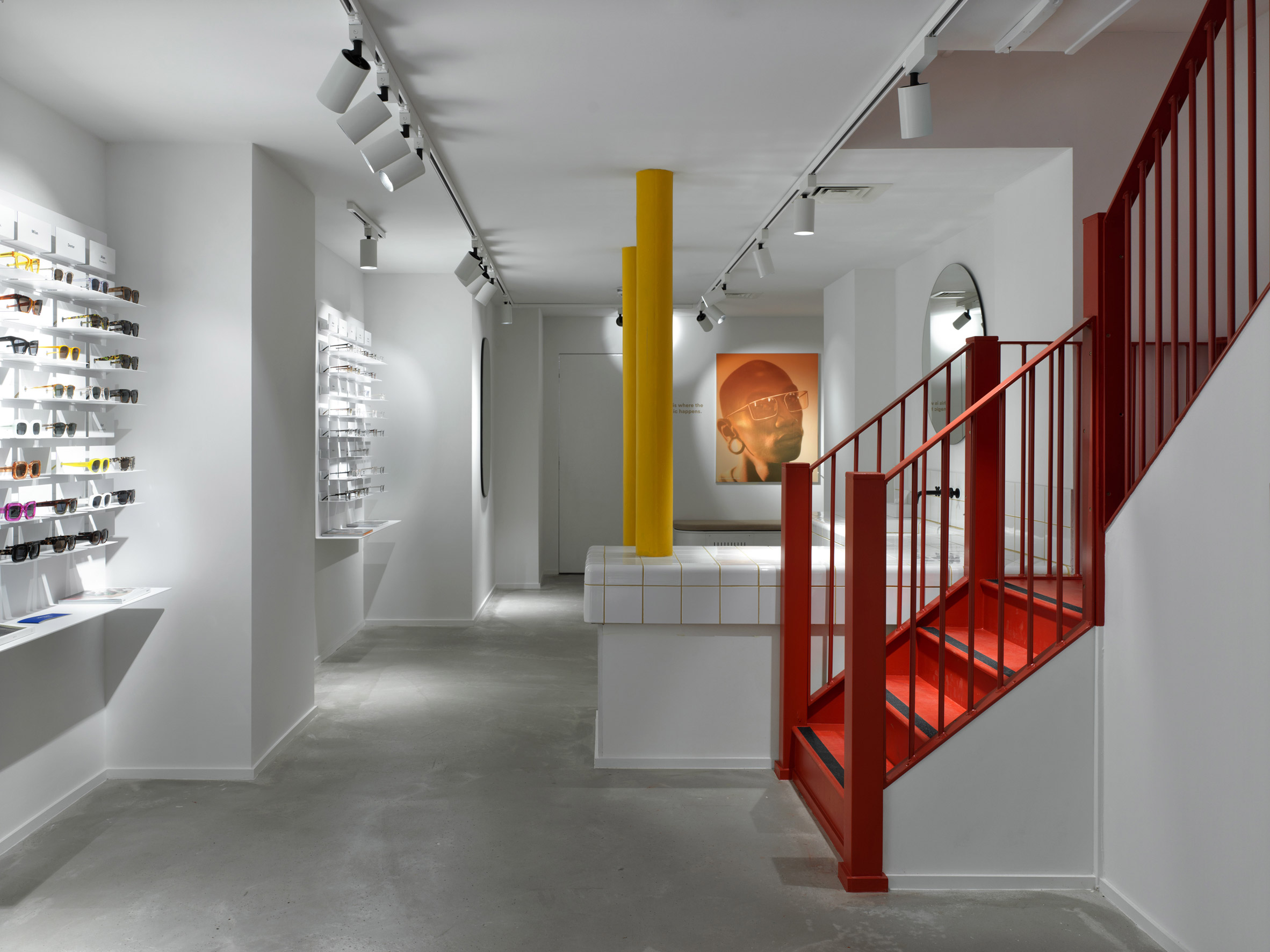
A red staircase leads downstairs to the basement, which plays host to a couple of optometry rooms and a large white-tile basin where customers can rinse their hands, remove contact lenses, and try on different glasses styles.
This level features simpler concrete floors, but interest is added by large posters of the brand's own campaign photos.
Ace & Tate have become known for their minimalist yet quirky retail spaces – last year they opened a branch in Copenhagen which featured primary coloured-walls and geometric shapes, while their outpost in Amsterdam has surfaces punctuated with peg holes that allow mirrors and shelves to be easily moved around.
Photography is by Erik Undéhn.
The post Ace & Tate opens "voyeuristic" glasses store in central London's Soho appeared first on Dezeen.
from Dezeen https://ift.tt/2JXokPw
via IFTTT
0 comments