Pentagram deconstructs Slack's hashtag logo in rebrand
January 17, 2019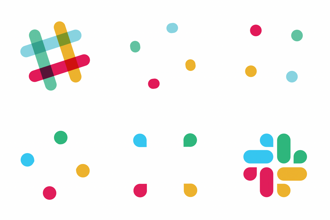
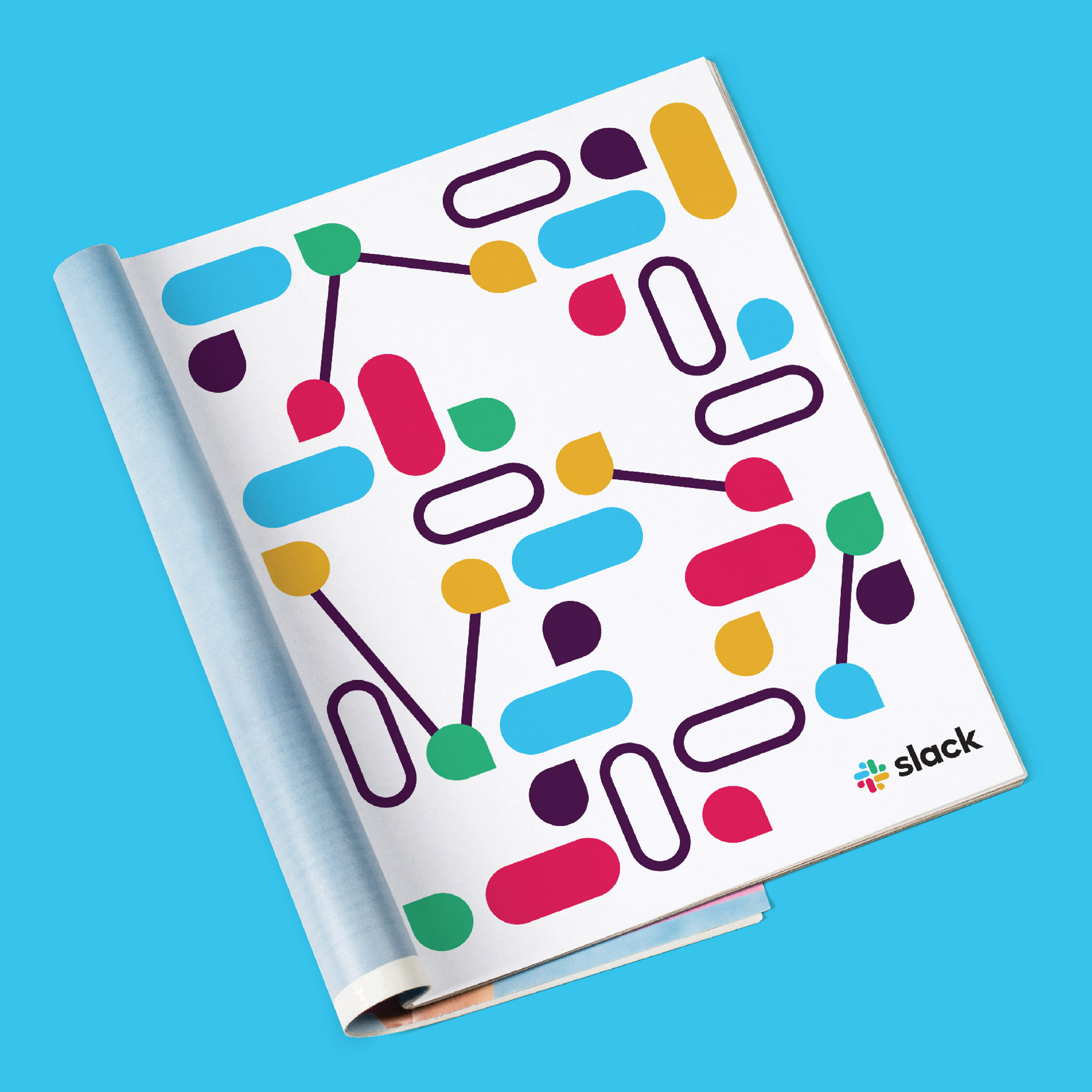
Pentagram has adapted the logo of workplace messaging system Slack into a pattern of speech bubbles and lozenge shapes as part of a rebranding effort.
Slack enlisted graphic design agency Pentagram to create a more simple version of its octothorpe symbol launched in 2013 – one that could be easily assigned to different uses across its branding.

"In the course of lots of conversation, I learned that their original branding elements were never quite thought through as a system," Pentagram's Michael Bierut told Dezeen. "And although in the aggregate they created a general feel of 'Slackness', in the details there was a huge amount of consistency."
"And this was only going to get worse as the company continued to expand," he added.
Bierut worked on the project with Slack founder and CEO Stewart Butterfield, and the company's in-house design and brand team. Together, they aimed to maintain elements of the hash, or pound, symbol because it plays an important part in the platform – it is used to signal the start of individual projects.
The redesign uses the four diagonals of the original mark as a starting point, but new elements include a pill shape and a droplet motif. The latter is intended to resemble a speech bubble as a reference to chatting.
"We took their familiar hashtag and deconstructed it," said Bierut, who led the project from Pentagram's New York office.
"After lots of trial and error and going back and forth with the Slack team, we arrived at something that would be distinctive even in one colour, recognisable at small sizes and on any platforms, consistent in all applications, and a starting point for lots of variations going forward."
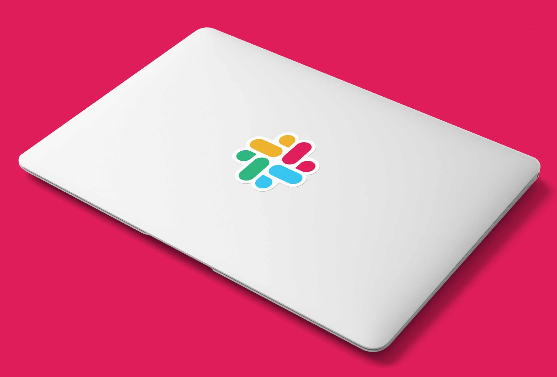
The pill and droplet shapes are paired together to create four sections, arranged around a central point.
"The pieces of the symbol are separate but come together, very much the way we do when we collaborate and communicate on the Slack platform: the forms are meant to look as if they're at once woven together, and bursting open," said Bierut, who also led Pentagram's rebrand of car company Vroom.
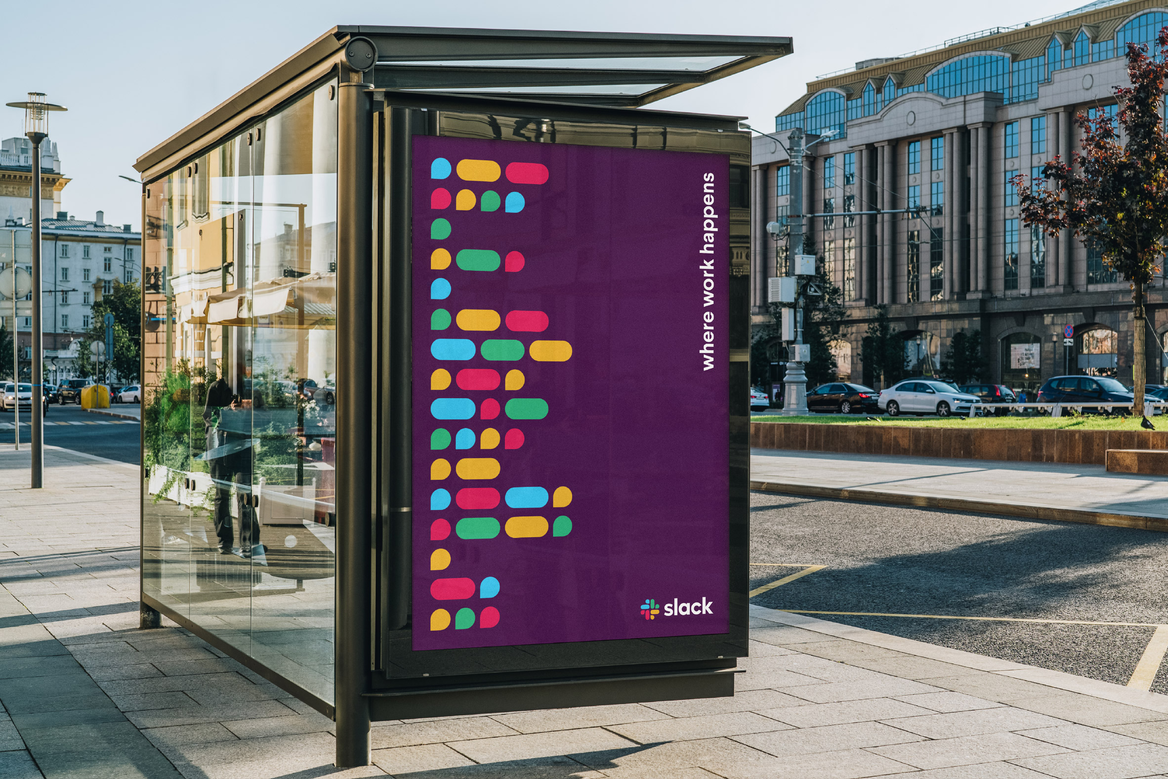
Another key aspect of the redesign was reducing the set of 11 hues on the old branding to four primary colours: red, yellow, green and blue. Slack's accent "aubergine purple" is maintained as the backdrop and on the left-hand column of the messaging platform.
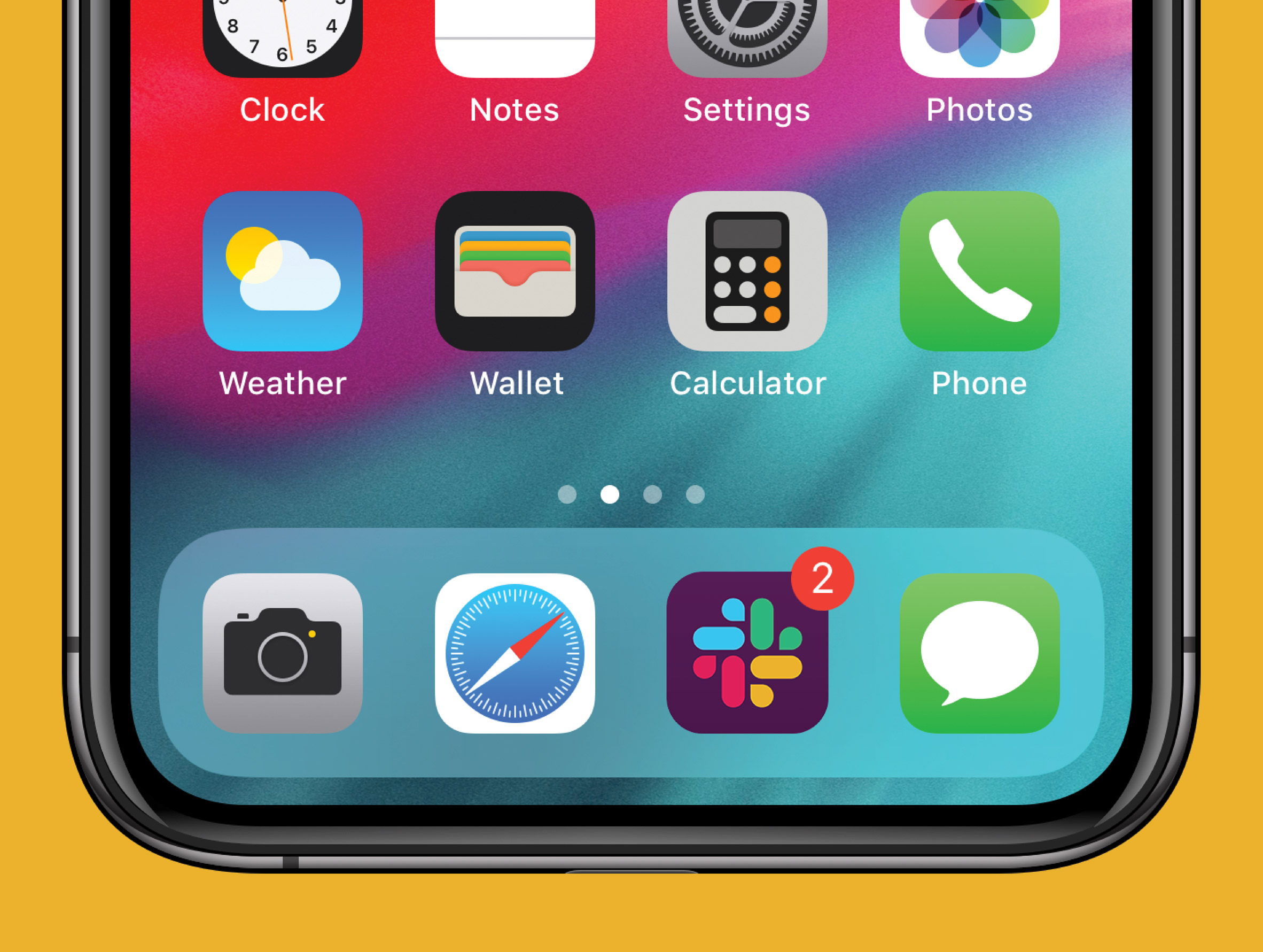
Slack, which has so far updated its phone and computer apps with the new logo, plans roll out the new design across its website and advertising soon.
The company is headquartered in San Francisco but has opened offices worldwide, for which it has typically enlisted local architecture studios to oversee the interiors. Snøhetta designed Slack's New York workspace, while ODOS Architects created timber and concrete interiors for its Dublin outpost.
Slack's other recently opened offices include a Leckie Studio-designed space in Vancouver, and another in Toronto designed by Dubbeldam Architecture + Design.
Established in 1972, Pentagram provided an obvious choice for Slack's rebrand with a number of major rebrands under its belt. The agency's recent overhaul of Mastercard involved dropping its name from the logo, while a stencil-style supergraphic was created ICA Boston.
The post Pentagram deconstructs Slack's hashtag logo in rebrand appeared first on Dezeen.
from Dezeen http://bit.ly/2MgUdE3
via IFTTT
0 comments