"Extreme architecture for other architects"
February 26, 2019
In this week's comments update, readers are questioning the thinking behind Gus Wüstemann's concrete-heavy housing block.
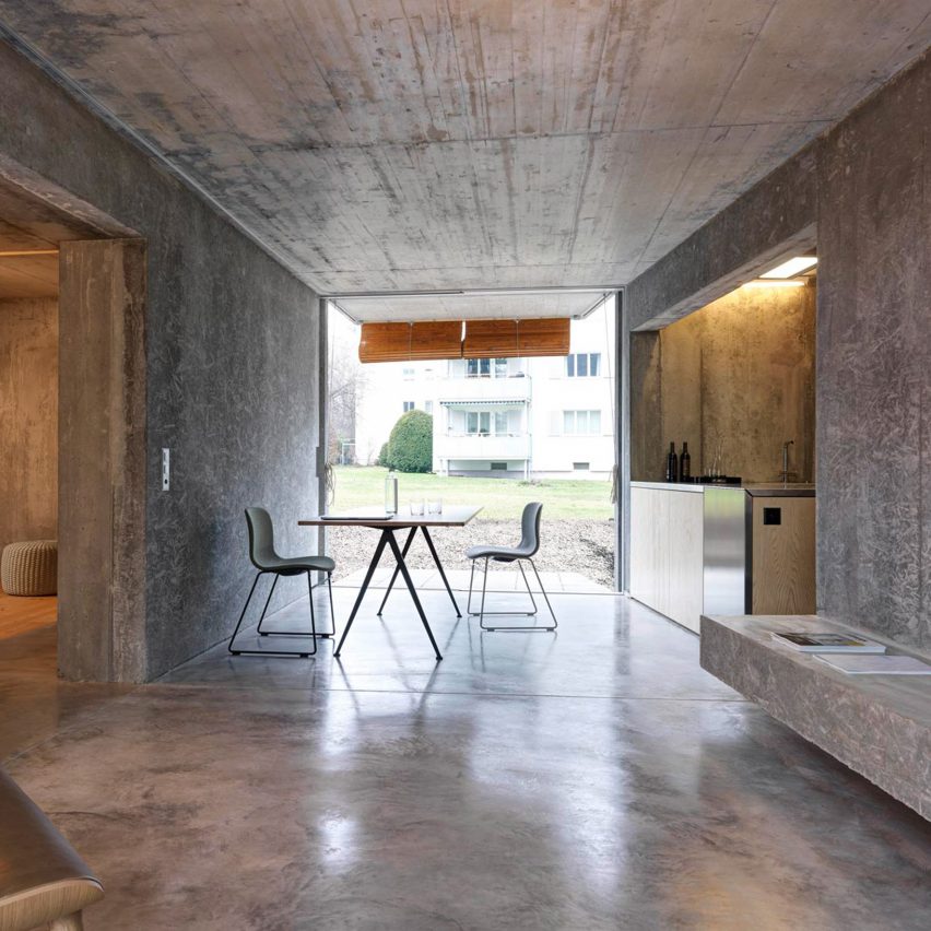
Material matters: Zurich studio Gus Wüstemann has divided readers with its low-cost housing block, designed for the Baechi Foundation that boasts an abundance of concrete.
"I love concrete and this is wonderful," praised Aigoual.
Duckusucker agreed: "Beautiful, textured, functional simplicity: well done!"
However, others thought it was self-indulgent, with Beartoe saying: "This is classic, extreme architecture for other architects. How, um, does one hang a picture on the wall?"
Blackout also raised a question: "Truly affordable, or affordable for young professionals and assorted hipsters who can already afford rents in city centres, but would prefer to spend a bit less?"
Regardless, this reader was impressed by at least one of the flats' features:
What do you think of the apartment block? Join the discussion ›
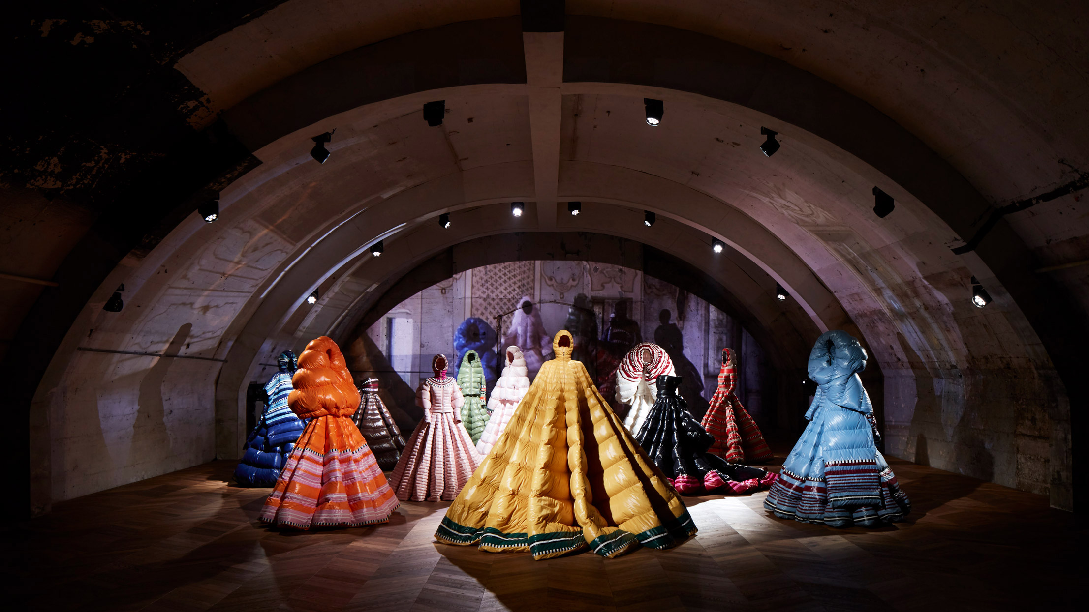
Sleep wear: Milan Fashion Week saw Moncler unveil a polarising collection of padded full-length evening dresses, designed by Valentino creative director Pierpaolo Piccioli.
"Everyday would be a duvet day. Bliss," wrote a delighted Interior Addict.
Sim was also complimentary: "A welcome change I guess for female stars. Finally clothes that will keep them warm on the red carpet."
"Why are so many 'creative' designs totally incompatible with reality? It’s like designing a great car with no wheels," said Hikoo, in contrast.
The Resistance was even less impressed: "Modern fashion is ugly and out of touch."
One word was all this commenter needed to summarise their thoughts:
Would you wear a padded dress? Join the discussion ›
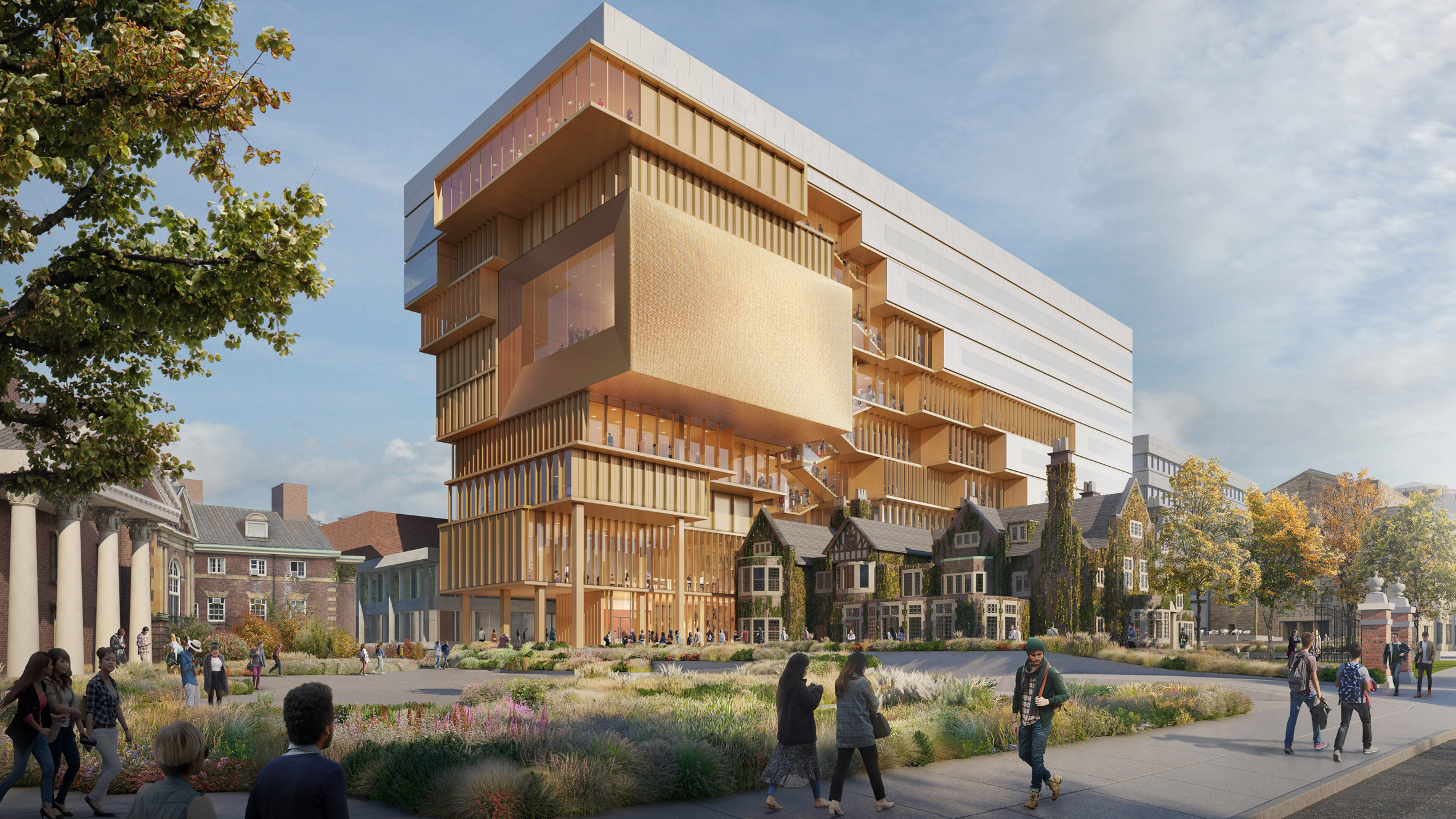
Supersized: readers are horrified by the scale of Diller Scofidio + Renfro's new campus building at the University of Toronto, which towers over neighbouring buildings.
"The gargantuan and completely inappropriate scale of this behemoth is frankly ridiculous. It's like one of Terry Gilliam's Monty Python cartoons – Bigfoot terrorises university campus!" argued Alfredhitchcock.
Jon agreed: "Scale is quite aggressive and the formal articulation is dated – would not be out of place in the portfolio of a less-talented studio."
"If anything is worthy of erosion, it's this fad of effing gimmicks," continued Colonel Pancake.
Rob Swain added: "Everything about this is wrong, and it appears everyone on here agrees!"
At least this person was stunned:
Is "everything about this wrong?" Join the discussion ›
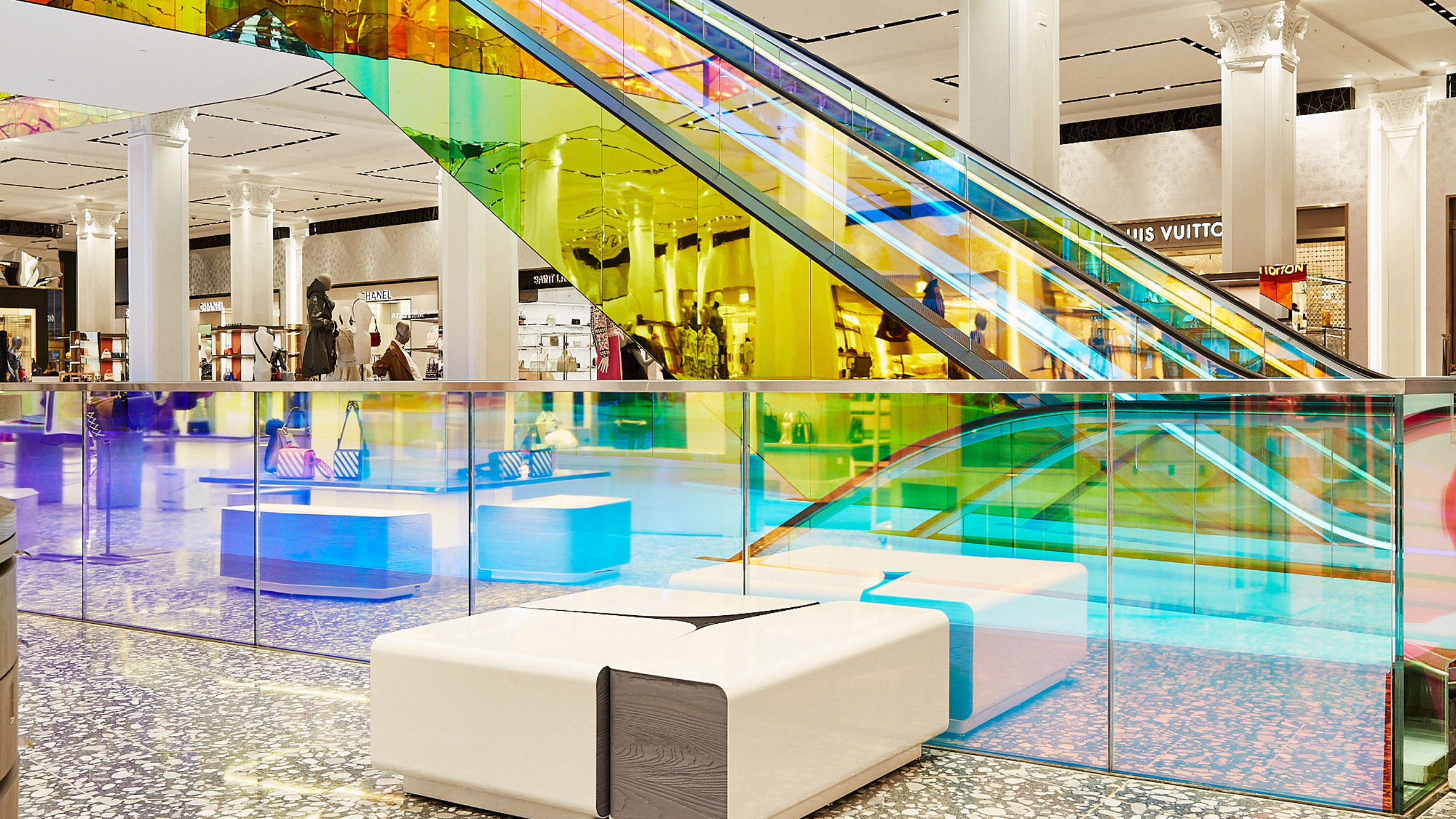
Time to reflect: the decision to update Saks Fifth Avenue department store in Manhattan with an OMA-designed, multicoloured glass escalator, hasn't gone down well with readers.
"They couldn't afford to do anything more than iridescent film? Why even hire a firm like OMA if this all you are going to fund?" quizzed Davvid.
Idracula responded: "Iridescence – the solution to retail".
"The 1960s are calling... they want their iridescence back," continued Frank sarcastically.
Slime thought the design was particularly hilarious: "LMAO"
Whether this comment was ironic is up for debate:
Does the design elevate you? Join the discussion ›
The post "Extreme architecture for other architects" appeared first on Dezeen.
from Dezeen https://ift.tt/2VrM2bv
via IFTTT


0 comments