Core Kensington pilates studio blends Mexican and Norwegian design
March 17, 2019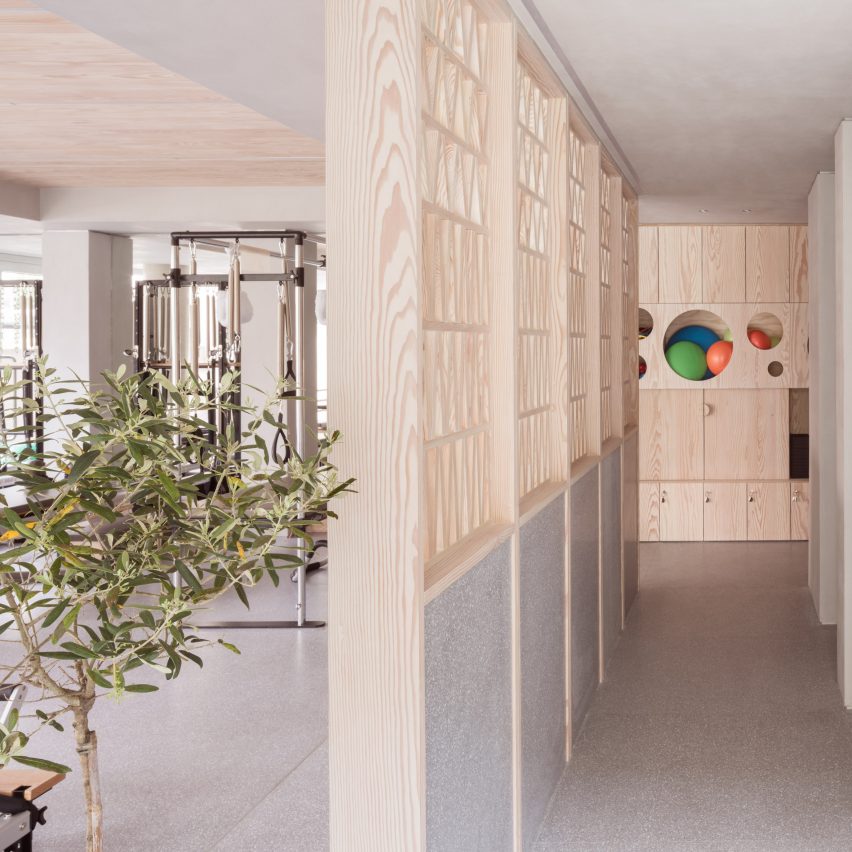
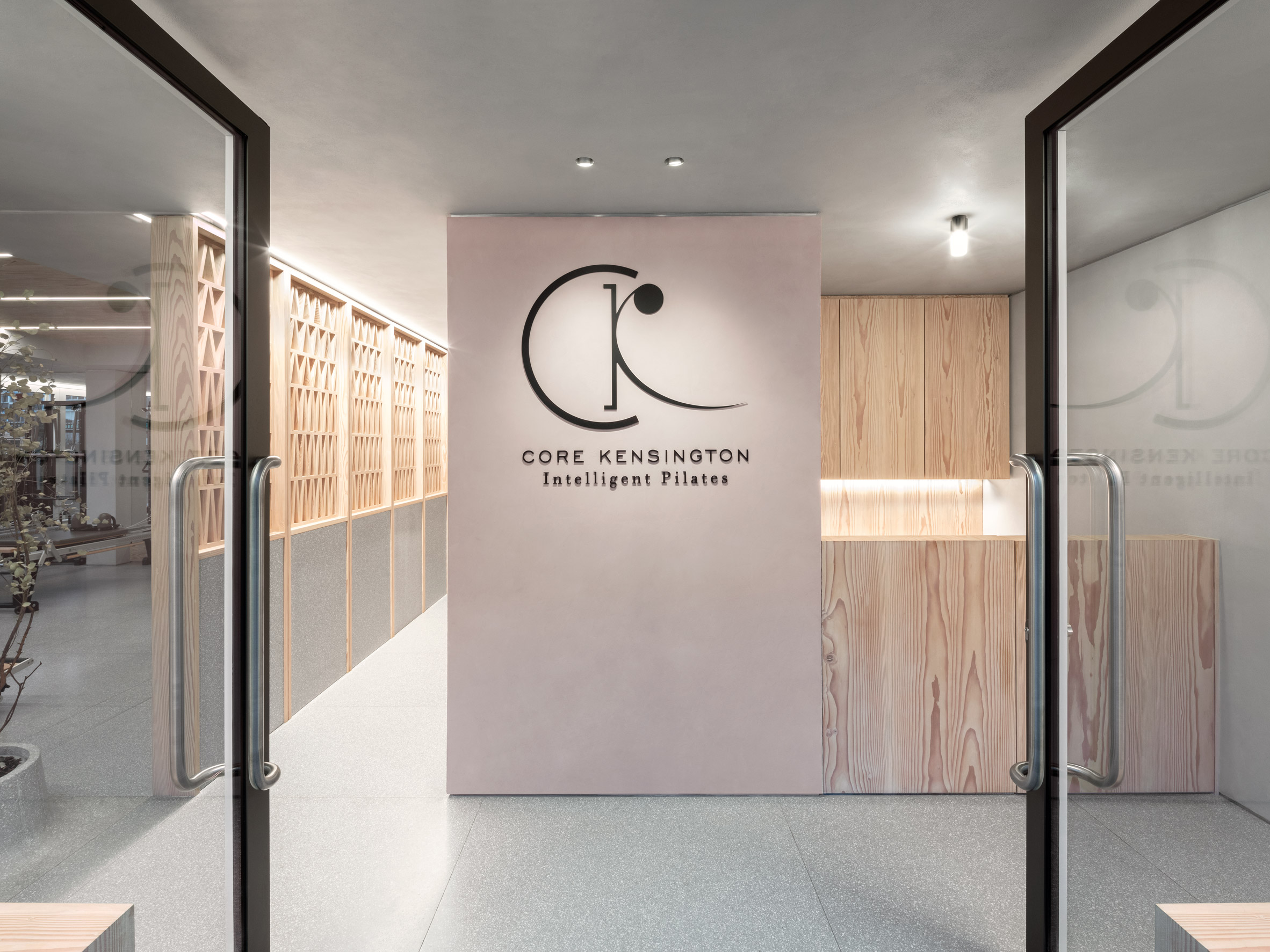
This calming pilates studio in Kensington, London, by Studio Wolter Navarro is divided by a central timber wall inspired by Mexican celosías.
London-based Studio Wolter Navarro was invited by the pilates studio's owners – a Mexican-Norwegian couple – to design a new premises for their pilates studio.
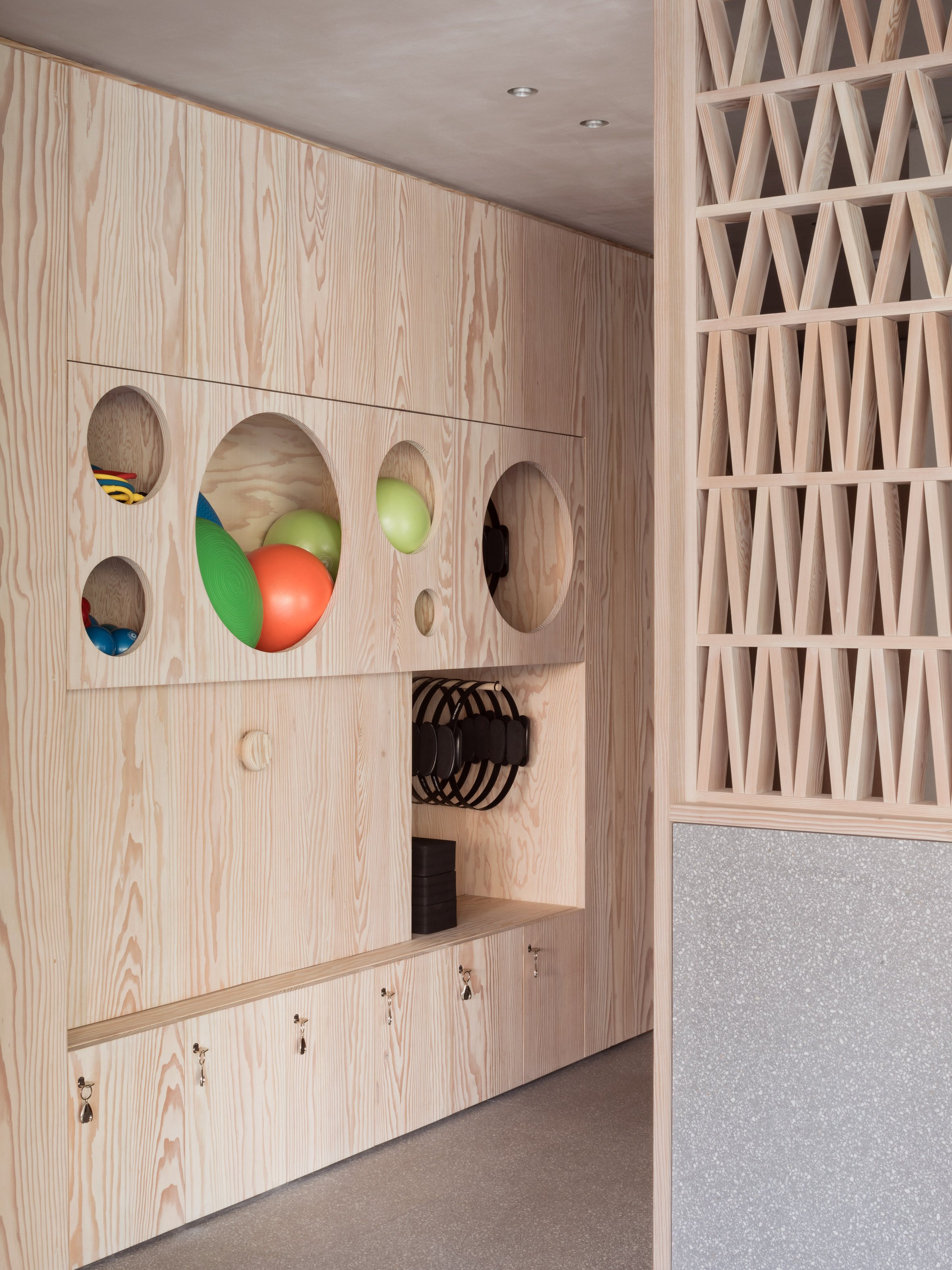
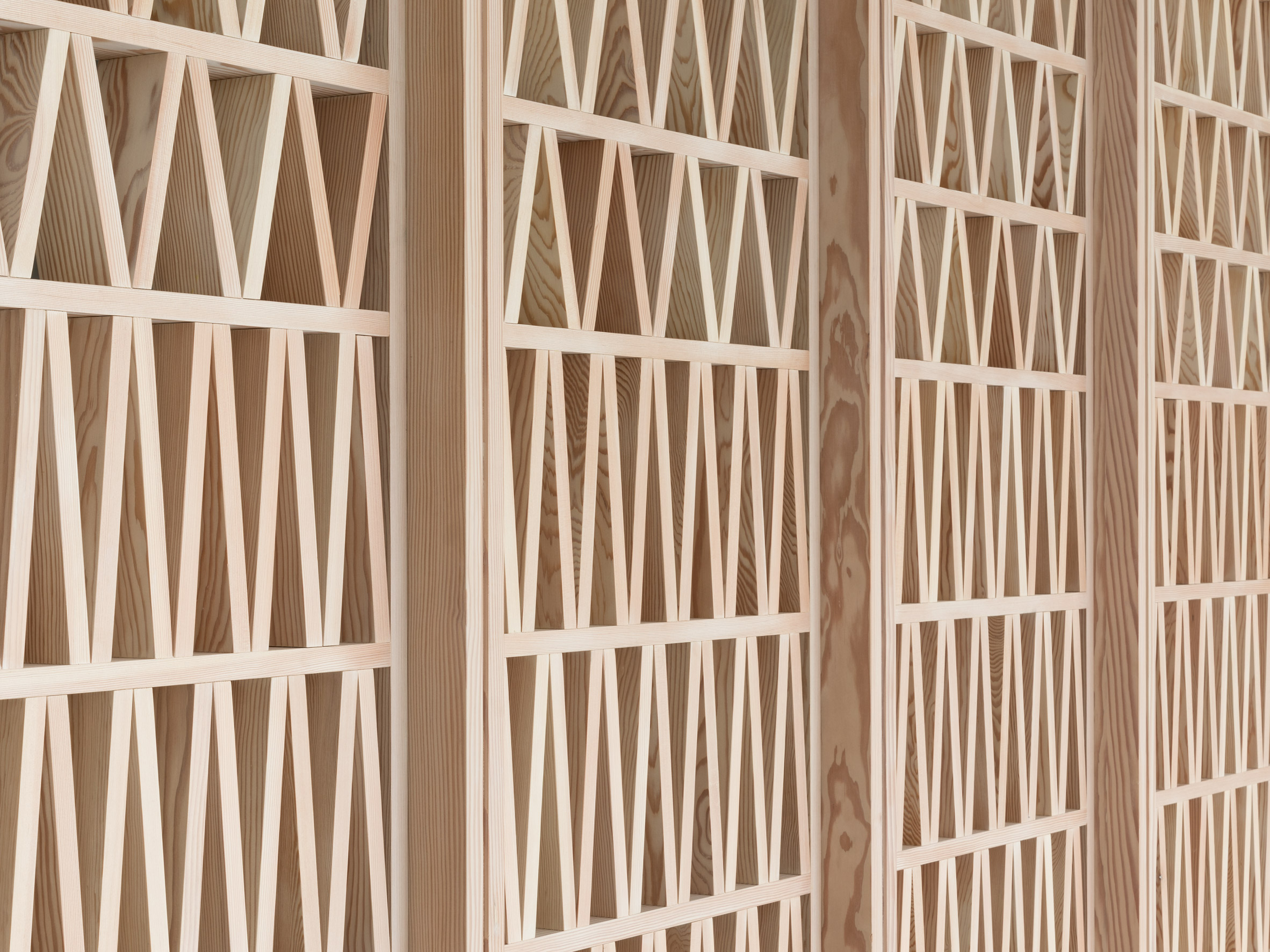
The space contains references to both Mexican and Norwegian design, such as the inclusion of a celosía – the traditional perforated breeze walls common to Mexican houses – as well as Douglas fir timber, which is synonymous with Scandinavian interiors.
Measuring 78 sqaure metres, the new Core Kensington location needed to fit nine large reformer pilates machines, a reception area, two changing rooms, sufficient storage for all the props required for the classes, lockers for the clients, a toilet and a kitchenette.
The classes at Core Kensington have a maximum of six participants who each receive highly personalised training. The studio also offer private training sessions.
"We set out to achieve a high quality, inspiring calm and bright space of highly bespoke nature; a space that would be in line with the expectations of their unique clientele," said Almudena Navarro, who heads Studio Wolter Navarro alongside René Wolter.
"The project required a very focused approach to material selection and space planning," she continued. "It would have been very easy for the space to feel very cluttered with all the necessary Pilates equipment, so it was also key to get the storage right."
To create an open interior with an uninterrupted flow of movement, light and air, the studio included only one door within the interior, which is a pocket door that is concealed most of the time.
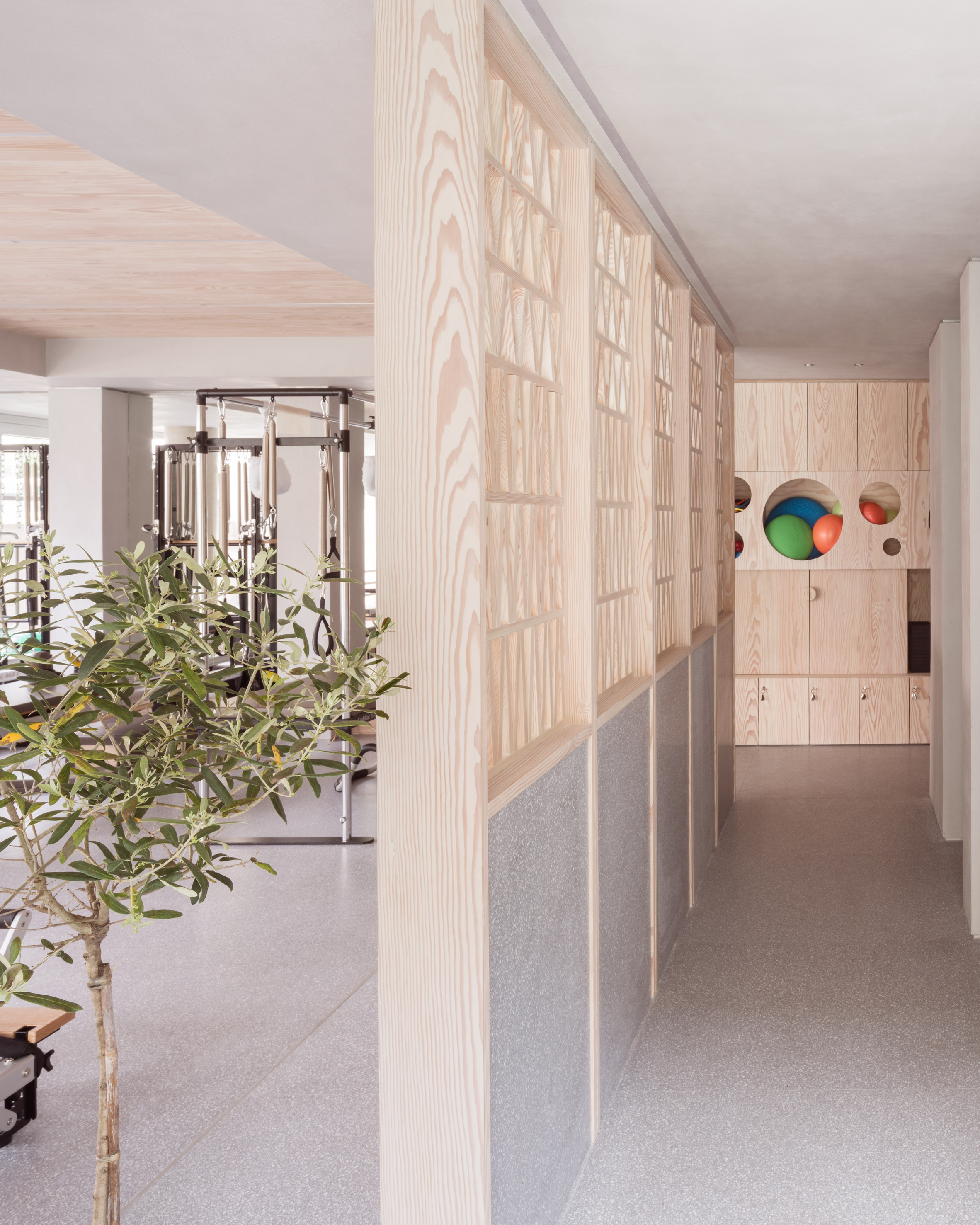
At the centre of the space, a partition wall based on a Mexican celosía provides a degree of separation without compromising the studio's open feel. It also allows light and air to circulate through the space while creating an intimate atmosphere in the main studio space.
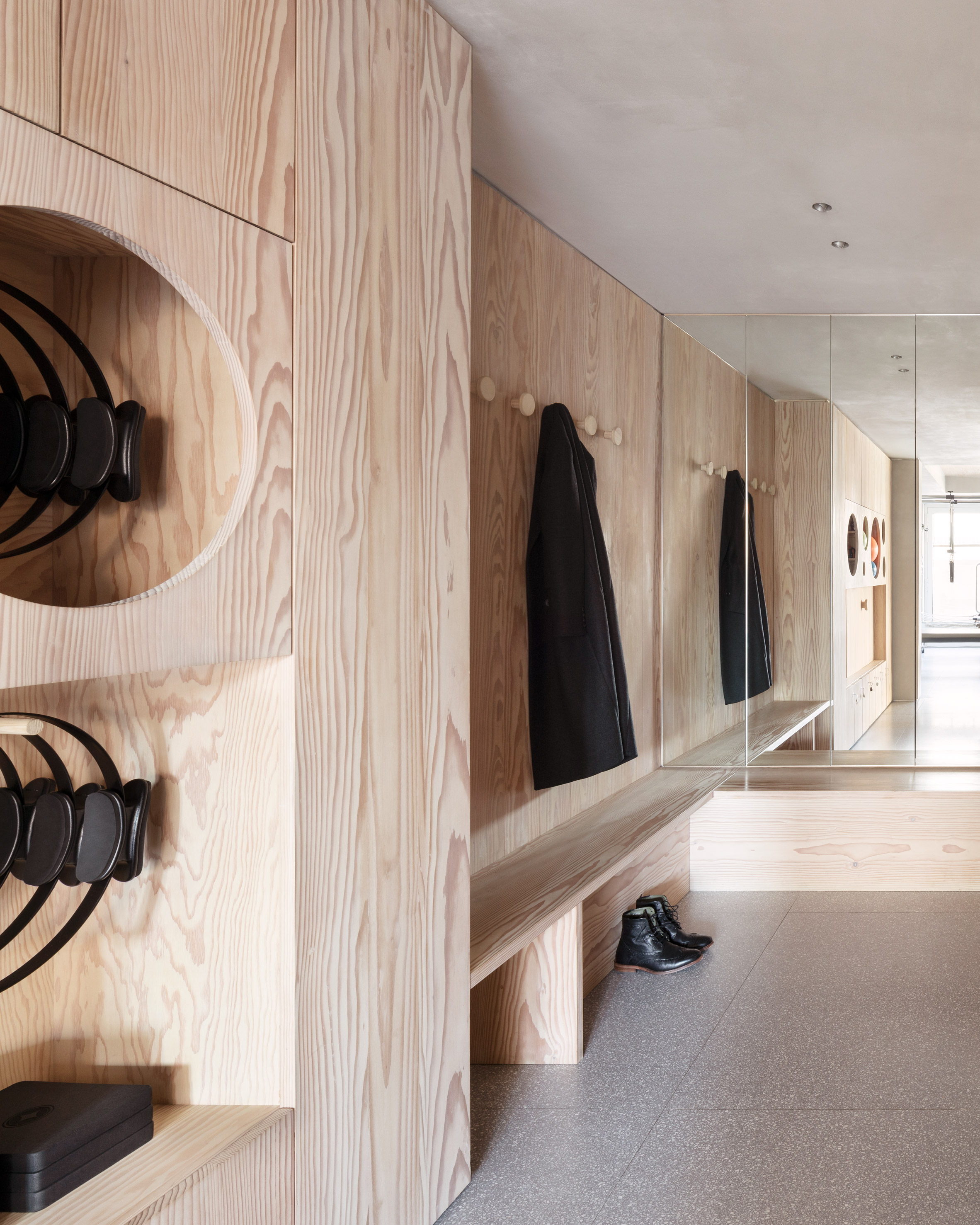
To avoid visual clutter, all equipment is discreetly stored within Douglas fir cabinets with only the pilates balls on display through porthole windows.
"We wanted the final result to be a place where sports practice and architecture would go hand in hand," explained Navarro. "By putting wellbeing at the core of the design we aimed to create a place where right after entering people would already feel better in their bodies."
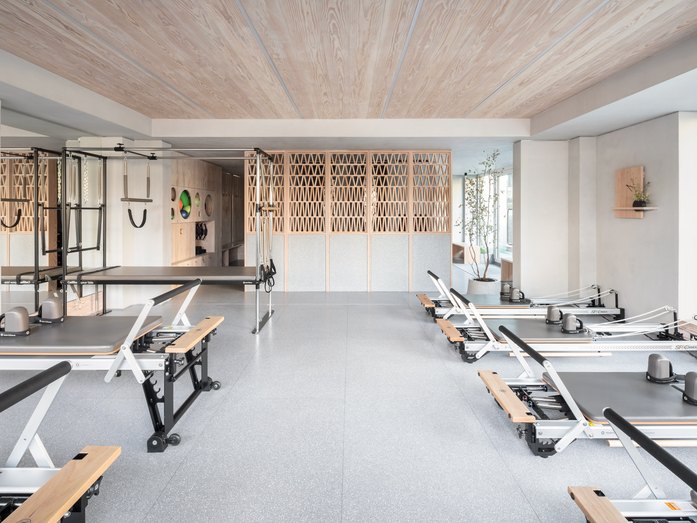
"The overall looks are kept minimal and calm, inviting one to relax and focus before, during and after the Pilates session."
A grey terrazzo tile is used across the floor and on the lower half of the central partition wall. In the reception area, one of the grey terrazo tiles emerges upwards to form a circular tree planter that acts as a barrier between the reception and the main studio.
This prevents people from walking directly into the main studio but still allows them to see inside through the branches of the eucalyptus tree.
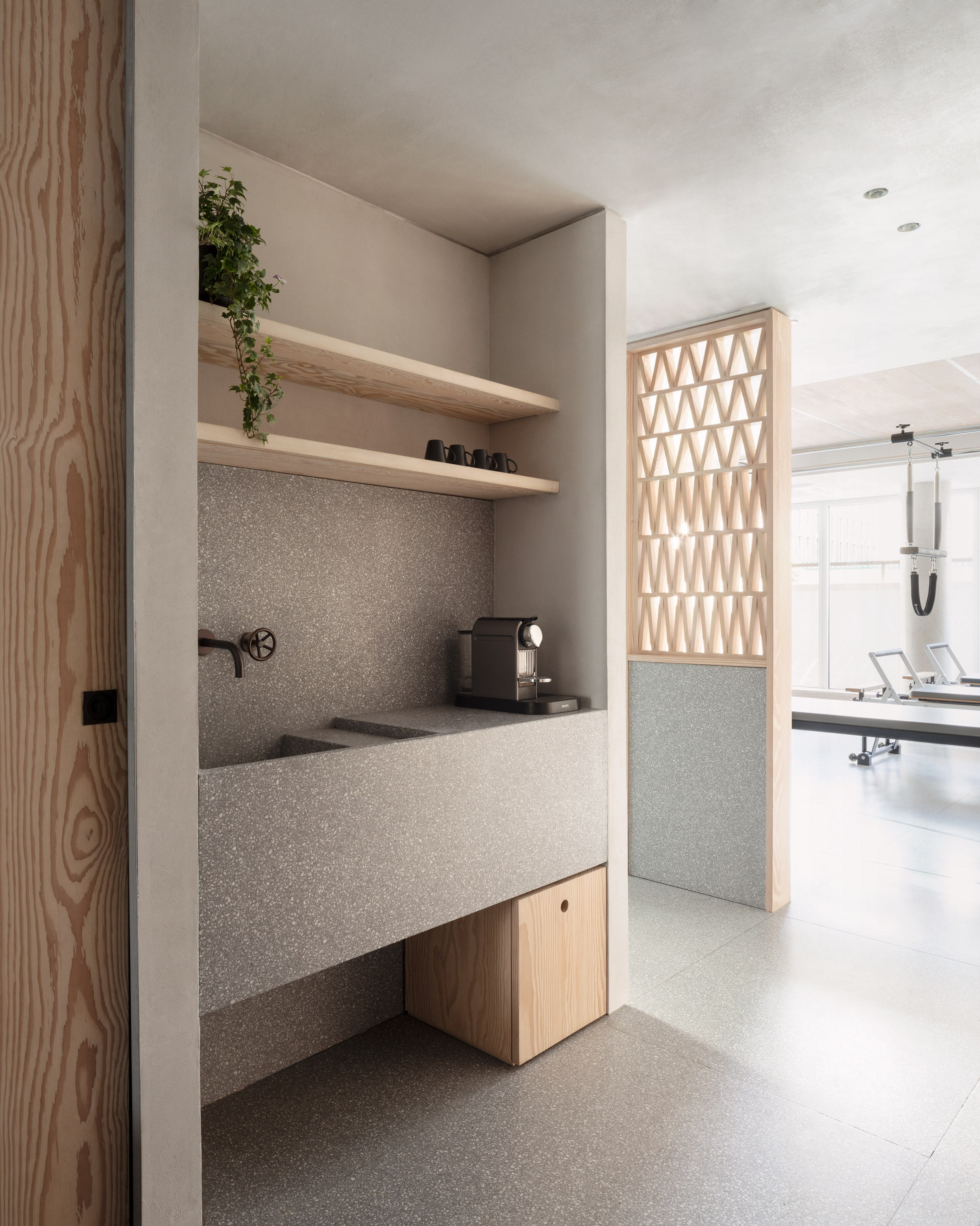
The sinks in the studio's kitchenette and bathroom are made from the same grey terrazzo, which the Studio Wolter Navarro said lends these spaces a "certain domestic feel" and eschews the typical commercial aesthetic of sports venues.
The handmade joinery pieces were produced by skilled joiner Juan Junca and include complex details such as waterfall effect joints and cabinets which feature a continuous grain that runs from the floor to ceiling.
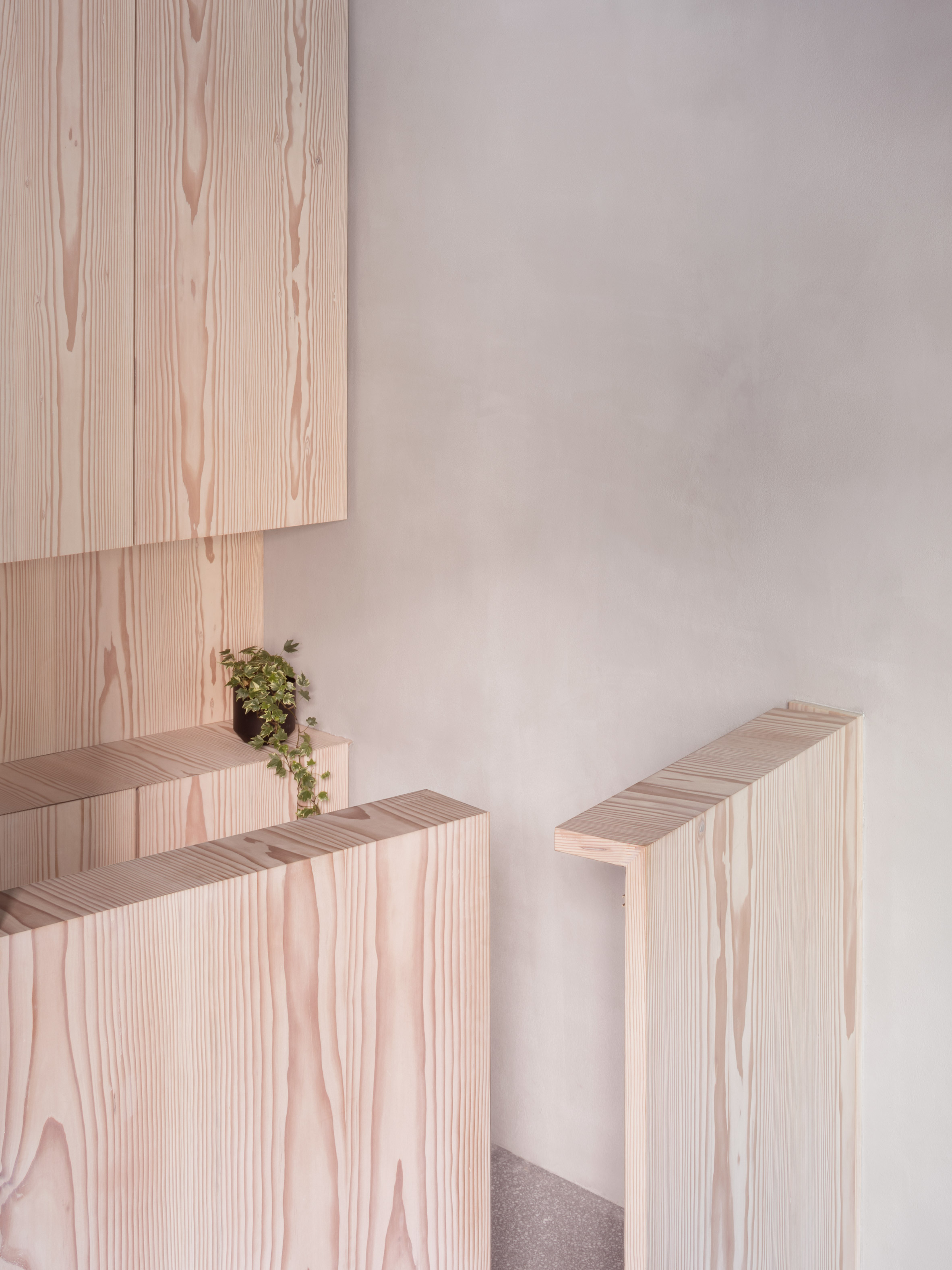
"From the very early stage of squaring and dimensioning the wood, every section of the boards had a predetermined position, in a specific orientation and could not be exchanged for another piece if anything went wrong," said Navarro.
"The grain running floor to ceiling creates the illusion of taller rooms, while contributing to visually decluttering the spaces, achieving a calm and elegant final result."
Navarro also explained that materials such as the suedette used to create the changing room curtains were chosen for their tactility.
"The materials have been designed to be touched, and the tactile experience of the space is purposely made part of the experience of the exercise," it explained. "The temperatures of the different materials also create different sensorial experiences for the visitors, bringing back full awareness into their bodies after the pilates sessions."
In California, MBH Architects added curving walls, fluted columns and golden touches to this Equinox gym located in an old TV studio in Los Angeles. Menawhile, architect Karen Abernethy created this multi-sensory yoga studio in a converted Sydney warehouse.
Photography is by Ståle Eriksen.
Project credits:
Architects and interior designers: Studio Wolter Navarro
Directors: Almudena Navarro and René Wolter
Joiner: Juan Junca
Suppliers: InOpera, Viabizzuno, The Watermark Collection, Canal Engineering, Quiligotti
The post Core Kensington pilates studio blends Mexican and Norwegian design appeared first on Dezeen.
from Dezeen https://ift.tt/2ua0l8R
via IFTTT
0 comments