Red Deer creates pastel-striped pasta restaurant for "Soho institution" Lina Stores
July 28, 2018The pastel-green and white striped interiors of this Italian restaurant, designed by London architecture studio Red Deer, pay homage to the eatery's sister business – the popular Soho delicatessen Lina Stores.
Lina Stores restaurant is the first expansion of the deli, which opened its doors in London's West End in 1944.
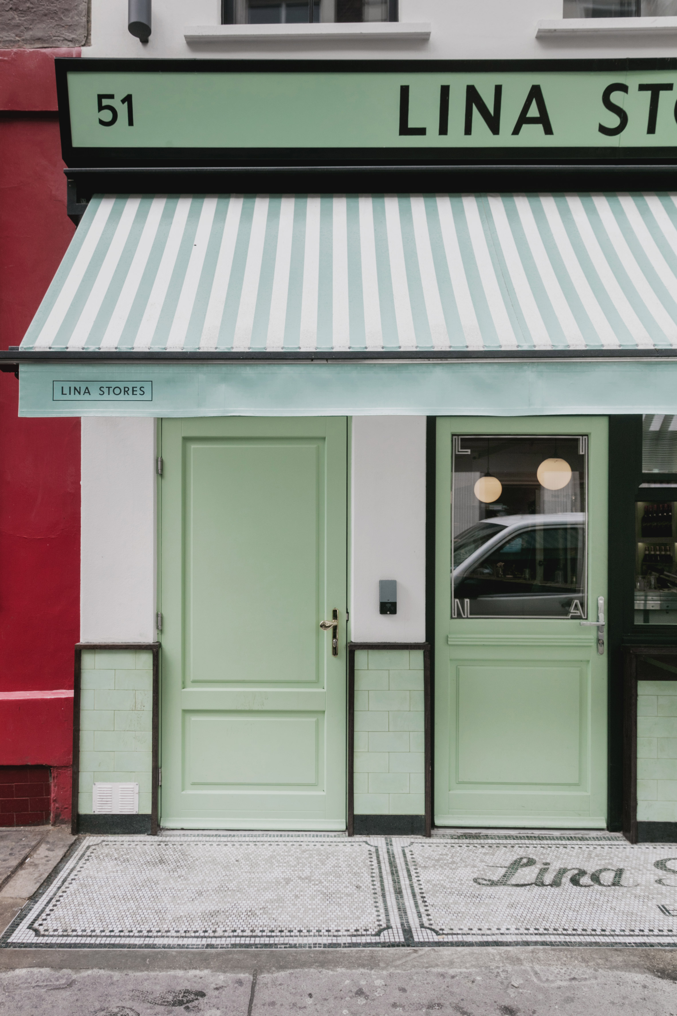
The 75-year-old "Soho institution" is recognisable by its pale green-and-white striped awning and interior. When Red Deer was approached to take on the project by the business's investor, White Rabbit Fund, it was keen to pick up on this colour scheme.
Studio co-founder Lionel Real de Azúa hopes the continuity will create a cohesive identity for the pair of businesses, which are located just around the corner from each other.
One of the biggest challenges for the team was pinpointing the precise shade of green, which had worn and discoloured across the surfaces of the store over years of use.
"We tried to extrapolate in material terms what the brand was made up of, and that was obliviously the green and white stripes," Real de Azúa told Dezeen.
"The exact green was of much debate. There were so many hues to it," he said. "They'd all evolved in their own way so we had no reference for the exact green. But we came to agree on a 'Lina green'."
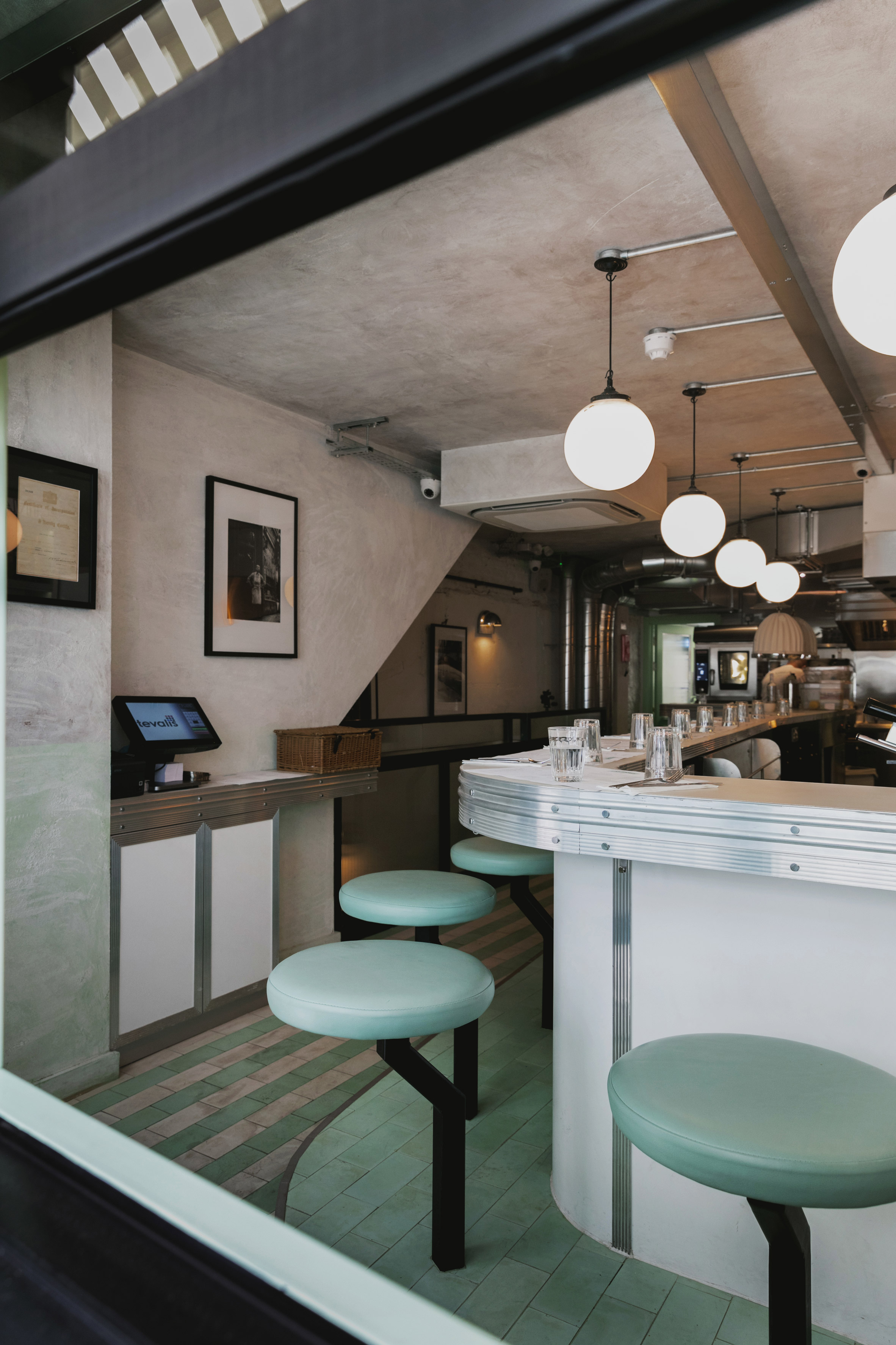
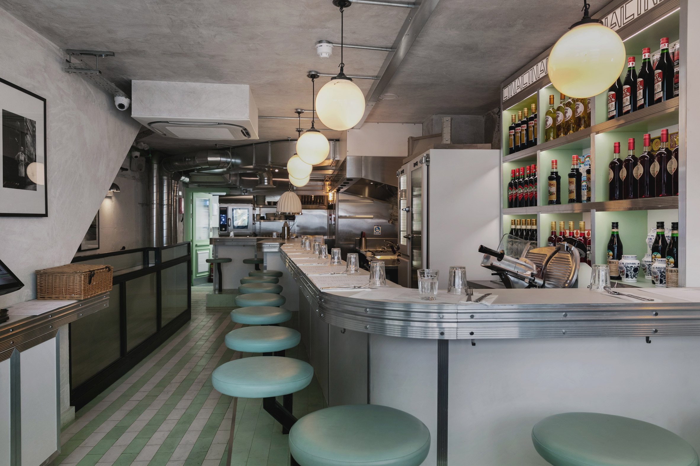
Stripes of green are applied to an awning in front of the restaurant and to the tiled floor at street level. Here, a row of stools with padded green tops line the edge of a bar with a brushed aluminium edge and a white countertop.
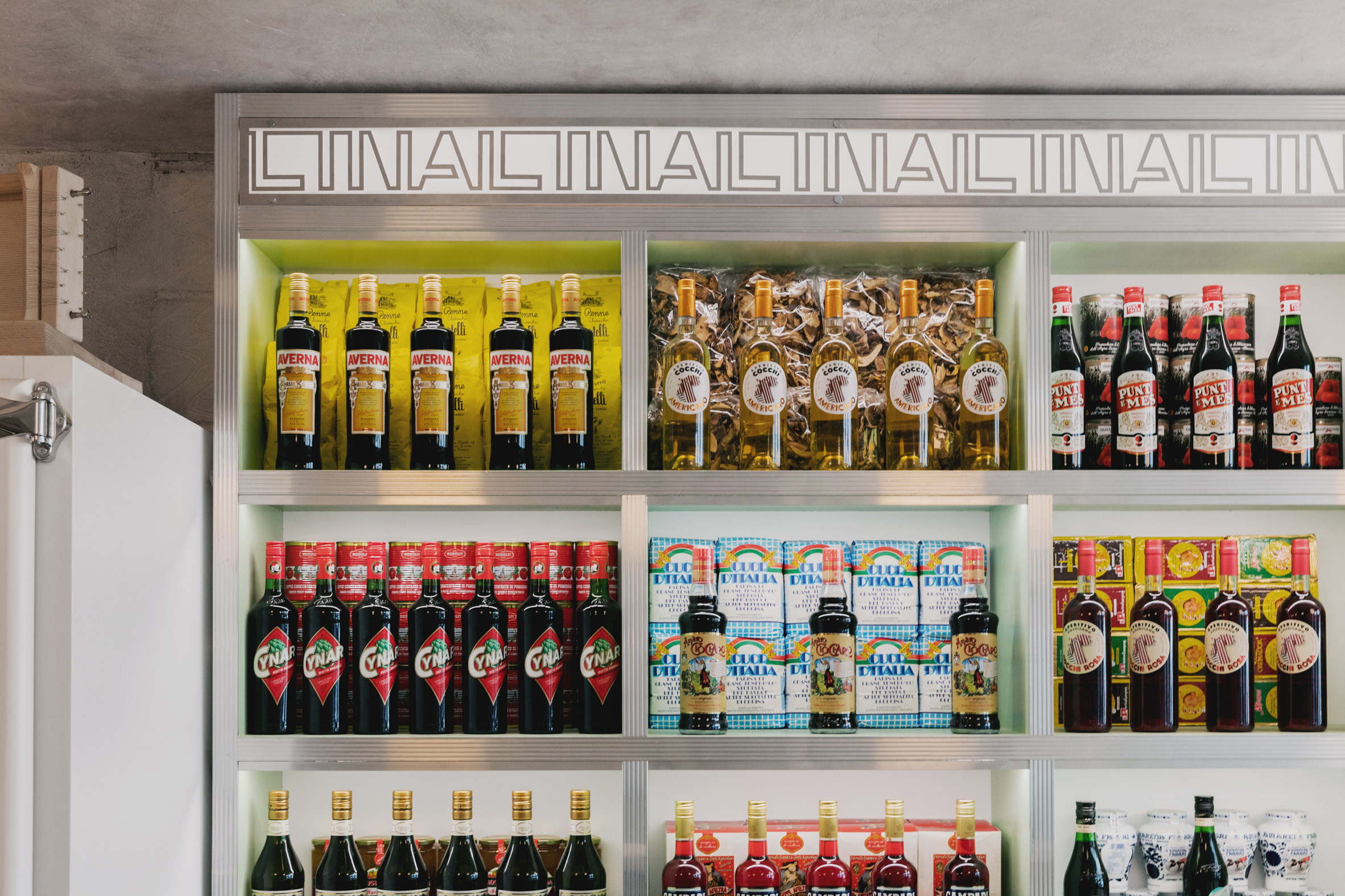
Lettering repeating the name of the store's founder, Lina, runs across the top of shelves behind the counter.
The graphic, developed by London design agency Everything in Between, is also inlaid in steel into the Carrara marble tops of tables in the basement.
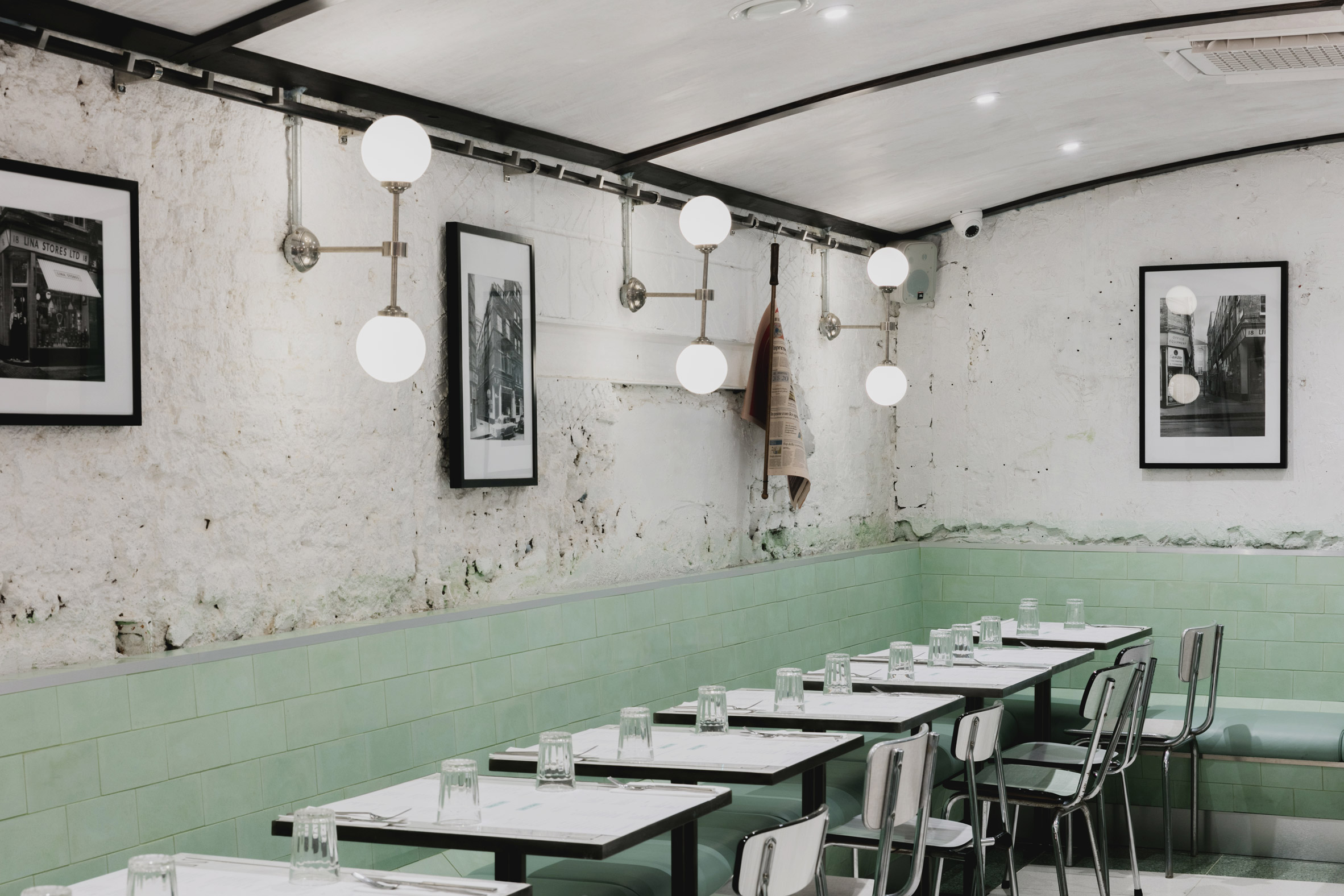
A border of green terrazzo wraps around the cream terrazzo floor on this level, accentuating the white tabletops and playing with the colour scheme.
Exposed brick walls and paint-washed plasterwork lend the lower floor a rustic appearance, and a new vaulted ceiling contributes to a cosy atmosphere for diners.
"We tried to play around with the application of that material palette so that a lot of the same visual cues were there but the overall experience is somewhat different," said Real de Azúa.
"We didn't want to be too pastiche-y but to allow that palette to almost sink into the texture so that you have the duality of the signature colours and of the textured walls."
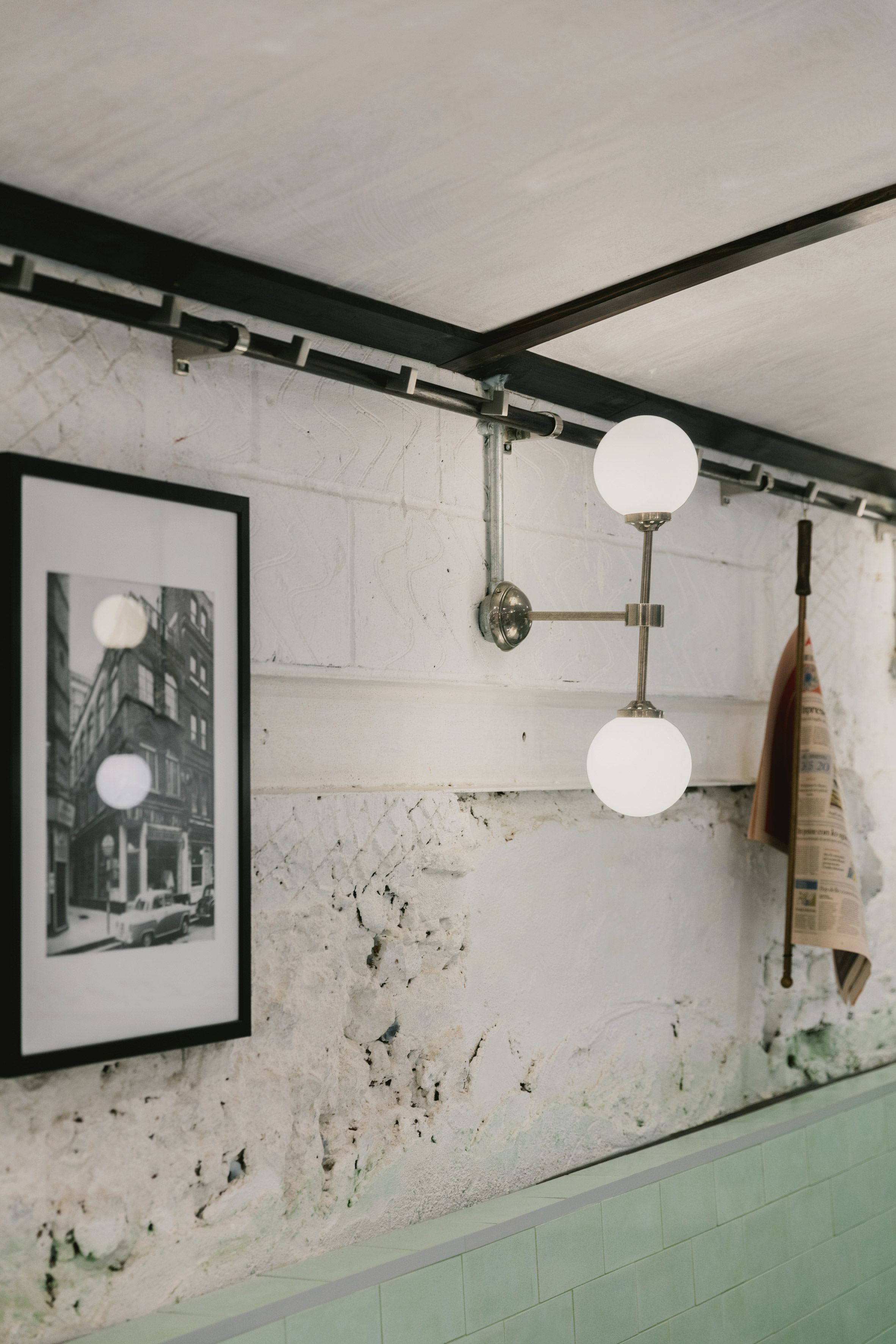
Brushed-aluminium, steel and ribbed glass surfaces throughout hark to the midcentury design of the original deli, as do the globe-shaped light fittings that were salvaged from a Czech factory building.
Red Deer, which operates from offices in London, Barcelona and Los Angeles, completed the restaurant on a budget of £480,000.
The practice run by architects Lionel Real de Azúa, Ciarán O'Brien and Lucas Che Tizard has also recently completed a brewery in east London for St John restaurant, and previously created a lighting installation for Clerkenwell Design Week in the capital.
Photography is by Mariell Lind Hansen.
The post Red Deer creates pastel-striped pasta restaurant for "Soho institution" Lina Stores appeared first on Dezeen.
from Dezeen https://ift.tt/2Oue7MC
via IFTTT
0 comments