Vancouver taco restaurant references "rustic glamour of mid-century Mexican resort town"
July 29, 2018Luxury 1950s Mexican vacationlands and the style of a "gaudy" furniture designer have informed the interior of this taco restaurant in Vancouver, by local designer Shiloh Sukkau.
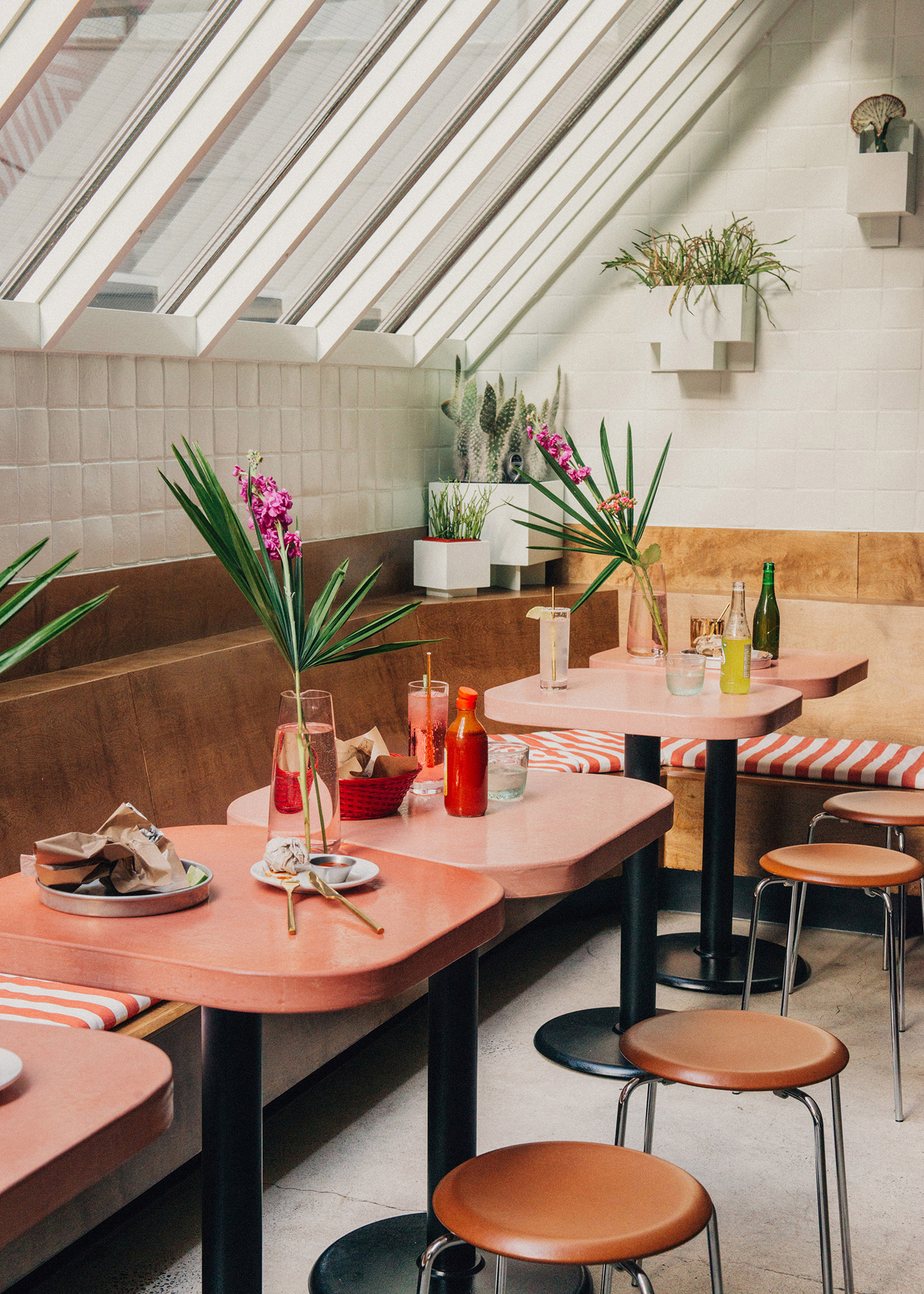
Located on West Pender Street in the city's Downtown area, the Tacofino Oasis is the latest outpost of a Mexican restaurant chain that serves tacos and burritos in a Californian style.
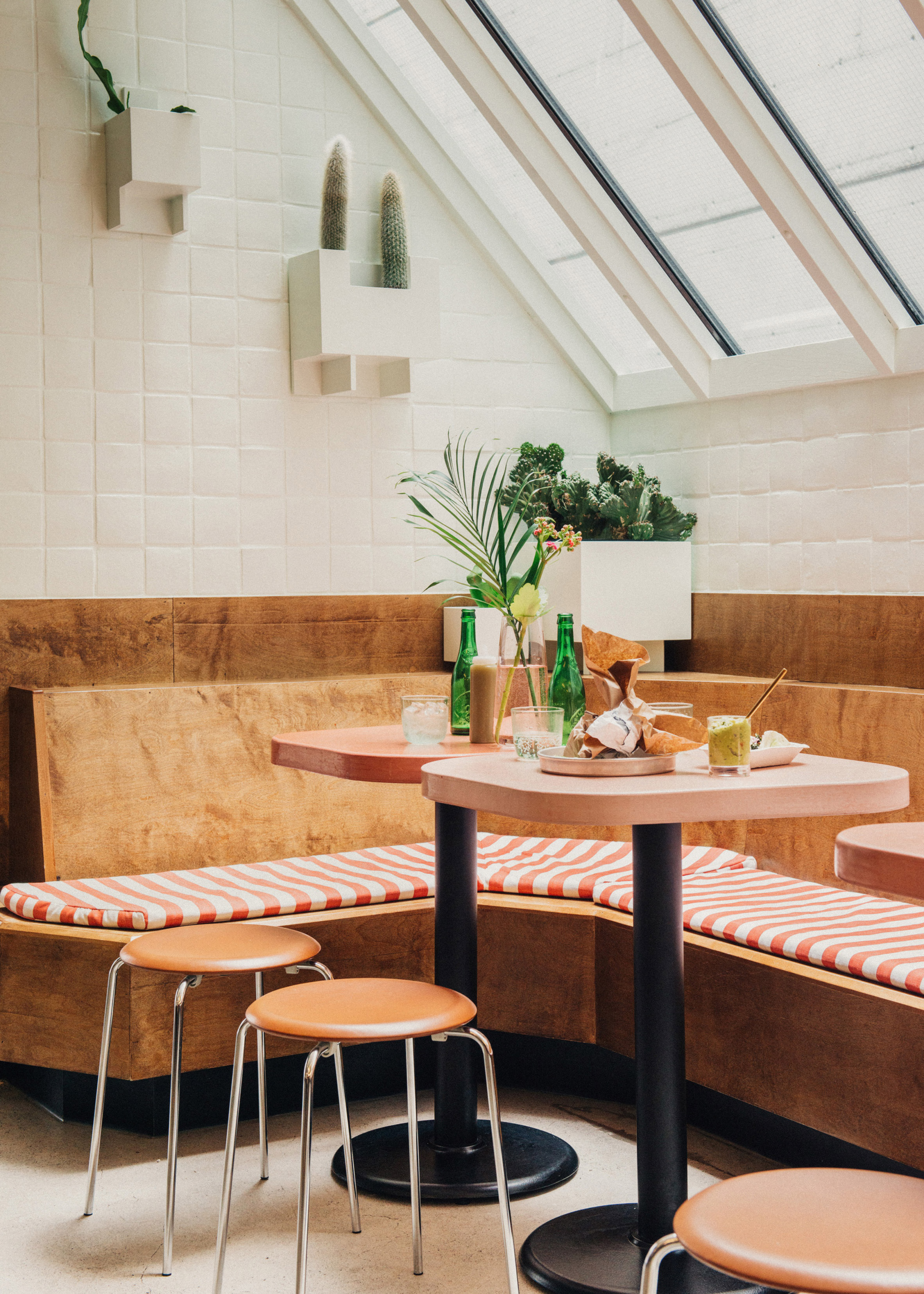
Taking cues from the menu, Sukkau based the eatery's decor on the colourful and lavish style of resort towns that flourished in Mexico during the mid-20th century.
She specifically drew references from Acapulco, which is one of the country's oldest beach resorts, and once a popular vacation spot for the rich and famous.
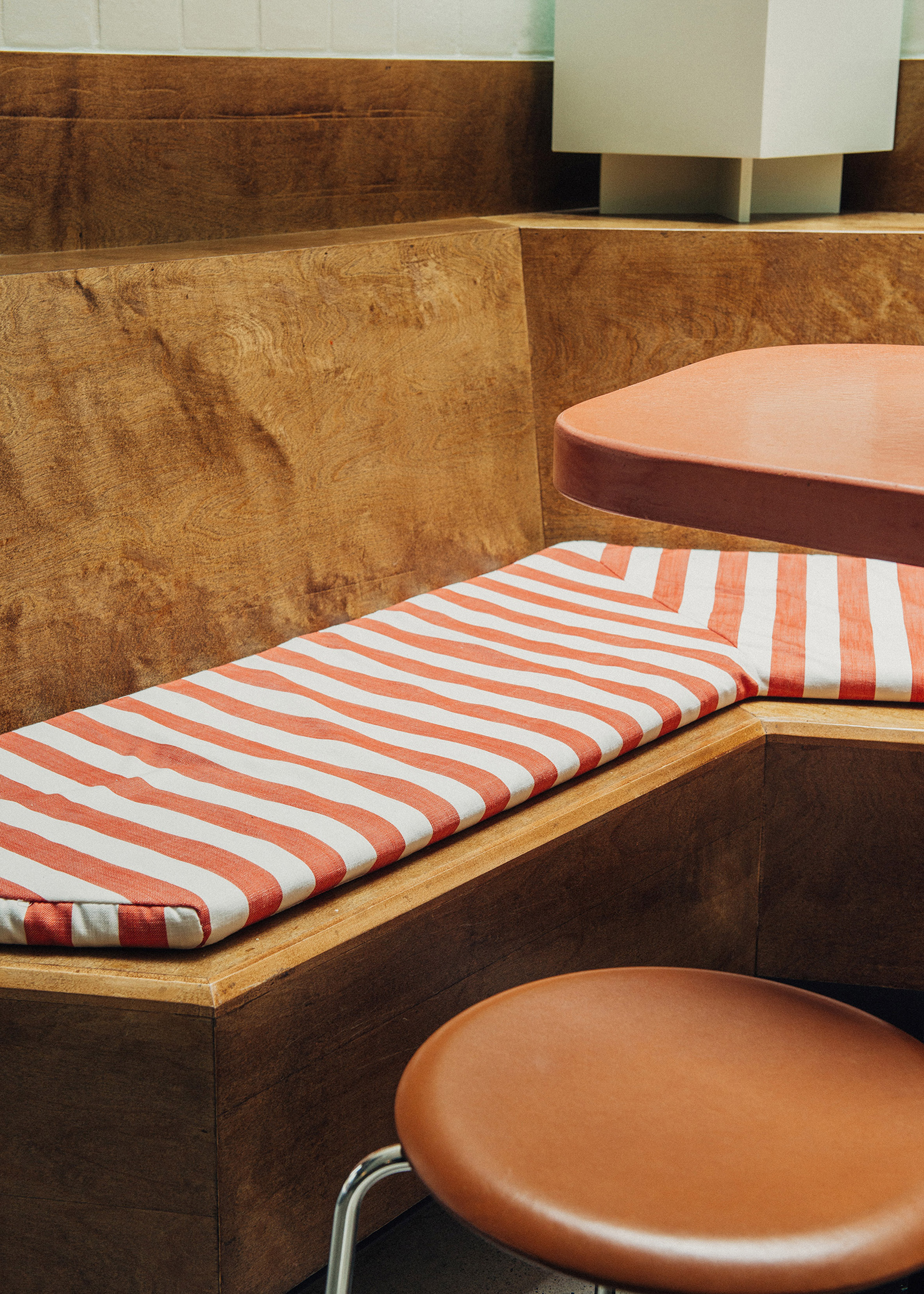
"The materials and finishes reference the rustic glamour of a mid-century Mexican resort town such as Acapulco, which in the 1940s and 50s became a fashionable place for Hollywood elites to vacation and dine," said the designer in a statement.
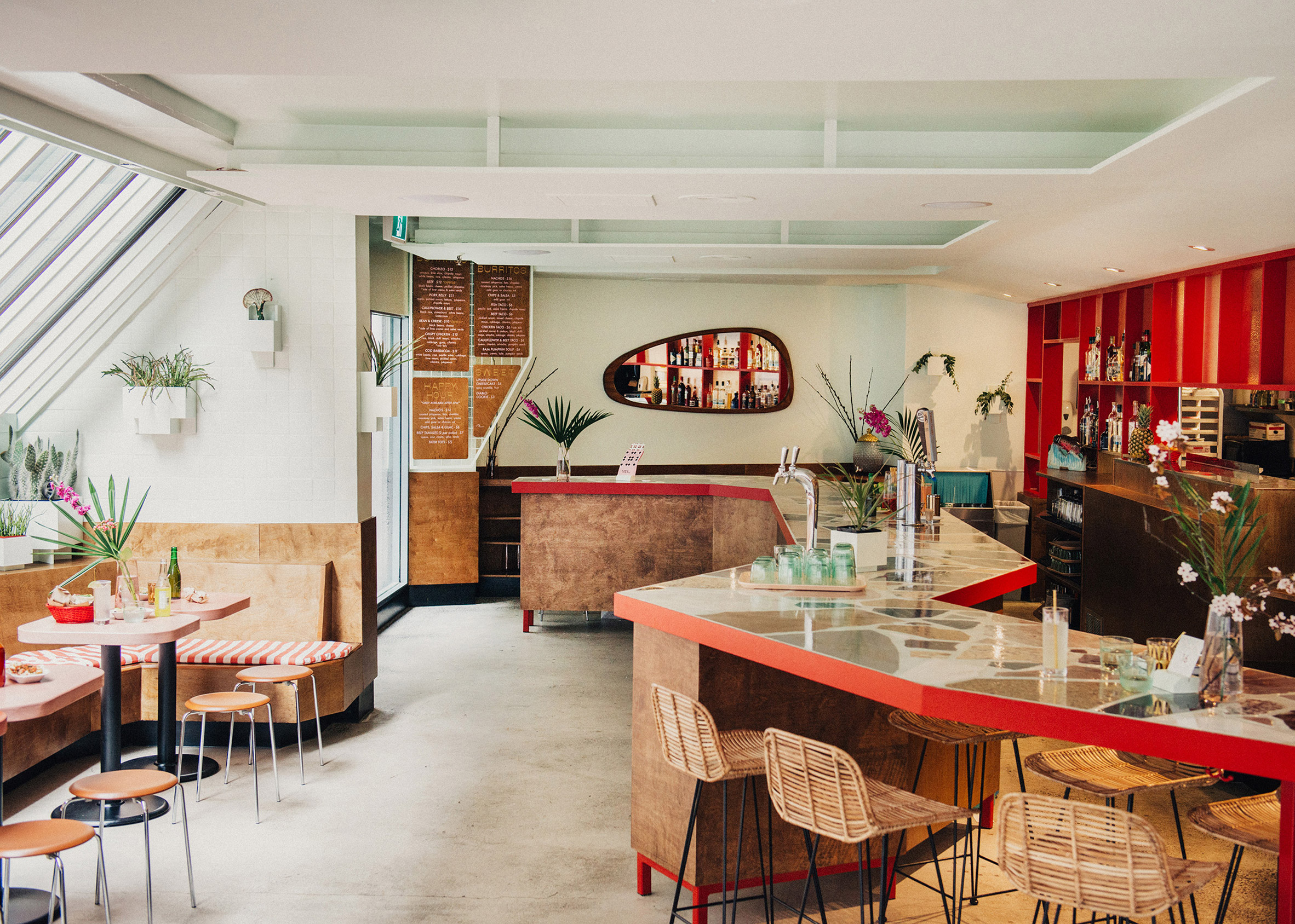
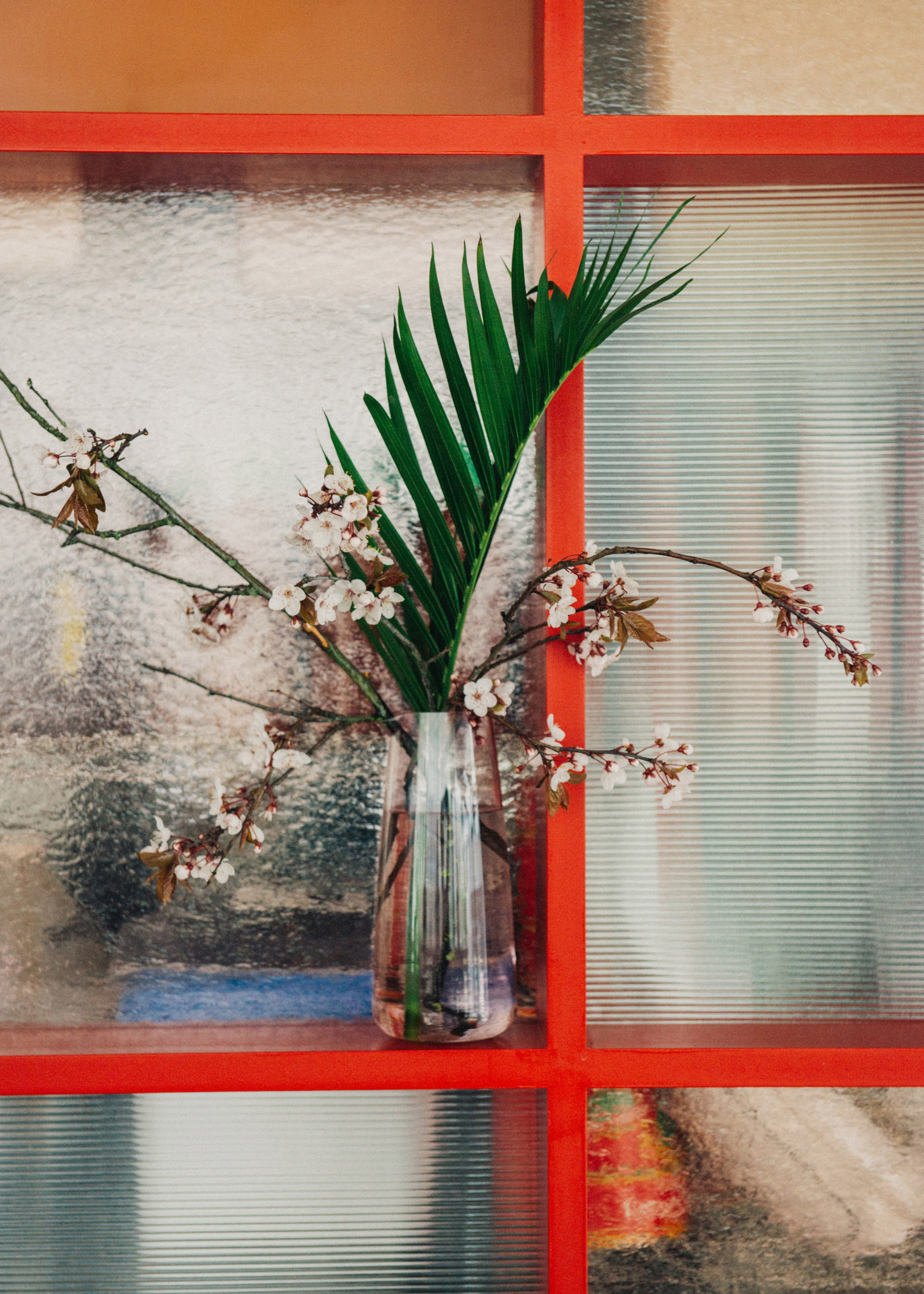
Reddish tones feature predominantly across the eatery. A long bar zig-zags through the space, topped with a terrazzo counter made of large blocks of recycled marble, in varying tones. Its red edges pick out the colour of the painted wooden cabinet built behind. Textured glass panels allow light into the kitchen beyond, while maintaining privacy.
Facing the bar is a built-in wooden bench that runs underneath a long skylight, with seating cushions covered in pink and white striped textiles. The accompanying tables are formed from custom-made concrete blocks that are pigmented pink to match.
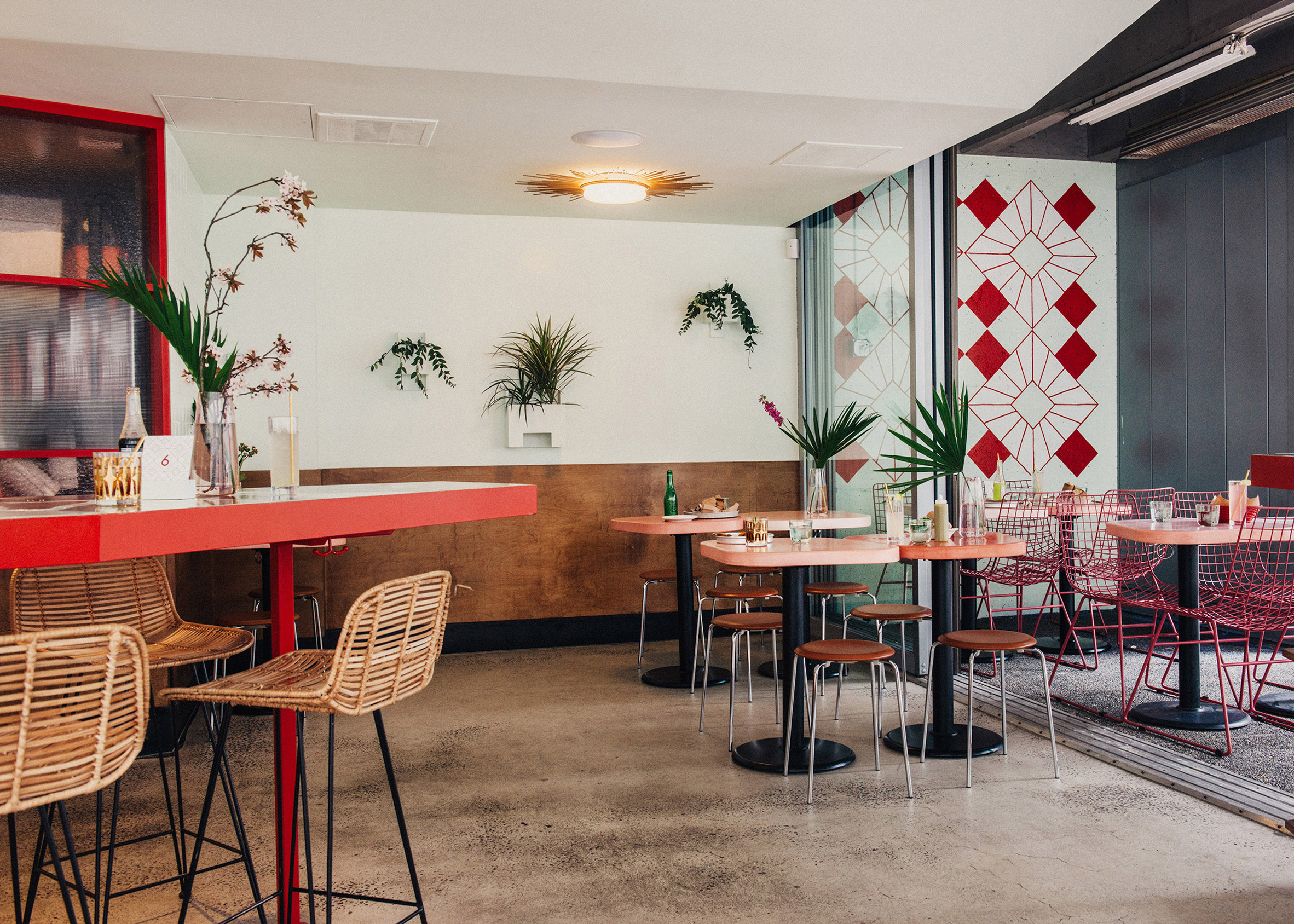
A variety of seating elsewhere denotes different types of dining styles, from tall wicker bar stools to small leather stools around tables. Metal mesh chairs furnish the adjoining patio, where a wall mural adds another red touch.
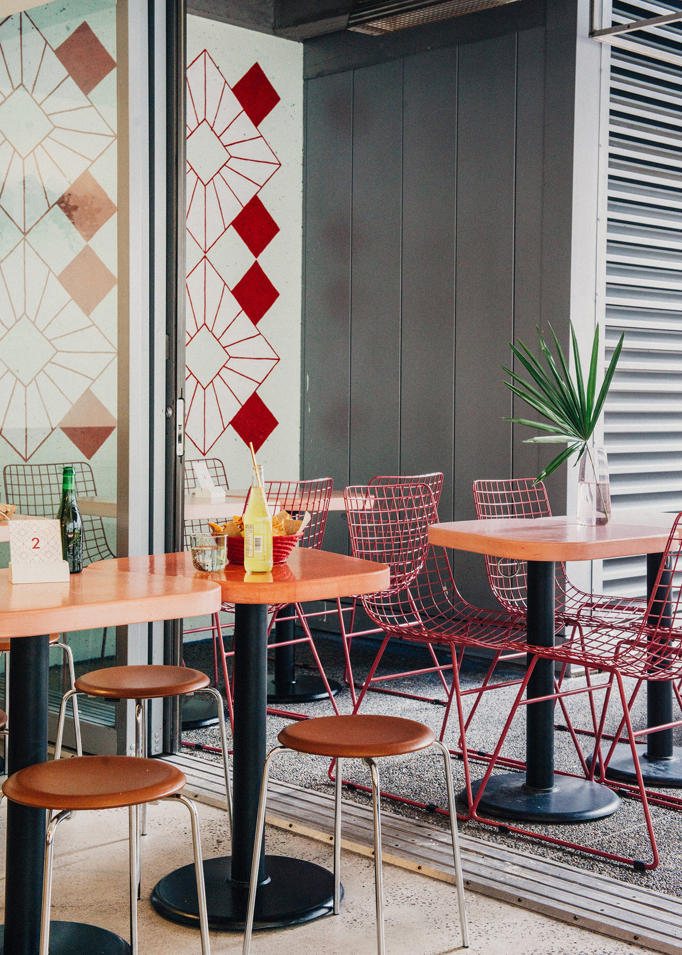
The interior is intentionally loud to follow the style of furniture and interior designer Arturo Pani, who Sukkau came across while researching the history of Acapulco. Pani developed a lavish style in the 1930s that became coined as the "Acapulco look".
"I found a table made by him and was truly in love with how gaudy it was," Sukkau told Dezeen.
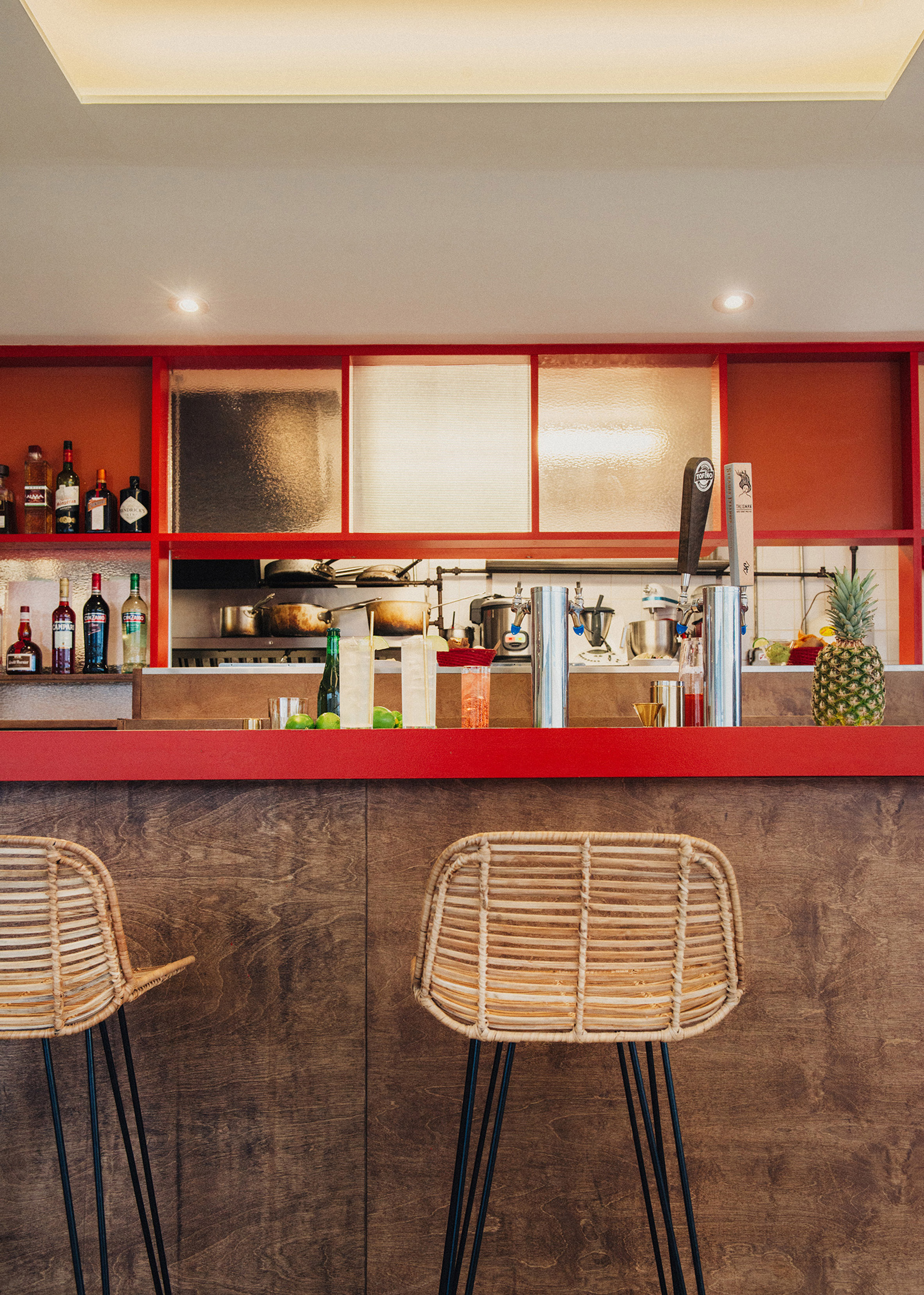
Plenty of natural light is provided inside the restaurant by sliding glass doors that open to the outside, as well as the long skylight. A ceiling light featuring a golden, spiky frame that Sukkau describes as a "single sunburst" offers additional illumination.
The colourful details are complemented by built-in wooden furniture and bright walls. Although appearing white, they are painted a shade called "pool blue" to lighten the space and match a water fountain in the yard outside.
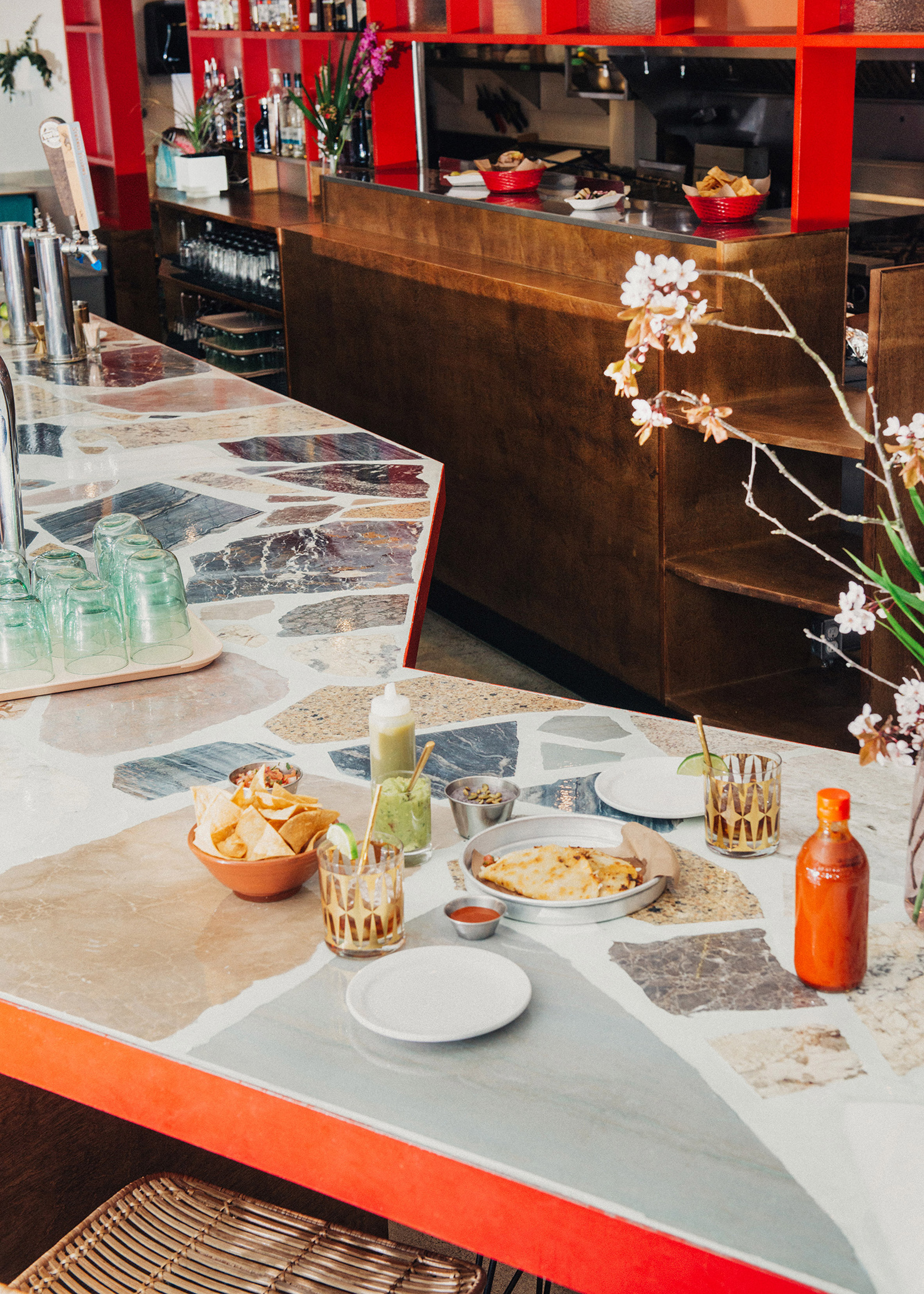
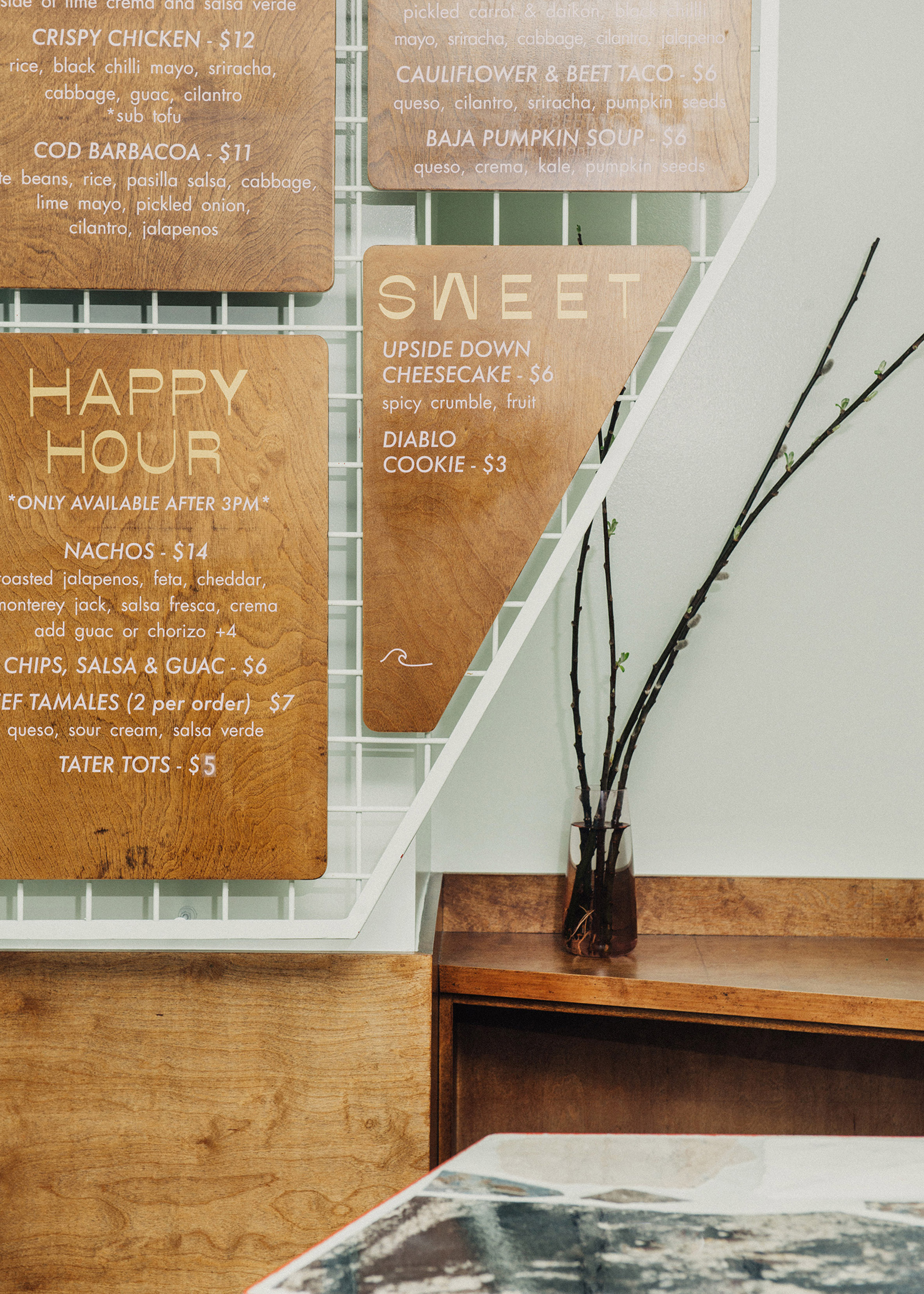
Other details include plant pots that are mounted on the wall and set on shelves, and filled with a range of vegetation. The menu is scribed in white onto wooden panels attached to a white gridded frame.
Located on Mexico's Pacific coast, Acapulco underwent major developments in the 1940s to become a hotspot for Hollywood stars and millionaires. The scene provided inspiration for the 1963 movie Fun in Acapulco.
Designs that cropped up during this time followed a style known as tropical modernism – an offshoot of the stripped-back movement developed to suit warmer climates.
Acapulco's popularity tailed off towards the end of the century, and in more recent years the town has become plagued with crime.
At another taco restaurant, in Austin, Texas, Chioco Design similarly referenced mid-century designs found in the city's roadside buildings.
Photography is by Vishal Marapon.
Project credits:
Designer: Shiloh Sukkau (SUKKAU)
Contractor: Pacific Solutions Contracting
Graphic design: Courtney Presber
Interior design: Sukkau
Styling: Mila Franovic
The post Vancouver taco restaurant references "rustic glamour of mid-century Mexican resort town" appeared first on Dezeen.
from Dezeen https://ift.tt/2AjPuPE
via IFTTT
0 comments