A steel and glass structure in the jungle forms the centrepiece of this nature retreat in Tulum, contrasting the thatched accommodation that faces the Caribbean sea.
Located on an acre of land with a private beach, the Habitas Tulum hotel was created by the hospitality group of the same name.

The flagship property for its chain was designed by the team from the ground-up. The project comprises a lobby and restaurant area, 32 guest rooms, an outdoor swimming pool and an ocean-facing deck.
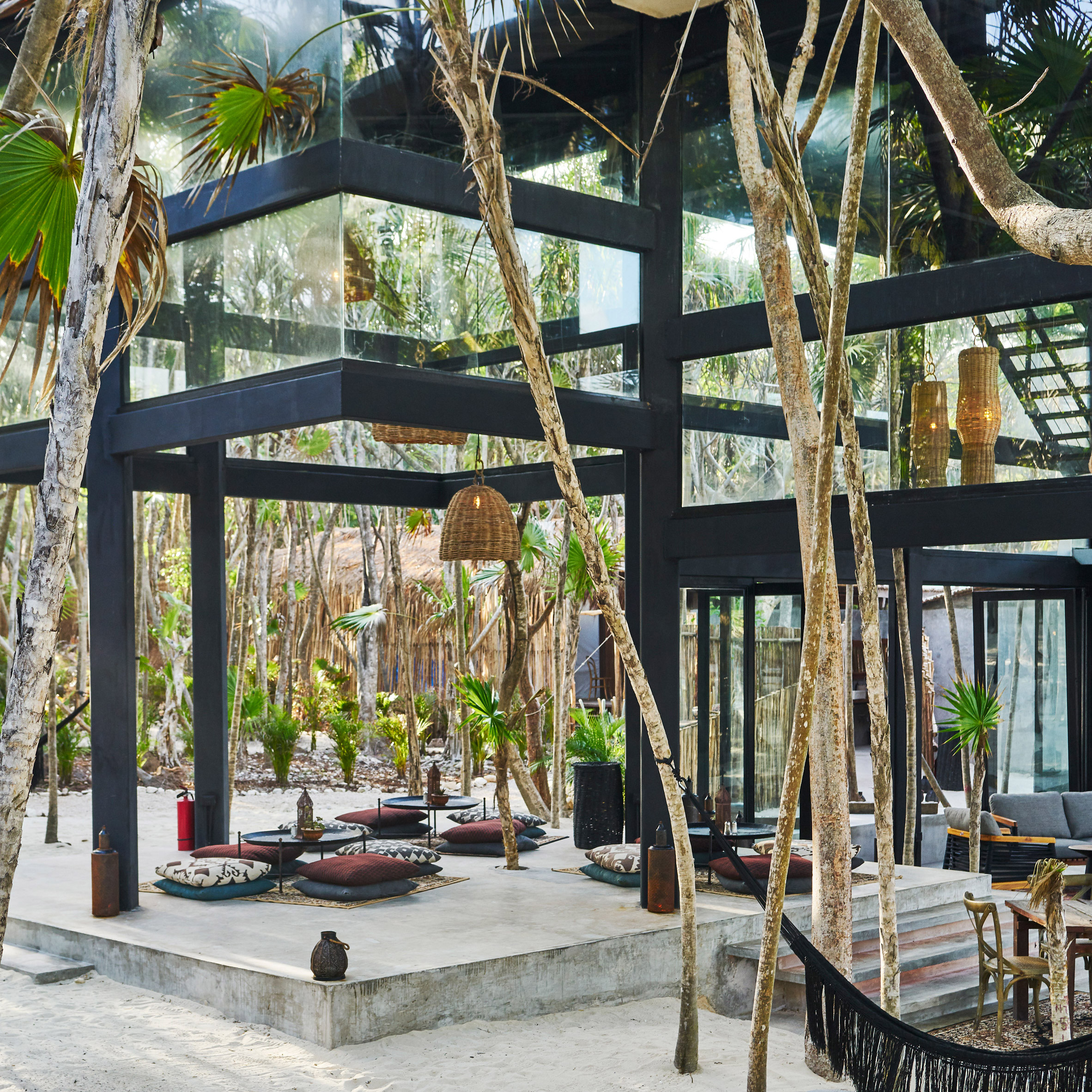
At the centre of the property is a three-storey glass structure, which serves as a hub for the community and includes a Moorish-style restaurant, a mezzanine and a rooftop deck.
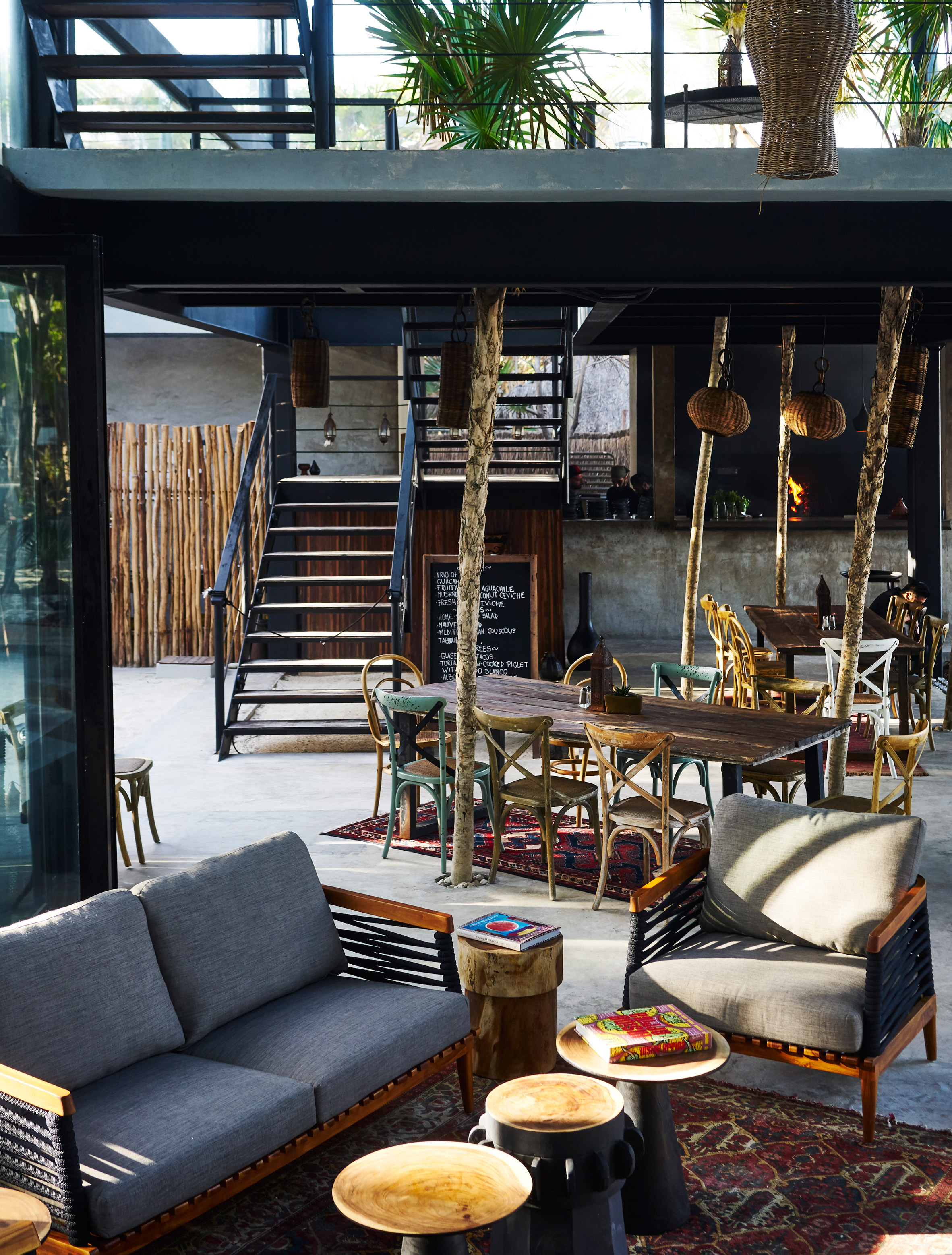
Scattered across the sandy site are a variety of lounging areas with long, communal tables made of reclaimed wood, and other areas with colourful pillows and low tables.
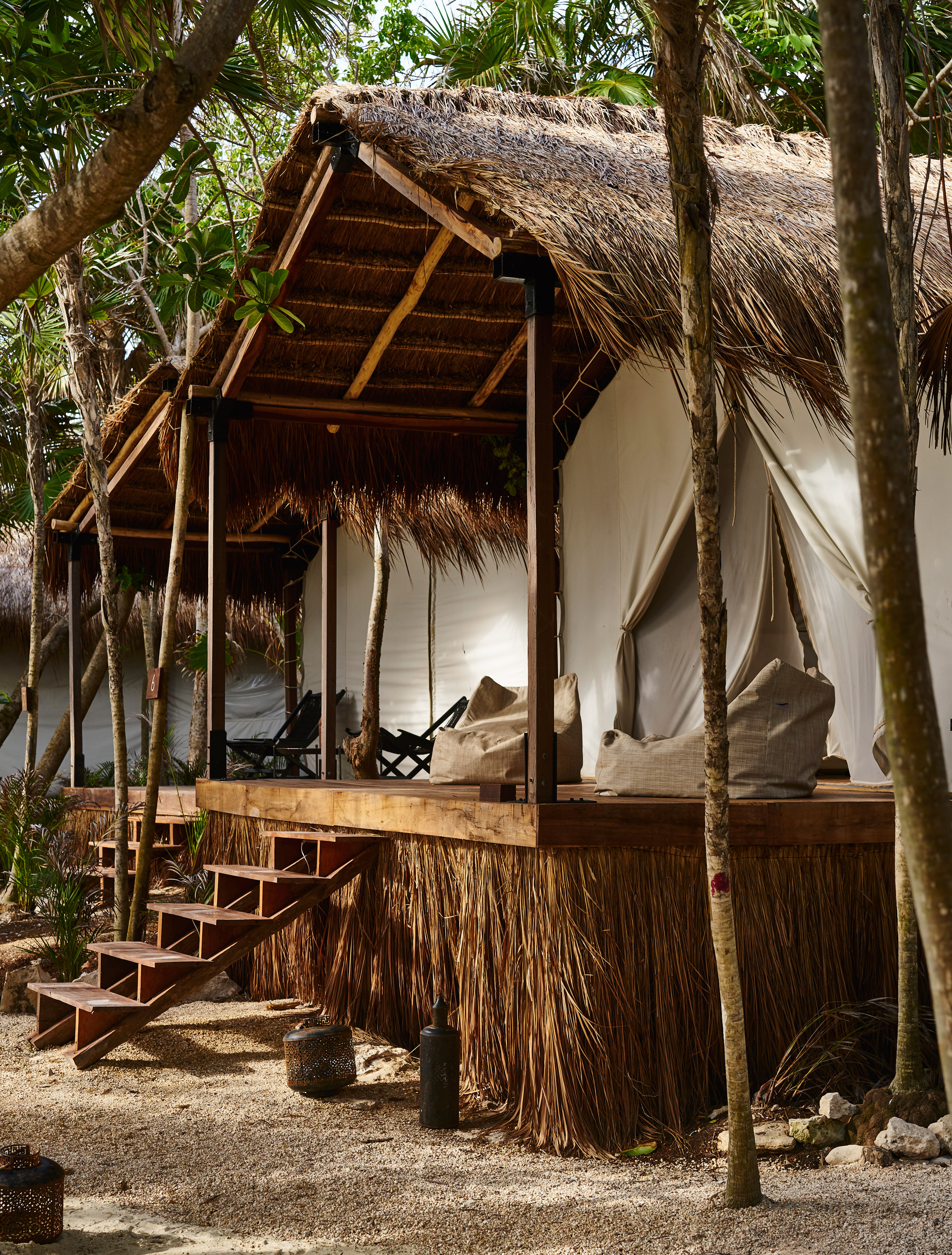
Surrounding this pavilion are guest rooms, all of them raised on platforms and built with consideration to the beach and jungle.
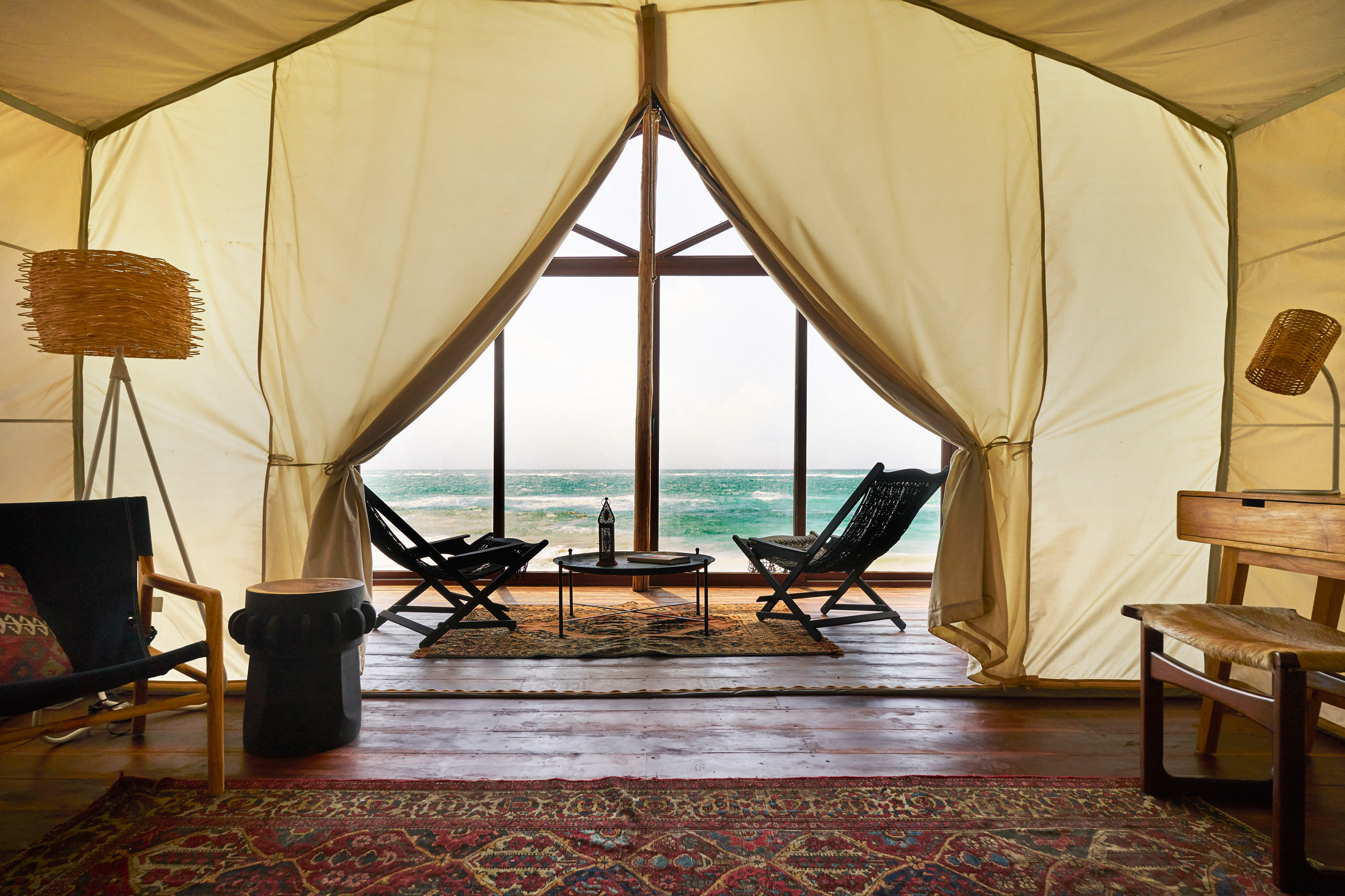
The rooms are constructed with indigenous materials, like natural palapa roofs and pale cloth walls, which open to private terraces and outdoor showers.
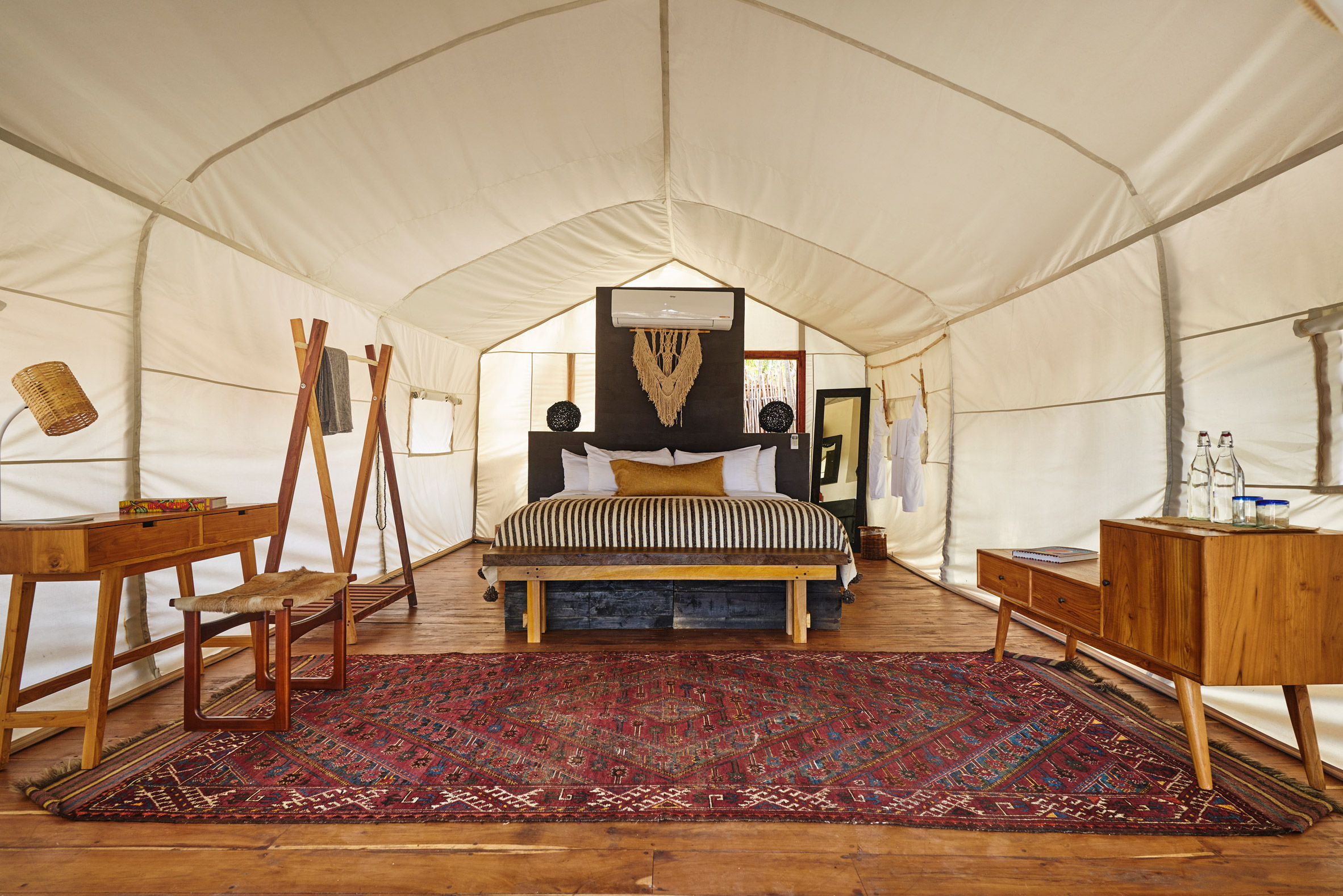
Habitas Tulum has five oceanfront suites, and 17 more closer to the jungle. All of the rooms have a king-sized bed and are decorated with a bohemian touch, including wood furnishings and colourful textiles.
Founded by Oliver Ripley, Kfir Levy and Eduardo Castillo, Habitas is a an experience-led hospitality group that also has a clubhouse in New York City and centre in Los Angeles.
The hospitality group also manages a nonprofit arm called Rise, which works with refugees in Africa to build community spaces. A recent project is a community centre in Uganda's Nakivale Refugee Settlement, based around an amphitheatre.

Located 80 miles south of Cancun on Mexico's Riviera Maya, Tulum is a popular resort destination for nature-seekers and is flourishing with boutique eco-hotels. Others include Papaya Playa Project, which boasts a curvaceous white suite above the jungle canopy, and a five-bedroom guest retreat called Tulum Treehouse.
Photography is by Adrian Gaut.
The post Habitas Tulum boutique hotel offers beachfront and hidden jungle rooms appeared first on Dezeen.
from Dezeen https://ift.tt/2QfLpPs
via IFTTT
New York studio Attn Attn Architecture and Design has gutted an apartment in the city, and used light-toned marble against dark colours for a "classic but unique aesthetic".
The 800-square-foot residence in the Lenox Hill area of Manhattan's Upper East Side was overhauled for a graphic designer, who wanted maximum impact on a limited budget.
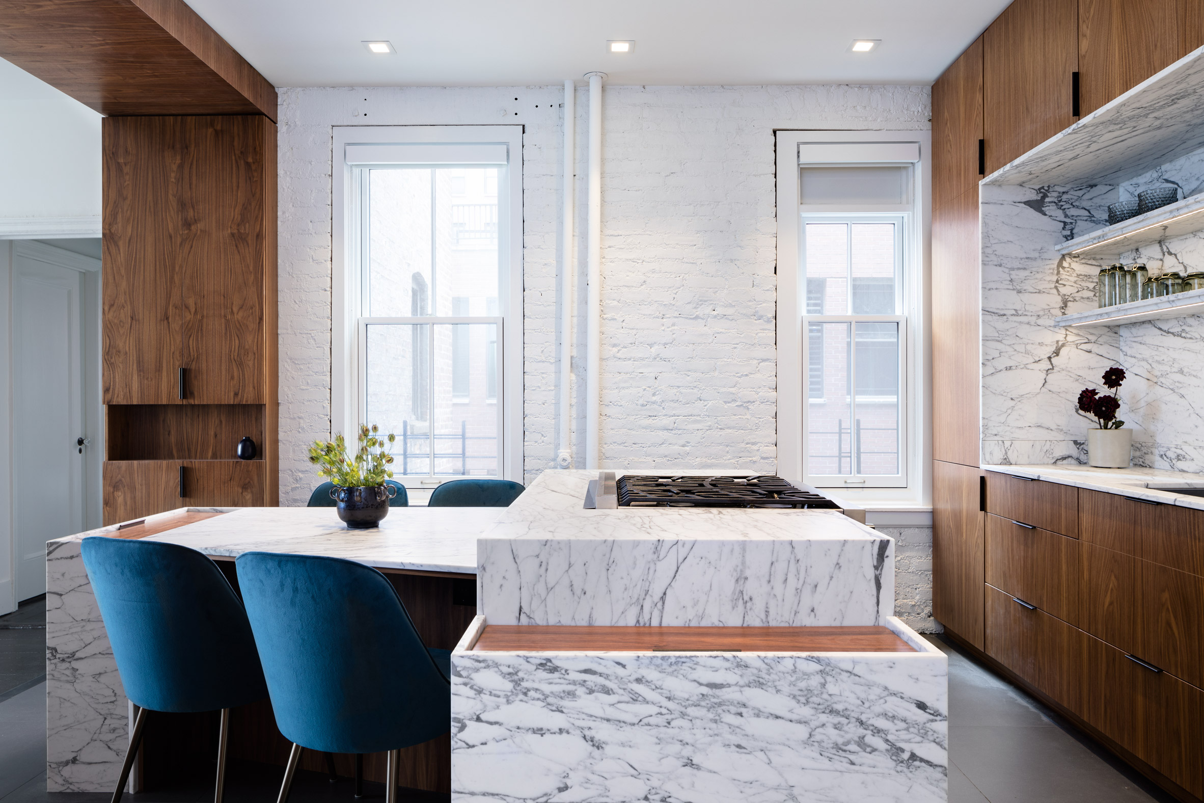
Attn Attn "started with ambiguous functionality, quirky original details, and deteriorating DIY finishes installed by a previous owner", so ripped everything out and began again from scratch.
The spaces in the pre-war apartment were reorganised, and a statement threshold was instead used to separate functions in the living space.
This dark wood element forms an arch between the kitchen and the lounge, and also integrates storage cupboards.
The same wood is used for cabinetry in the cooking area, where units surround a recessed counter and shelves of veiny marble.
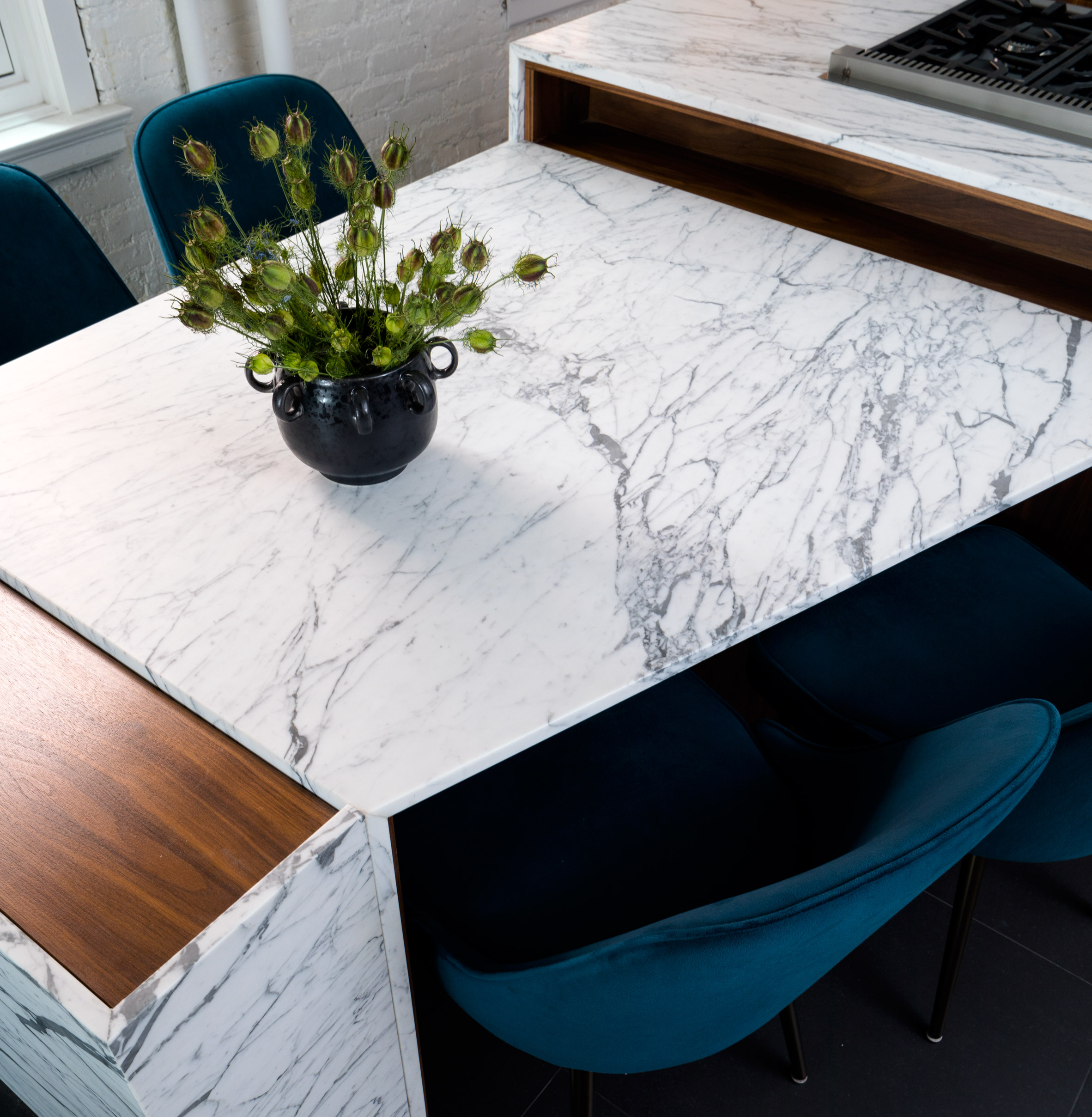
This stone provides an accent material throughout the apartment. It forms a kitchen island, from which a dining table extends at an angle, and surrounds the tub and shower from floor to ceiling in the bathroom.
"In reference to the client's graphic designer sensibilities and appetite for bold patterning," said Attn Attn, "natural stones and woods with contrasting lines and textures were chosen, and carefully manipulated to delineate spaces while simultaneously tying together appropriate functionality."
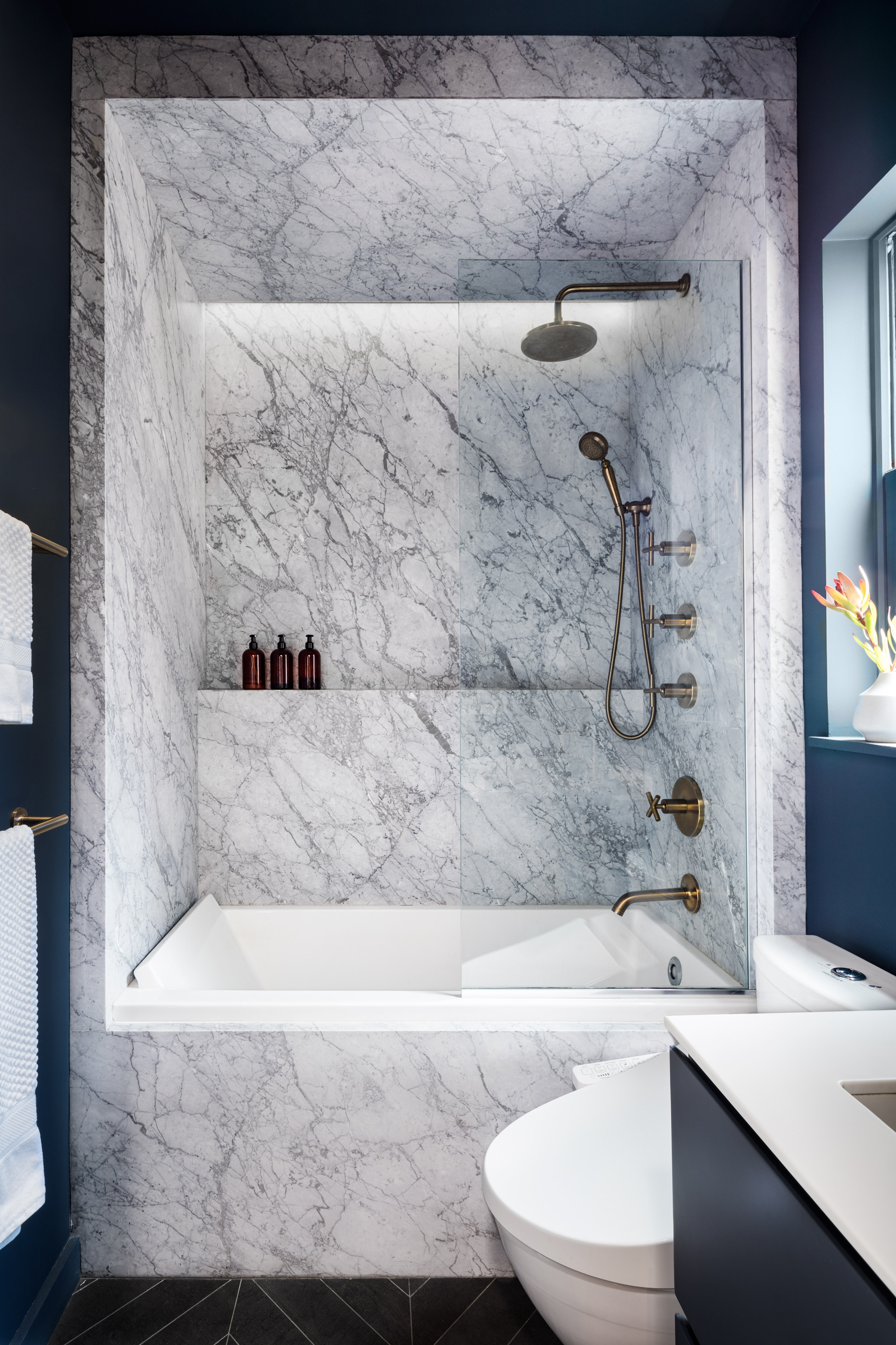
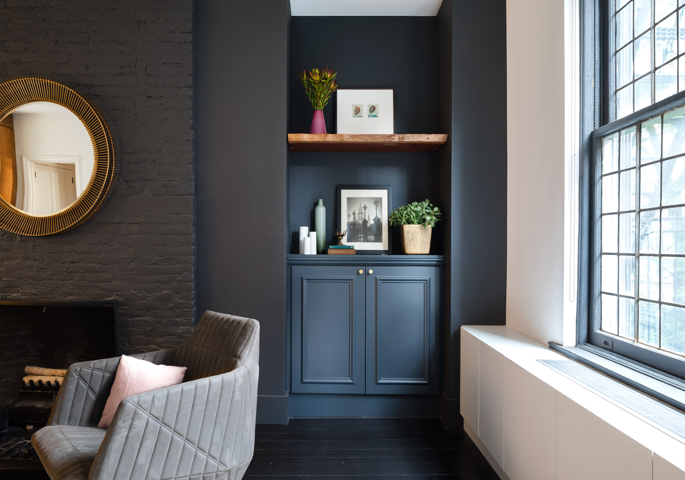
Other surfaces in the bathroom and living area are painted rich blue, and the flooring is black – both to highlight the light shades of the marble.
Walls containing windows are coloured white, while the navy paintwork is matched with the dining chair upholstery.
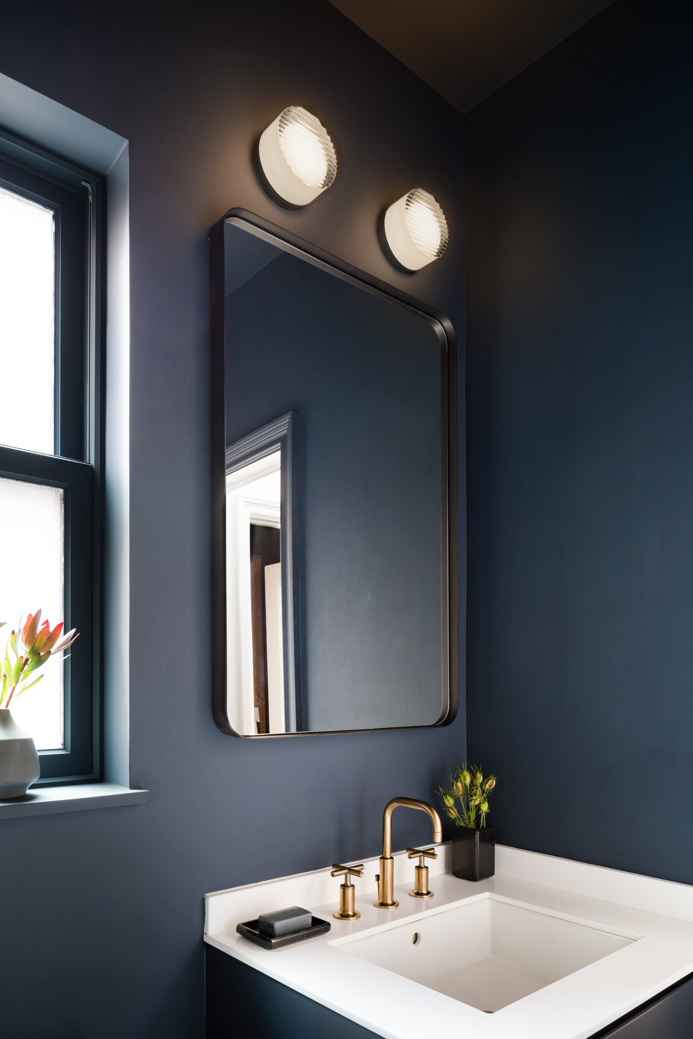
Overall, the Lenox Hill Residence comprises "simple geometries with just a touch of unexpectedness, for a classic but unique aesthetic", according to Attn Attn director Egbert Miles Chu.
New York City's notoriously small apartments often require creative solutions to maximise space. Others that have rearranged layouts to make the most of floor area and natural light include BoND, which renovated a "dark, divided" home in Chelsea, and MKCA, which used custom cabinetry to transform a West Village apartment.
The post Attn Attn renovates Lenox Hill Residence for graphic designer appeared first on Dezeen.
from Dezeen https://ift.tt/2QjR9rE
via IFTTT
This affordable housing development in China's Fuyang District, near Hangzhou, features sloping tiled roofs and a pared-back material palette inspired by the region's vernacular architecture.
Gad Line+ Studio, which is based at Zhejiang Gongshang University in Hangzhou, developed the proposal in response to the poor living conditions that affect many communities in rural China.
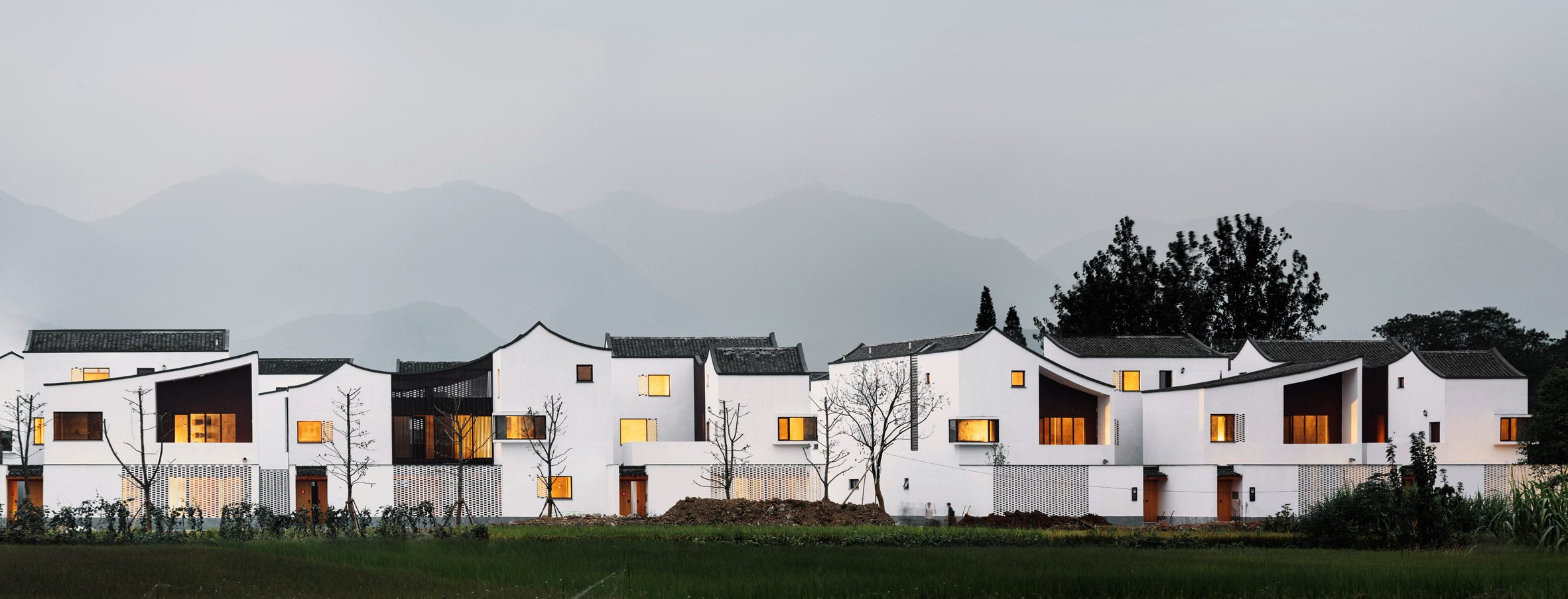
According to the practice, villages across the country have been neglected for decades as investment was focused on major cities, and young people deserted the countryside in search of better jobs.
The project is located in Dongziguan Village and was supported by the municipal government of Hangzhou, which sought an innovative model for good-quality affordable housing.
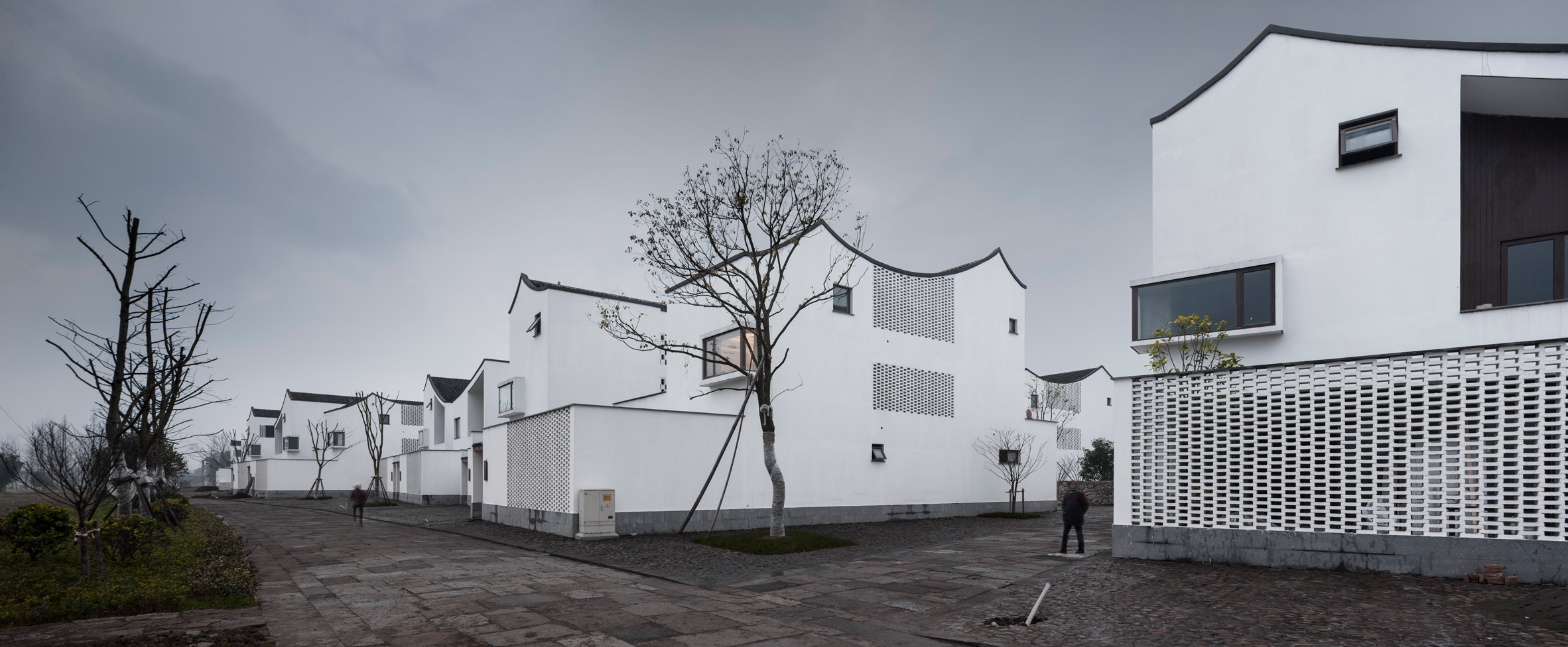
The scheme, which covers 15,300 square metres, earned Gad Line+ Studio a place on the shortlist in the Housing Project category of 2018 Dezeen Awards, alongside a London apartment building that has been served with a demolition order.
A total of 50 dwellings were constructed at a total cost of £2.3 million, meaning an average construction cost of just £145 per square metre, which is far below the average, even in rural Hangzhou.
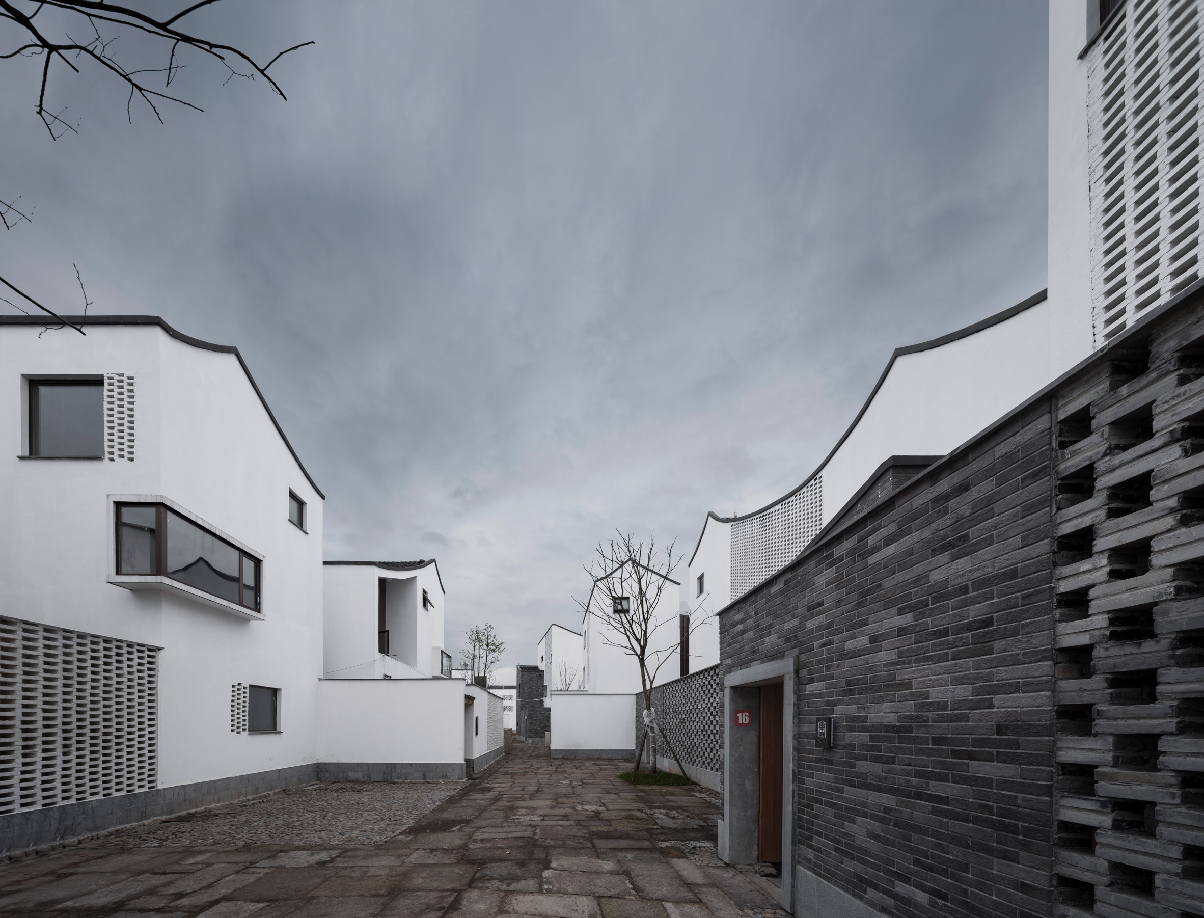
"How to design and construct quality housing for relocalised farmers with such a low budget, while maintaining their original lifestyle of collective living, becomes the major challenge of this project," the architect explained.
The scheme seeks to support the traditional model of collective living using forms and materials that are linked to the region's architectural past.
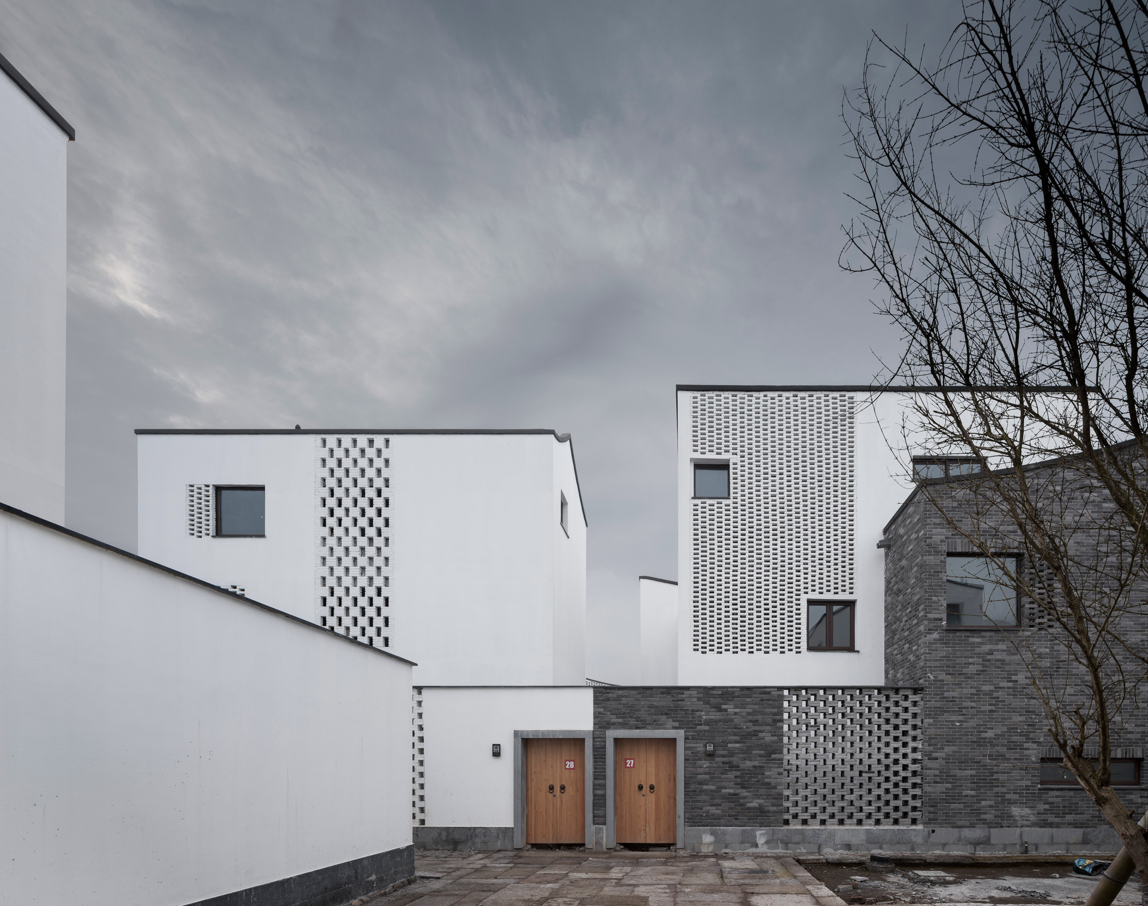
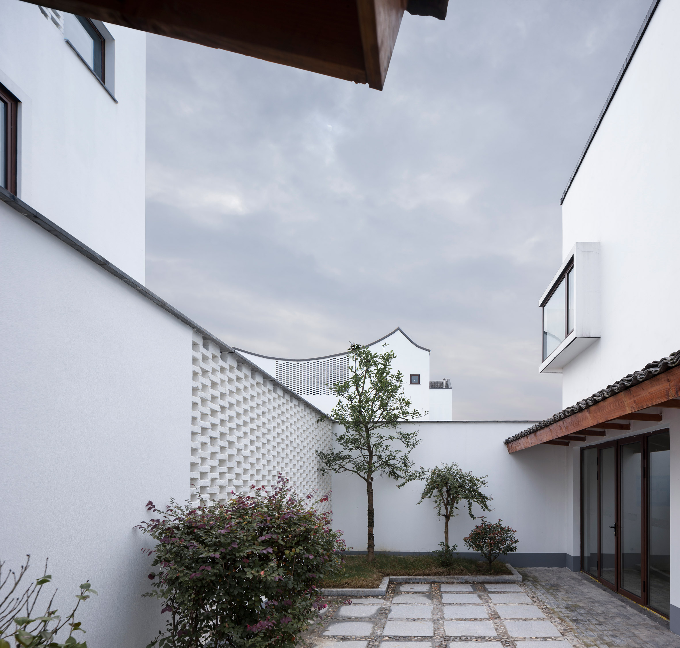
The buildings are grouped in clusters of six around shared courtyards as would traditionally have been the case in local villages. There are two housing models, with varying internal proportions, as well as four different courtyard configurations.
The homes feature simple forms topped with dual-slopped tiled roofs that evoke the local vernacular. The asymmetric ridges of the rooflines introduce variation and character to the scheme.
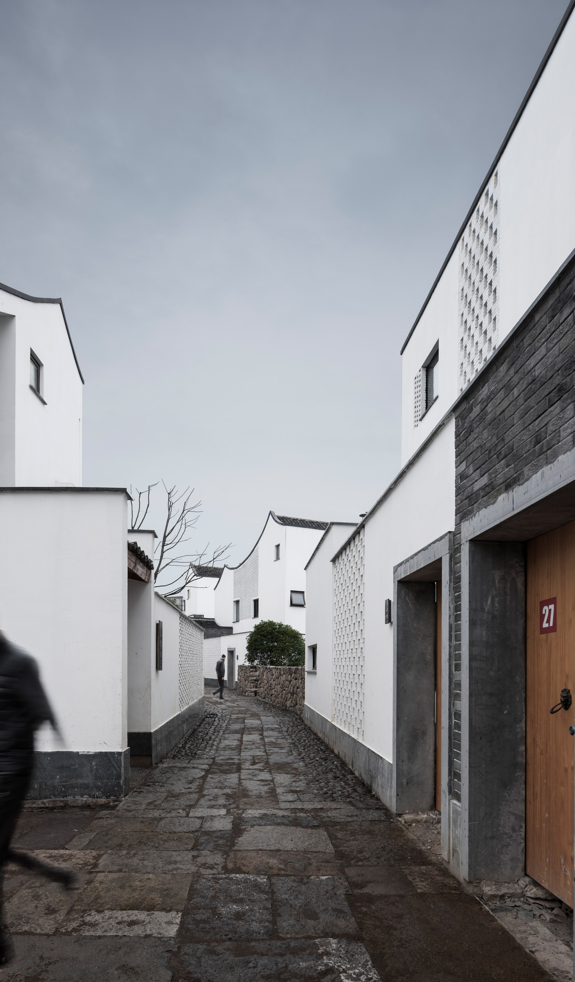
"The roofs cantilever out to aesthetically recall the vernacular architectural style in Hangzhou," the studio added, "and they also function as part of the shelter considering Hangzhou has a rainy season."
Materials used throughout the project were chosen to echo traditional building techniques, as well as achieving the required thermal and ventilation performance.
White and grey bricks are used for the main building envelope, with the brick bonds staggered in places to form perforated screens that allow fresh air to flow into the circulation areas.
The combination of brick, steel and minimal double-glazed windows is softened by the introduction of wooden doors and details, which add warmth to the otherwise stark palette.
Photography is by Yao Li.
The post Gad Line+ Studio creates low-cost housing in rural Chinese village appeared first on Dezeen.
from Dezeen https://ift.tt/2zFhAlS
via IFTTT
New York studio Visibility has created a refillable deodorant system for Myro, which uses 50 per cent less plastic than a regular disposable deodorant.
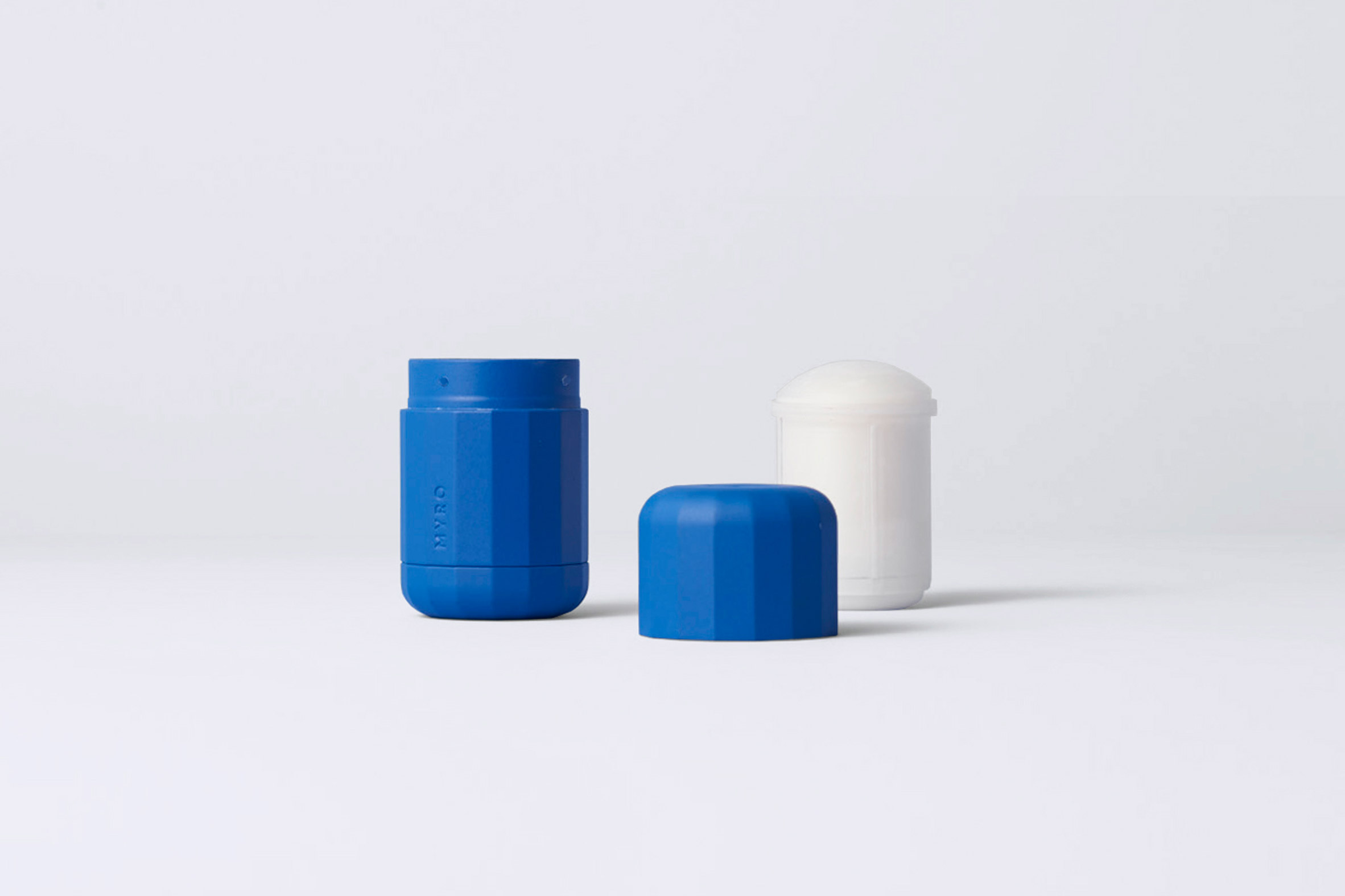
Designed for newly-launched plant-based deodorant brand Myro, the system consists of a permanent injection moulded deodorant case that the user keeps, and recyclable refill pods that plug into it.

The plastic case has a simple design that's easy to use and is durable and dishwasher safe.
Its tactile multifaceted shape is designed to provide a sturdy grip in the hand and also prevents the deodorant from rolling away when it's knocked over.

The fully recyclable replacement deodorant pods twist into the case by turning a dial. Each click of the dial allows more deodorant to be dispensed, while the deodorant itself is natural and aluminium free.
When empty, the refillable case pops out automatically.
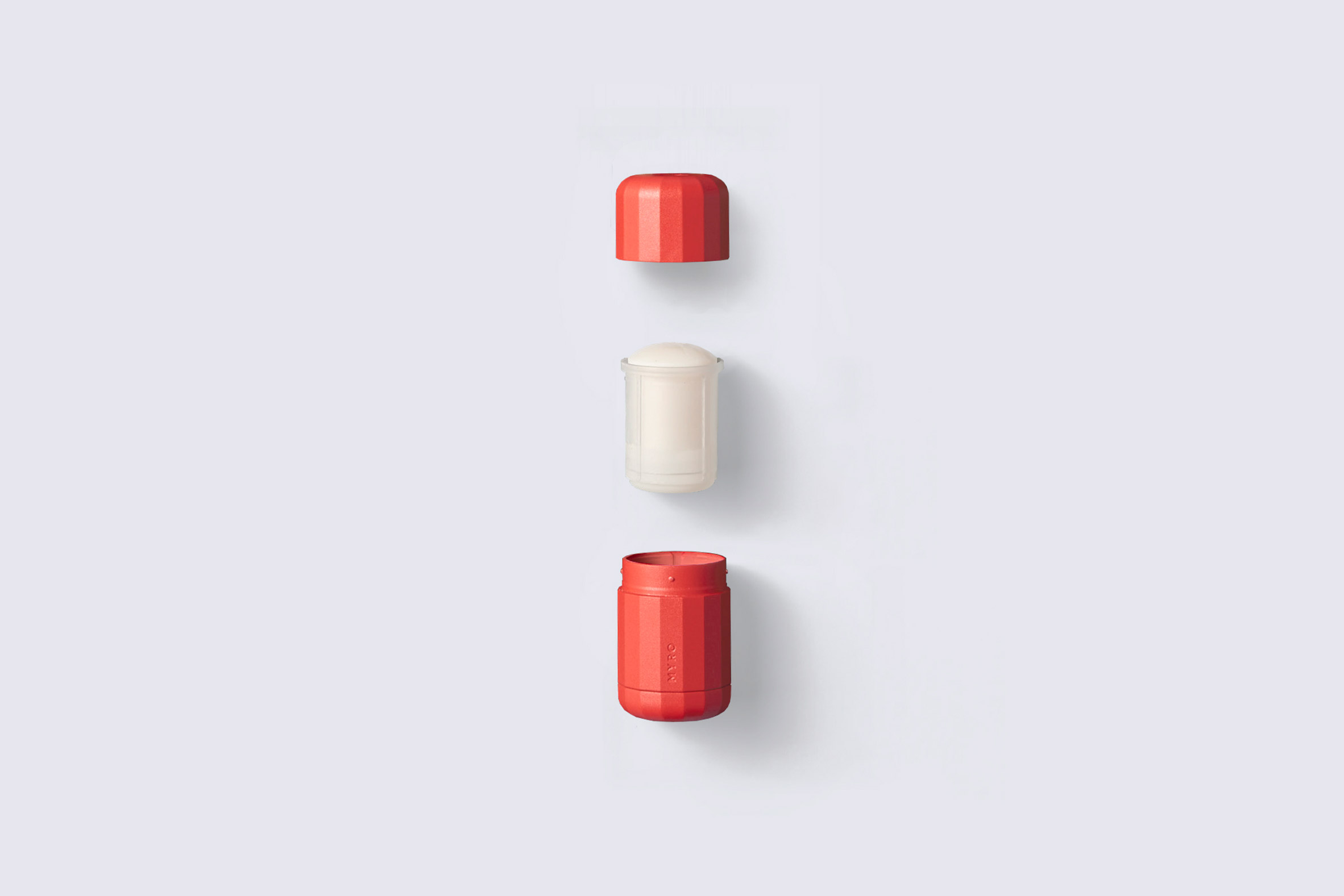
Using 50 per cent less plastic than a typical deodorant, the designers said the system represents a shift away from the overwhelming plastic waste that is typically caused by the industry as well as the harmful chemicals often found in deodorants.
"We're all so used to disposing of deodorants when they're empty that we had to figure out how a plastic applicator would visually suggest it's a different product and still maintain familiarity," Sina Sohrab, co-founder of Visibility told Dezeen.

"The mechanics of inserting a refill and getting it to engage seamlessly were also a huge challenge, which were resolved with the aid of a great engineering partner."
The deodorant cases come in five different colours while the pods are available in five different natural scents that release over time, and are available from Myro on a subscription basis.
Visibility were conscious of considering both ecological impact and gender inclusiveness during the design process. The resultingdeodorants are designed for use by both men and women.
"We explored quite a few forms before we arrived at the one you see, and it was thanks to a diversity of viewpoints – both in terms of gender and background – on the team that we were able to arrive at something that we hope will have wide appeal," said Sohrab.

The finished design is far removed from that of regular deodorant. "It was a balancing act in form language. We wanted to create something that felt distinguished, yet accessible," explained Sohrab.
"It was also important to create an iconic design that the user would want to keep on their counter rather than tucked away in a drawer. We wanted to create a whole new typology for this kind of hygiene product," he added.
Founded in 2012 by industrial designers Joseph Guerra and Sina Sohrab, New York product design studio Visibility has previously created products for brands such as Areaware and Normann Copenhagen.
Visibility also designing its own homeware collection, which includes a series of slip-cast porcelain kitchen tools with built-in ridges for grating, grinding and gripping food.
The post Myro's recyclable refill system is alternative to disposable deodorants appeared first on Dezeen.
from Dezeen https://ift.tt/2Rb52cM
via IFTTT
Explore fashion boutiques with impressive interiors via our Pinterest board
Dezeen September 30, 2018We've created a Pinterest board showcasing new fashion boutiques with impressive designs, including John Pawson's limestone and cherrywood interiors for Jil Sander and Celine's Miami flagship store featuring sky-blue marble. Follow Dezeen on Pinterest ›
The post Explore fashion boutiques with impressive interiors via our Pinterest board appeared first on Dezeen.
from Dezeen https://ift.tt/2y0rsVm
via IFTTT
Ocean-themed restaurant by Alexander & Co and Tribe Studio opens on rooftop of Dubai Opera
Dezeen September 29, 2018A carpet designed to look like the ocean and an octopus-inspired artwork feature inside Sean Connolly at Dubai Opera, a restaurant atop Dubai's opera house, designed by Sydney studios Alexander & Co and Tribe Studio.
The ocean-themed restaurant and bar is located on the rooftop of Dubai Opera – a glass-wrapped performing arts centre designed to resemble a local dhow boat with its swooping roof.
Taking advantage of this, the 350-person restaurant features an external courtyard and sky garden, which offers diners impressive views of the city skyline, including the Burj Khalifa.
This garden is used to grow produce for a kitchen run by chef Sean Connolly, who is known for his oceanic Australian- and New Zealand-influenced cuisine.
His involvement provided the inspiration behind the restaurant's oceanic design, which Alexander & Co describes as an "underwater modernist salon".
"The bistro explores the colours and tones of the sea, oyster, sea cliff and coastal escarpment," explained the Sydney-based design interiors studio, which completed the project in partnership with architecture office Tribe Studio.
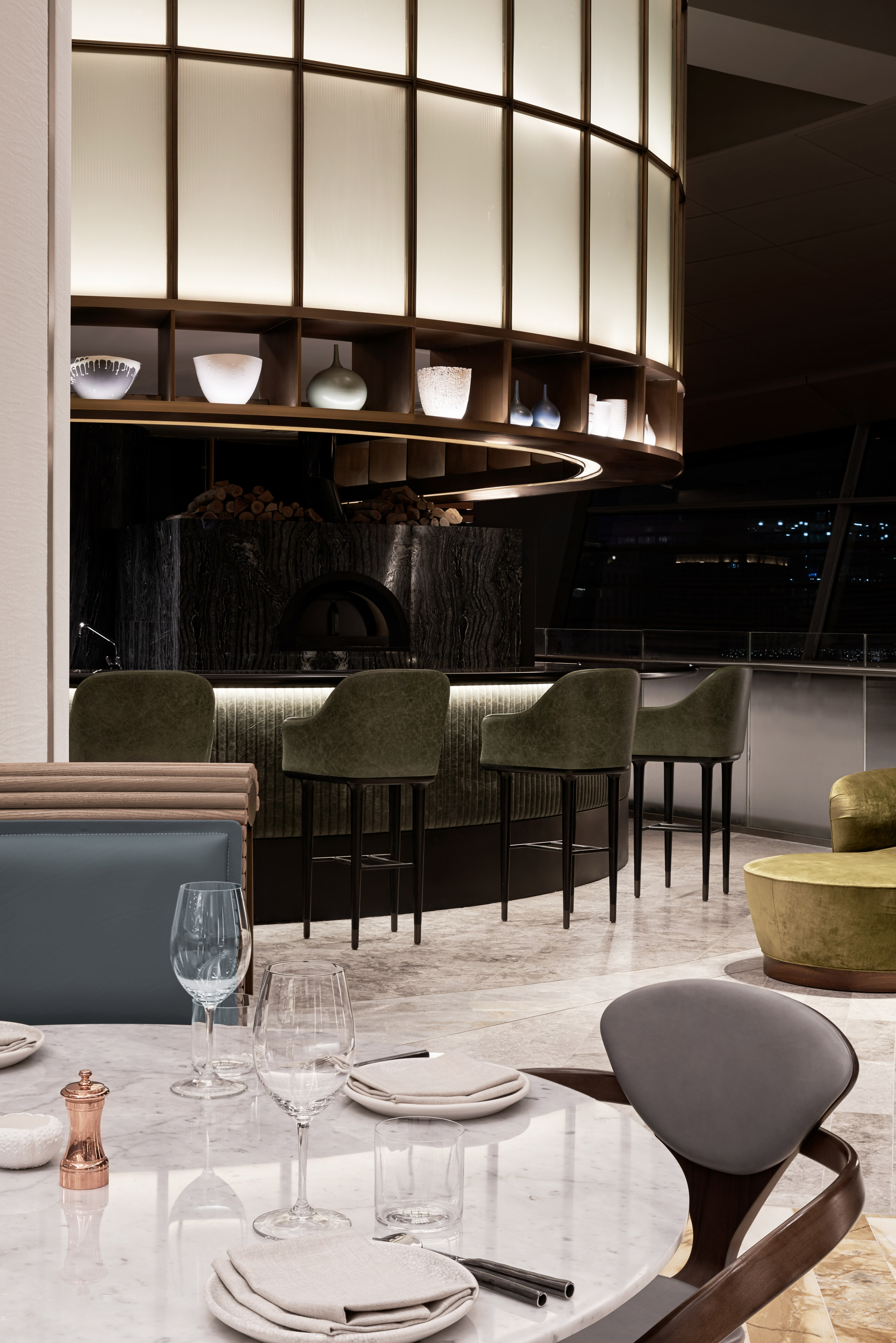
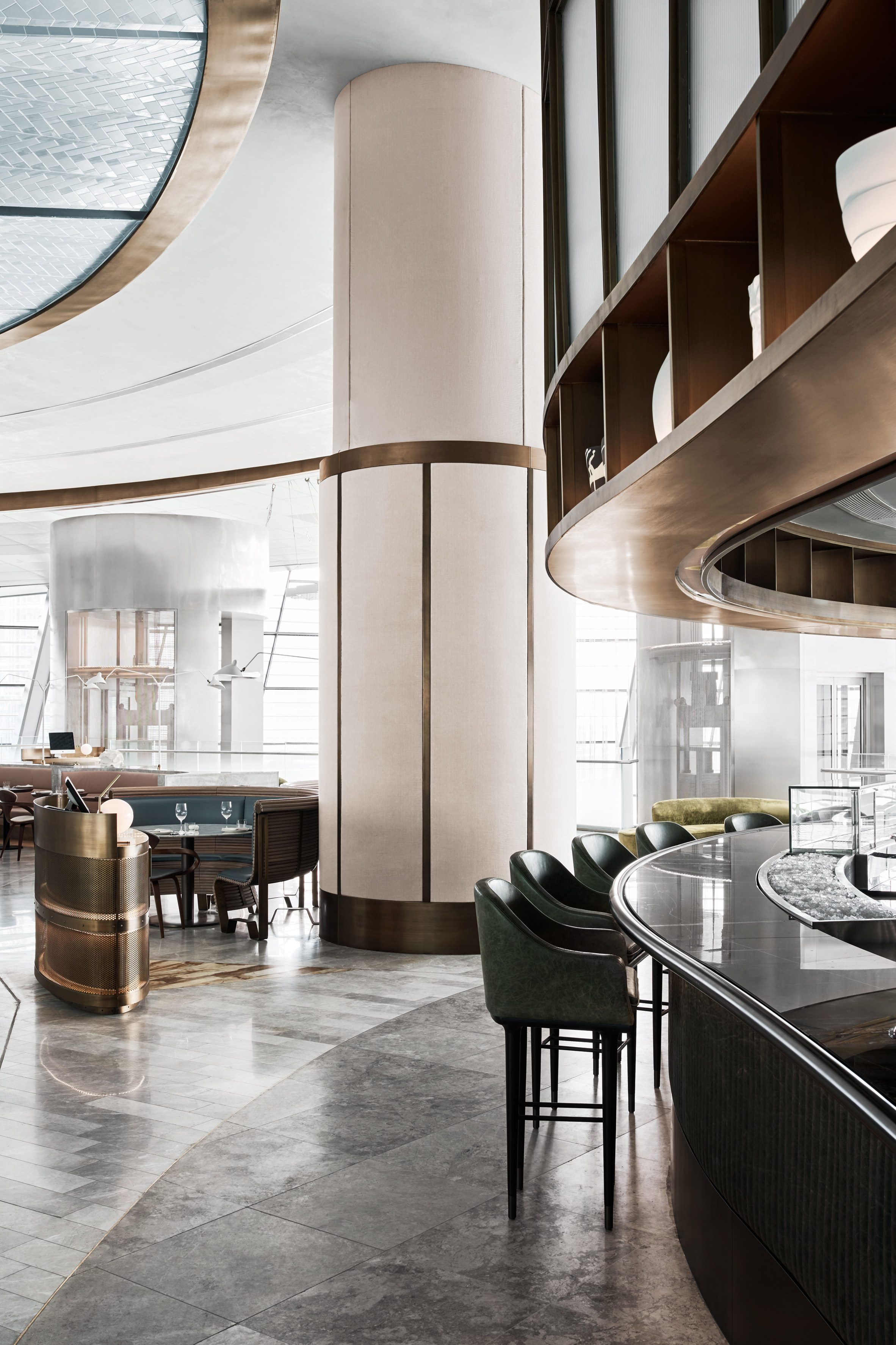
Although largely open-plan, the venue is carved up into various different areas defined by changes in materials and finishes. Spaces include the Raw and Fire bars, a brasserie, a main bar, a private dining room, a chef's table and an external bar.
"The project was very ambitious and quite large," said Alexander & Co. "The design DNA developed from what was initially a coarse-grained Tasman inspiration – rugged, worn and sun bleached."
"However realities of the many Dubai Opera stakeholders and their own ambitions shaped the restaurant to become more refined, and a bit more delicate."
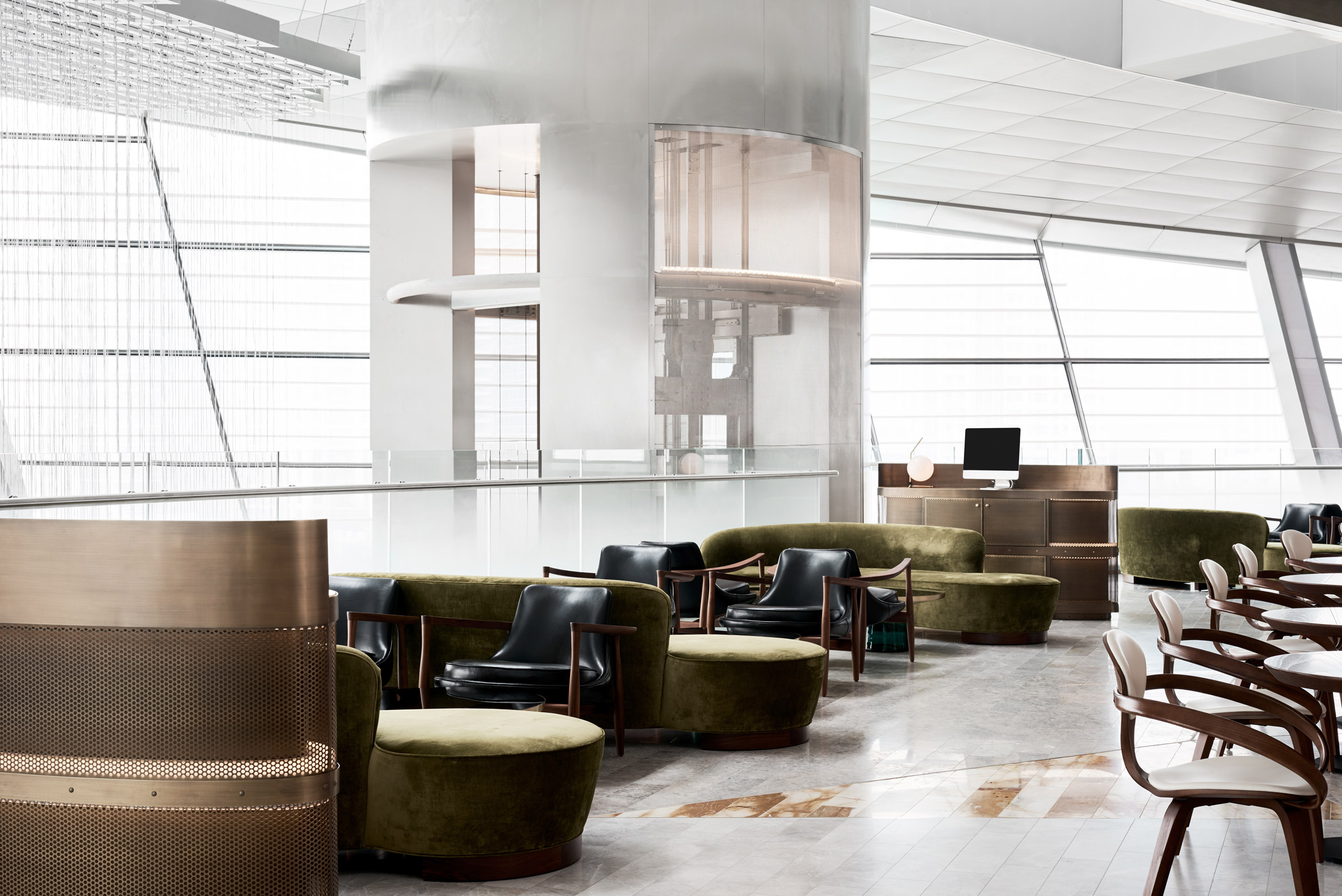
The team were influenced by various 20th century buildings with swopping curved lines, such as the wing-shaped concrete roof of New York's TWA Terminal at JFK airport by Eero Saarinen, and the shell geometries of the Sydney Opera House.
"Each design element within the venue explores ideas of the sea, from the oyster with its combination of smooth sensual surfaces and textured outer surfaces, to the oceanic tones and colours of corals and pearlescent hues," they explained.
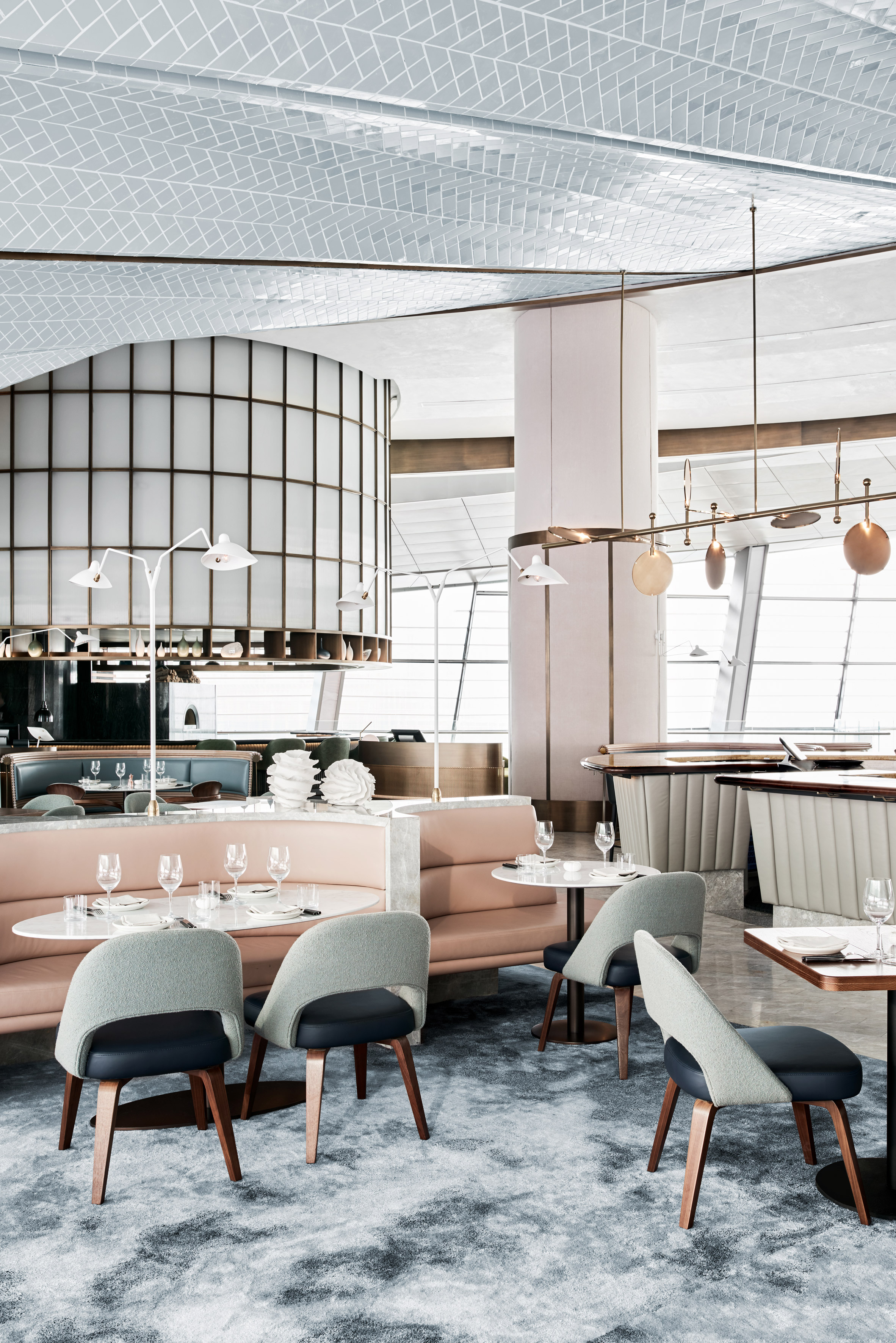
For example, the designers used a combination of matt and gloss tiles on the restaurant's vaulted ceiling to evoke the sheen of oyster shells, while the grey marble banquettes with pink leather upholstery in the central Pearl Bar are inspired by the delicate contrasts of ocean corals and sea creatures.
The Pearl Bar, which functions as a central cocktail bar, is constructed from grey leather, walnut timber and yellow marble, while the decor of the raw and fire bars is influenced by the outer edges of blackened seashells.
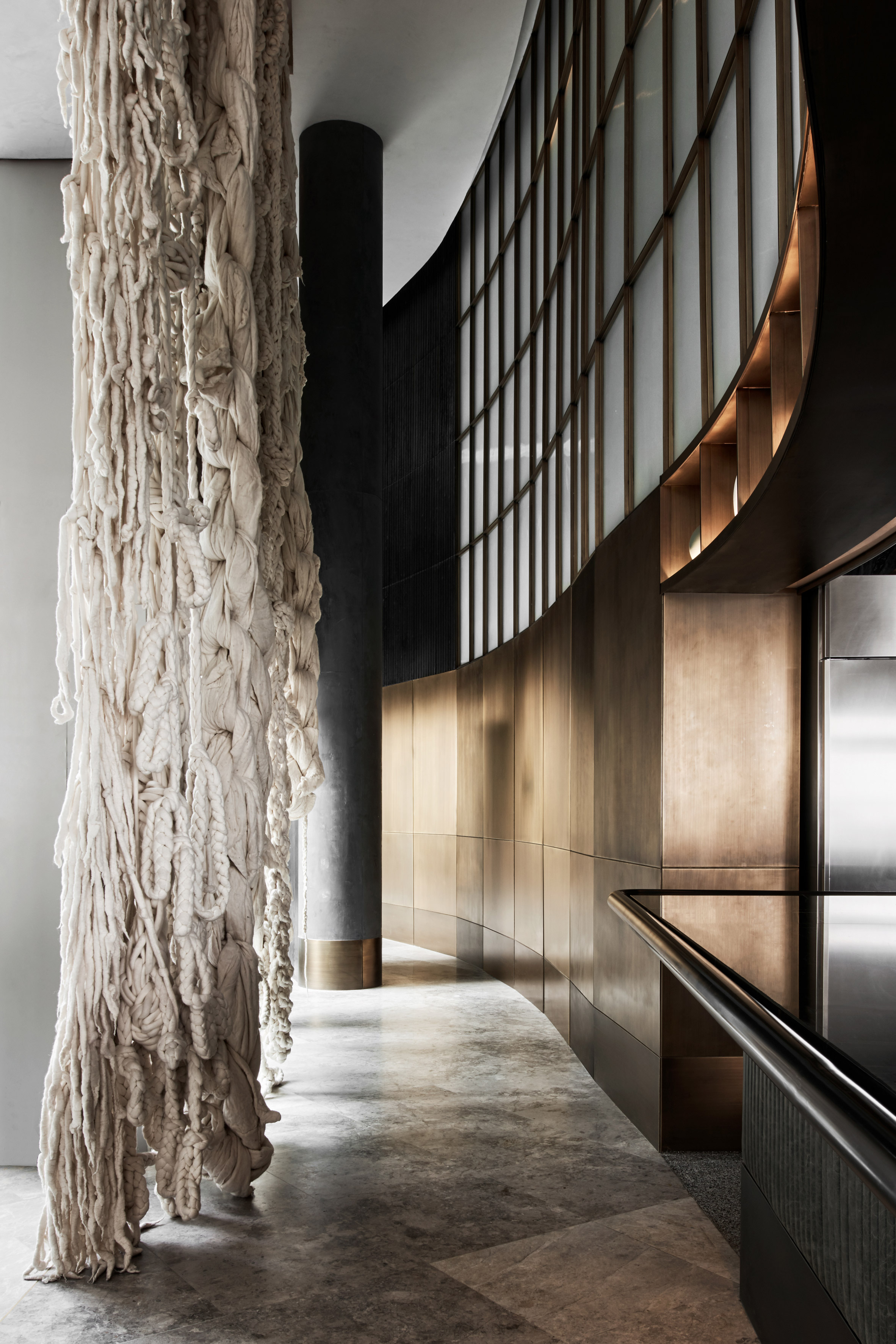
Extreme knitter Jacqui Fink created a custom six-metre-high Merino Wool hanging artwork that references the tentacles of sea creatures. Meanwhile local Sydney artist Tracey Deep, known for her floral installations using found and native flora, created three hanging sculptures based on the ocean.
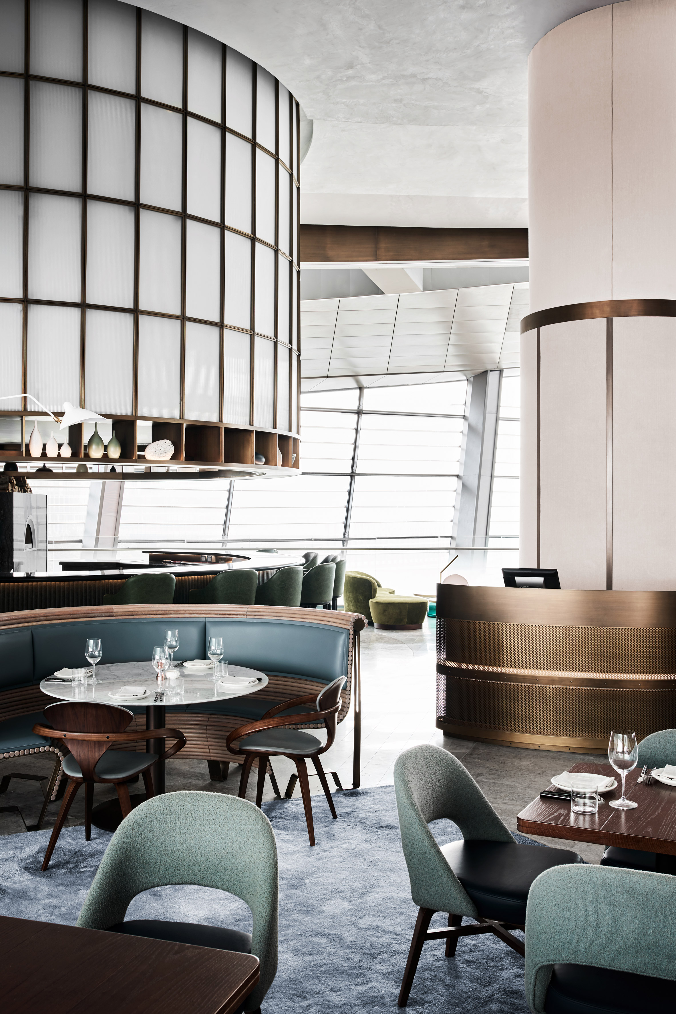
A dappled blue woollen carpet that recalls ocean waters was custom designed by Alexander & Co, while classic Serge Mouille lighting was custom made in curving white enamel steel and brass finishes to tie in with the references to the curvaceous 20th century buildings.
The spaces are furnished with various pieces of 20th century furniture in green, grey, blue and white tones combined with natural walnut timbers.
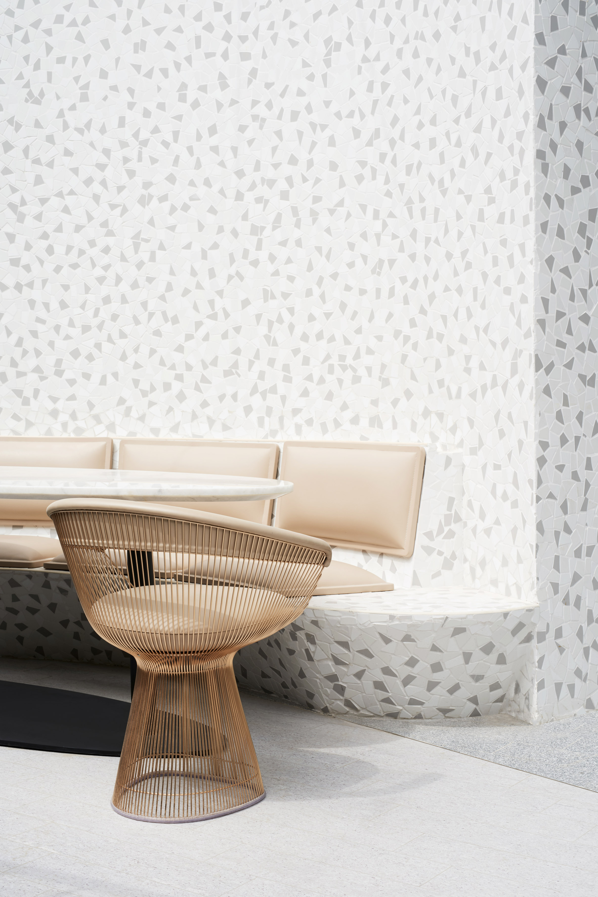
"Central to our innovation at Sean Connolly at Dubai opera was an ambition to arrange inexpensive materials in a way that would give them architectural value and a historical reverence," concluded the team.
"Noting that the local trends within Dubai are recognised for a design tendency to overuse expensive materials to the point of cheapening them, our goal was to utilise where ever possible inexpensive or mass produced materials in a very focused and detailed way so as to almost through alchemy, turn them into something magically beautiful."
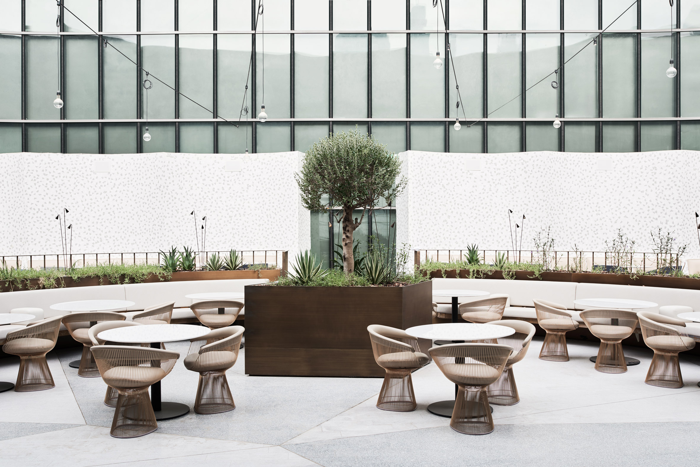
Alexander & Co is shortlisted for emerging interior designer of the year in the inaugural Dezeen Awards. Other projects by the studio include a renovation of a waterfront holiday home in Sydney featuring a monochrome colour palette.
Tribe Studio's other recent projects include a house extension featuring a "brick sunburst".
The post Ocean-themed restaurant by Alexander & Co and Tribe Studio opens on rooftop of Dubai Opera appeared first on Dezeen.
from Dezeen https://ift.tt/2y3vD2E
via IFTTT
This waterfront property by US studio McCall Design and Planning is built into rugged granite boulders that face Idaho's Payette Lake.
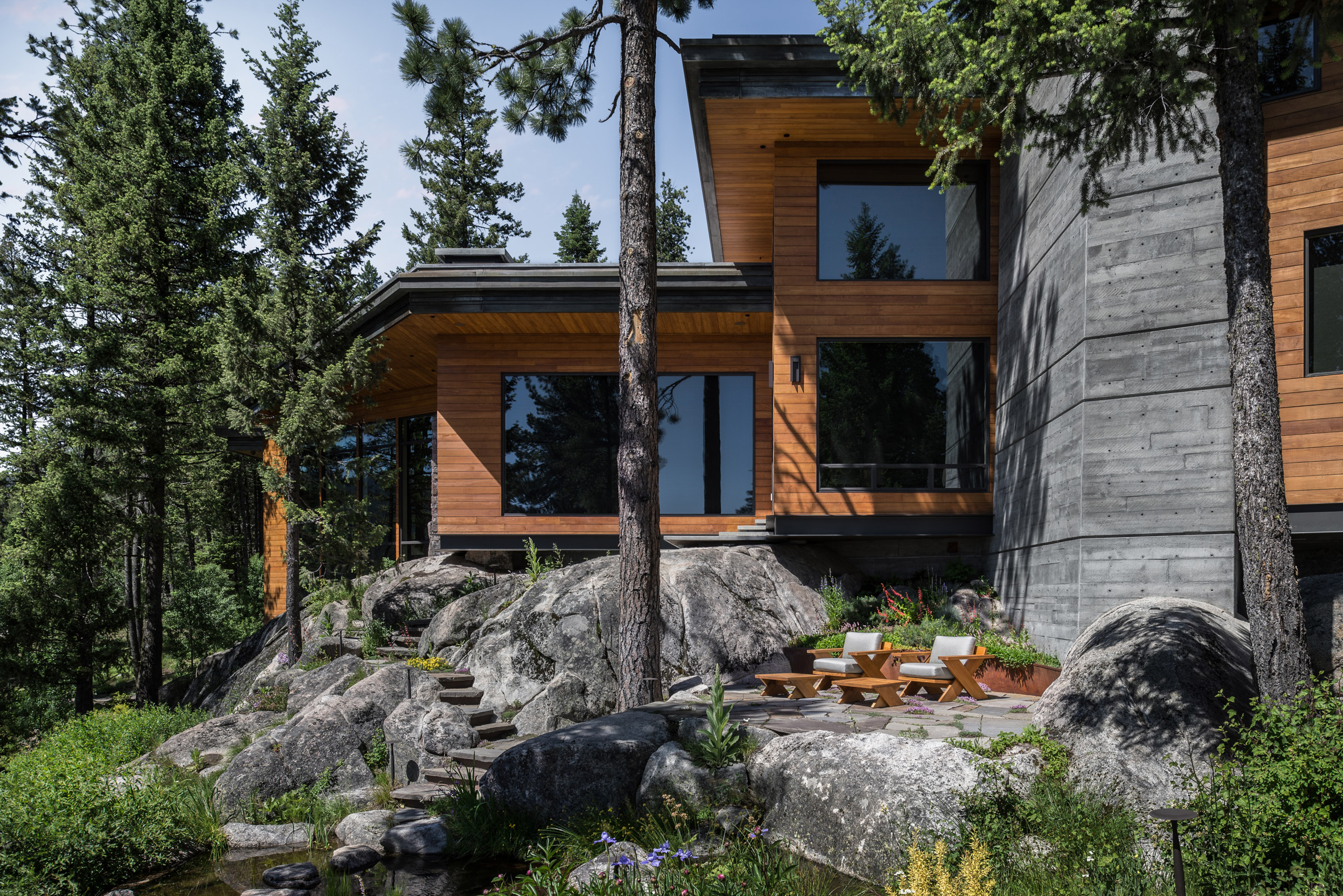
The five-bedroom Cliff House is named for its placement on a steep slope in a wooded area. The design was informed by the natural context, which helped determine the layout of the home's three levels as they step down the hillside.
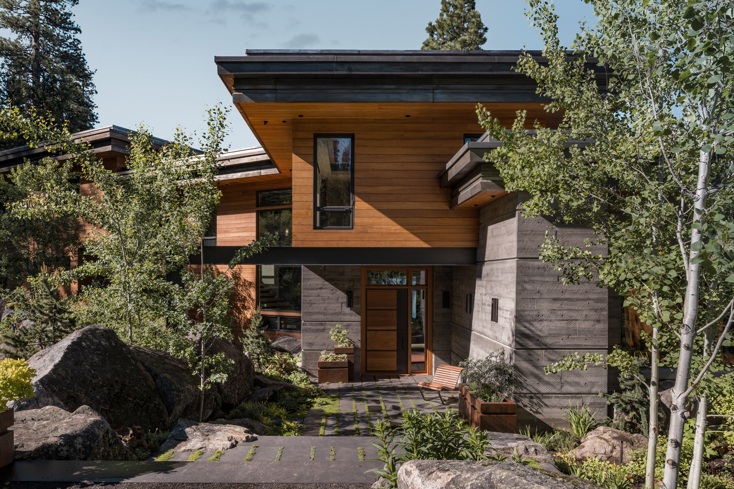
"The stepping of the site to the lake drove the design towards horizontal layers, creating a strong sense of grounding into the site," said Idaho-based firm McCall Design and Planning in a project description.
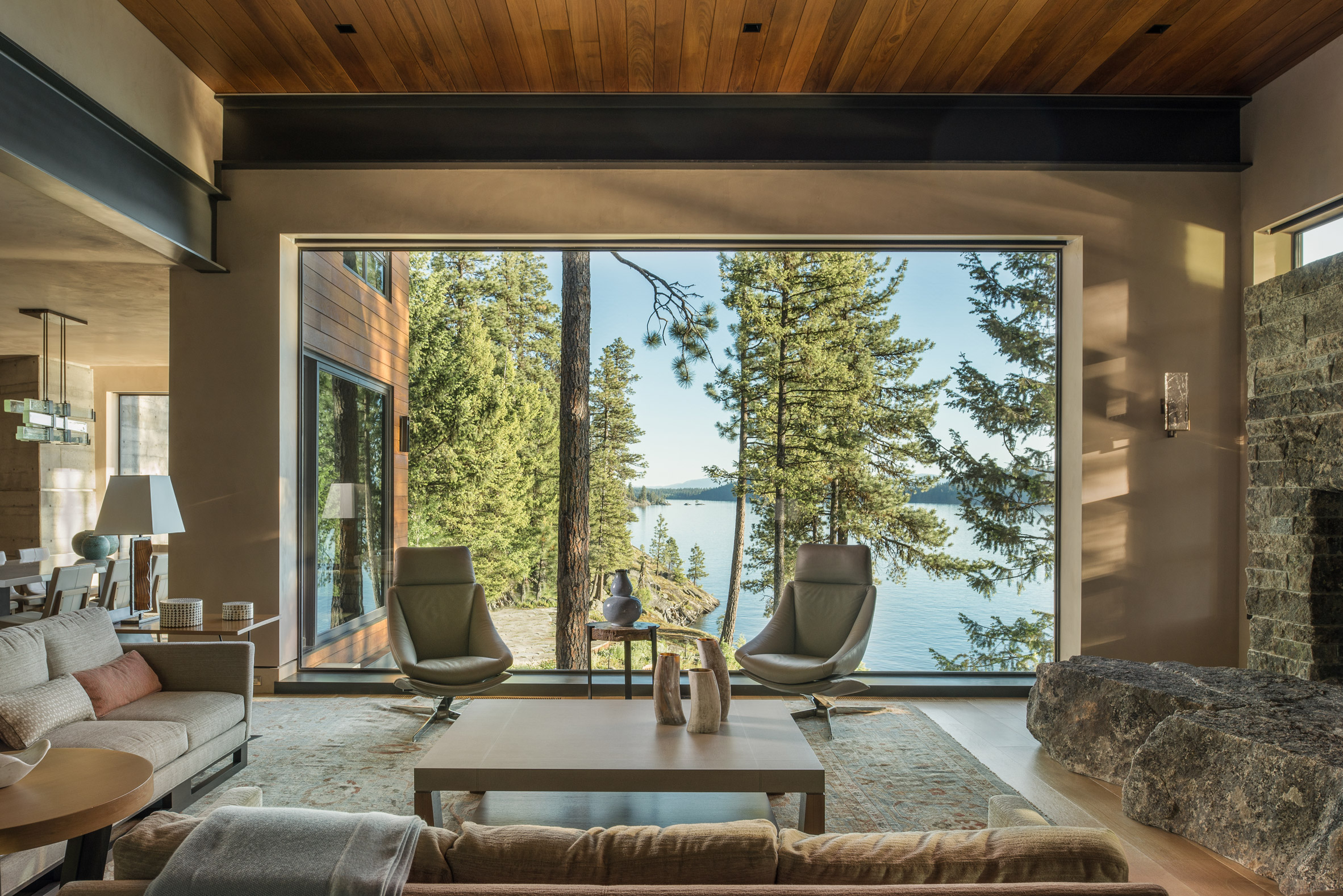
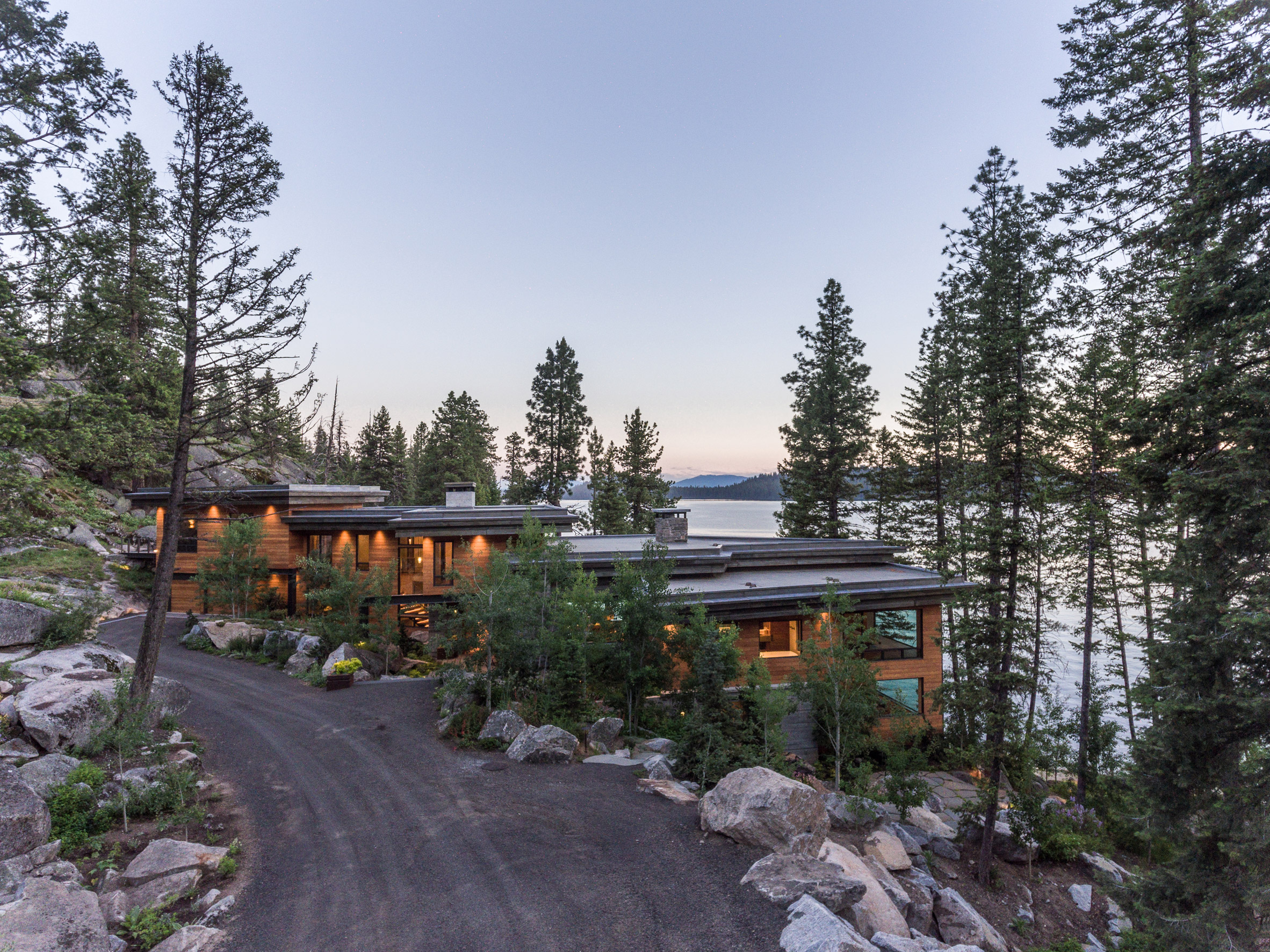
Entrance to the wood-clad home is on the middle level, into an open vestibule that leads to the dining area on one side, and the living room on the other.
Floor-to-ceiling windows wrap around this space, providing the main social areas with expansive landscape vistas. The zig-zagging outline of the plan means that these rooms benefit from double exposures to the wooded scenery, making them feel "as though you're outside", according to the architects.
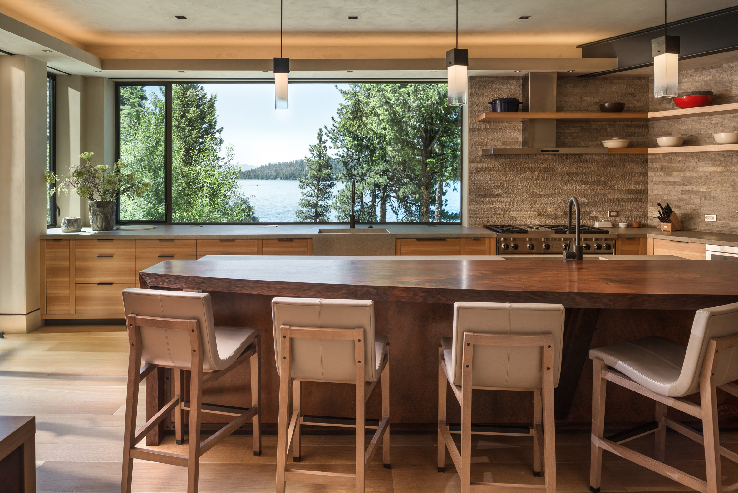
Just off the dining room is the kitchen, which feels separate due to a change in the plan's orientation. From this area, residents can access outdoor spaces carved out of the site's rocky topography.
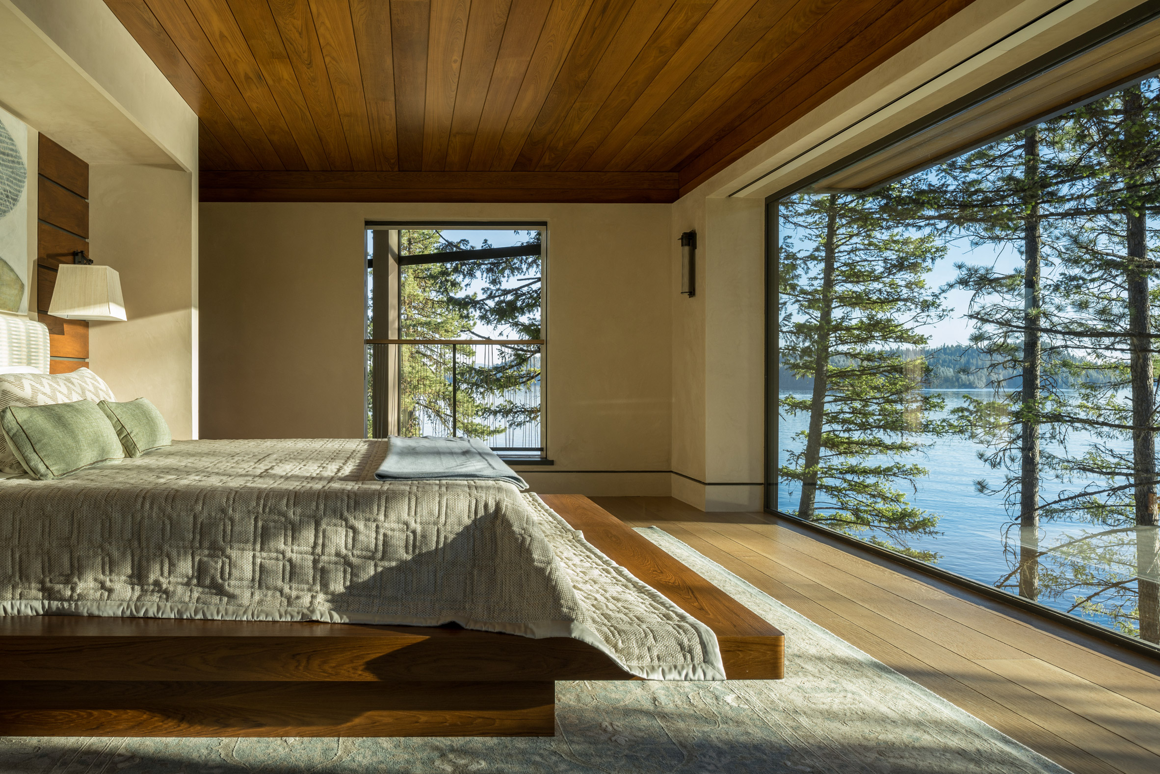
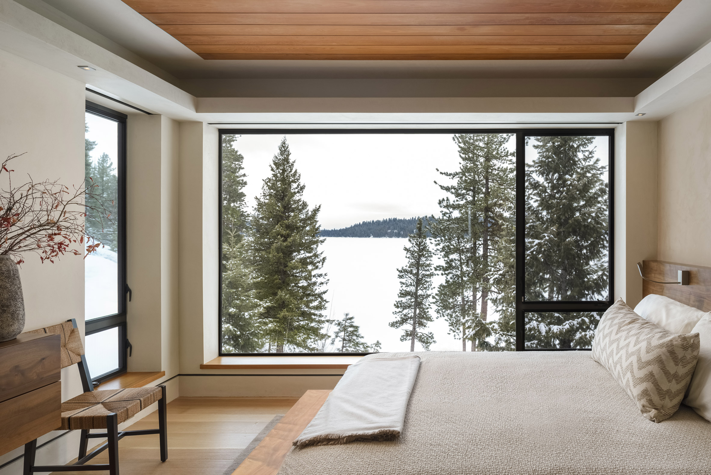
The other end of the main level is occupied by the master suite, which the architects describe as a "sophisticated treehouse for grown-ups". Its low wooden ceiling is meant to contrast the wide panes of glass that occupy two full walls of the space.
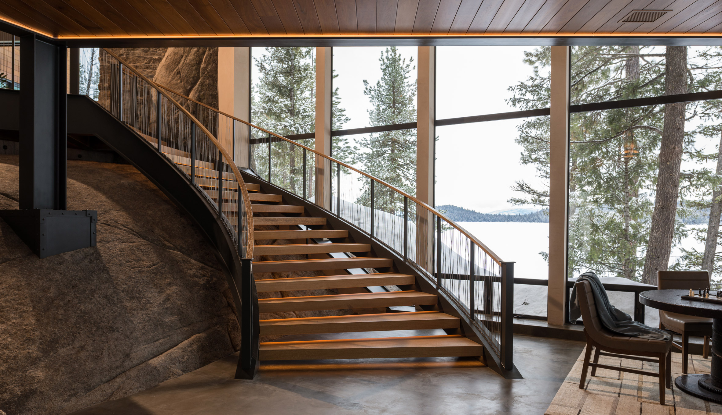
From the living room, a circular stair leads down to the den, where the architects laid out a bar and game room. An exposed boulder is visible here, reinforcing the connection to the site.
"Staircases were treated as sculptural elements, floating above existing and introduced rock elements," said McCall Design and Planning. "The flaring circular staircase to the game room was built using I-beams bent in Seattle after a full-scale mock-up was created on site in wood."
The topmost level of the home contains several bedrooms for guests and children, as well as an exercise room.
According to McCall Design and Planning, the original scheme had a more traditional appearance. The home's modern outcome was the result of several design iterations.
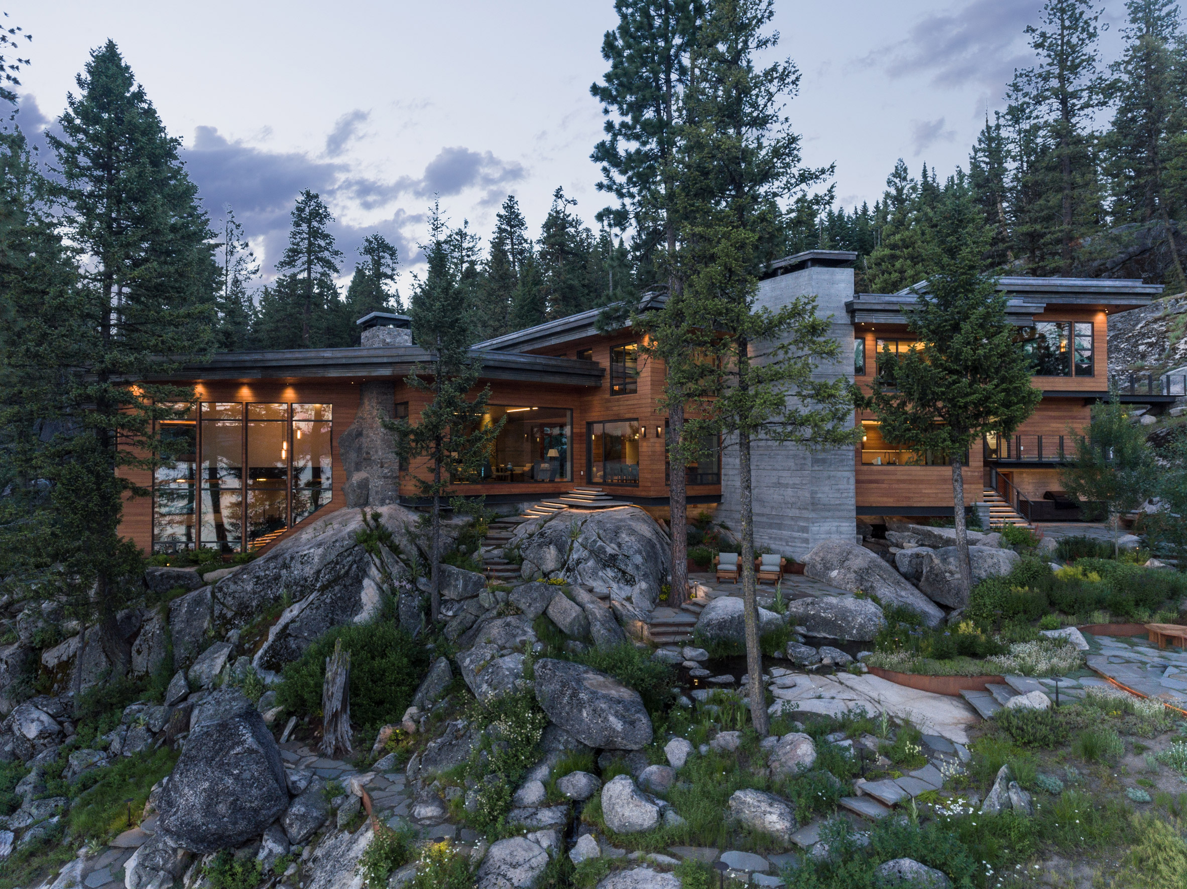
"Time allowed the design team to try just about every roof form possible, before settling upon a flat roof that integrated the house into the site the most successfully," the team explained.
"As time passed, the clients warmed up to a more contemporary direction with the architecture and finishes that were in keeping with their desire for a lot of glass."
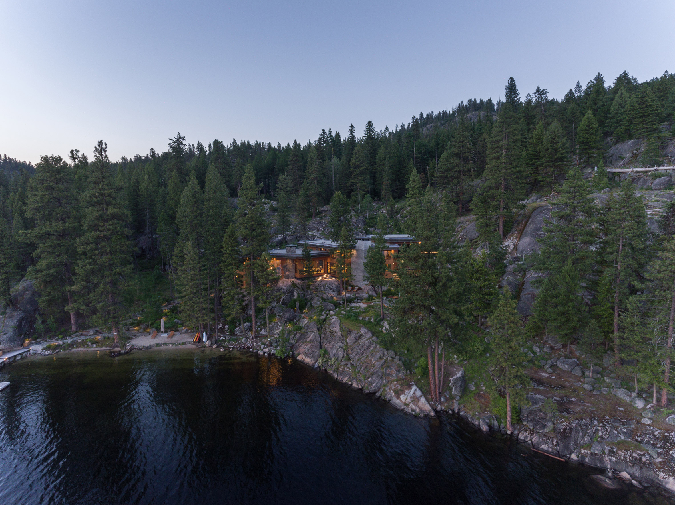
Idaho's remote landscape is a popular setting for vacation homes and secluded retreats. Other residences in the US state include a property lifted on stone walls by Ro Rockett Design, and a house by Olson Kundig that includes a variety of automated features, such as pivoting doors and moveable light fixtures.
Photography is by Gabe Border.
The post Cliff House in Idaho steps down a granite slope to a lake appeared first on Dezeen.
from Dezeen https://ift.tt/2QdVaxA
via IFTTT
Japanese furniture and saddle bags influence Vidivixi's furniture collection
Dezeen September 29, 2018Designs in Mexico City studio Vidivixi's debut furniture collection include a bed cradled by cotton-covered rolls, and a bronze glass table with a base of interlocking, blackened wood tubes.
Vidivixi – named after the Latin phrase vidi vixi, which translates to "I saw, I've lived" – launched the collection in September 2018. It comprises five pieces, including a bed, a cabinet and three tables in circular forms and a variety of materials like stained oak, leather and bronze glass.
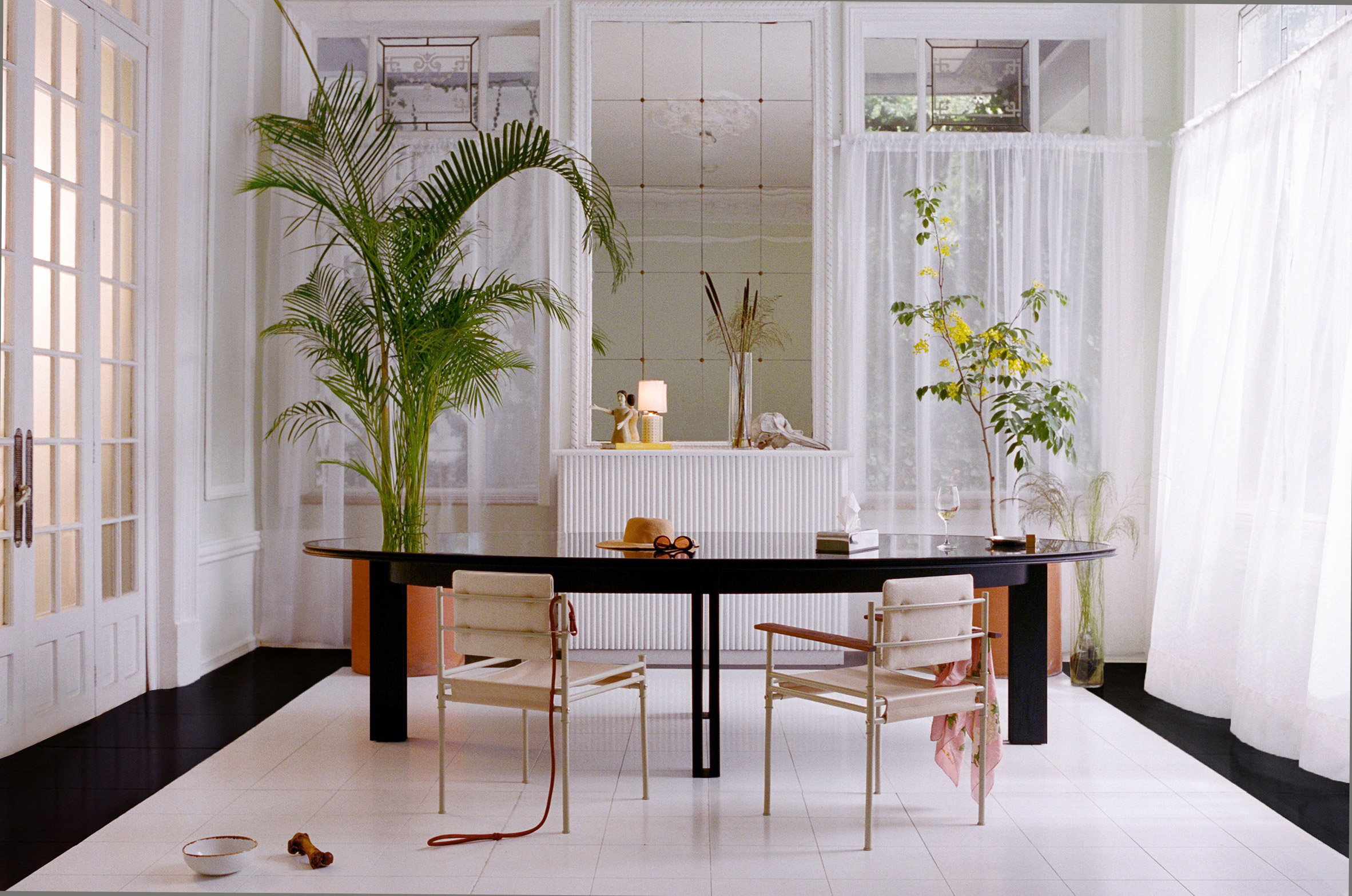
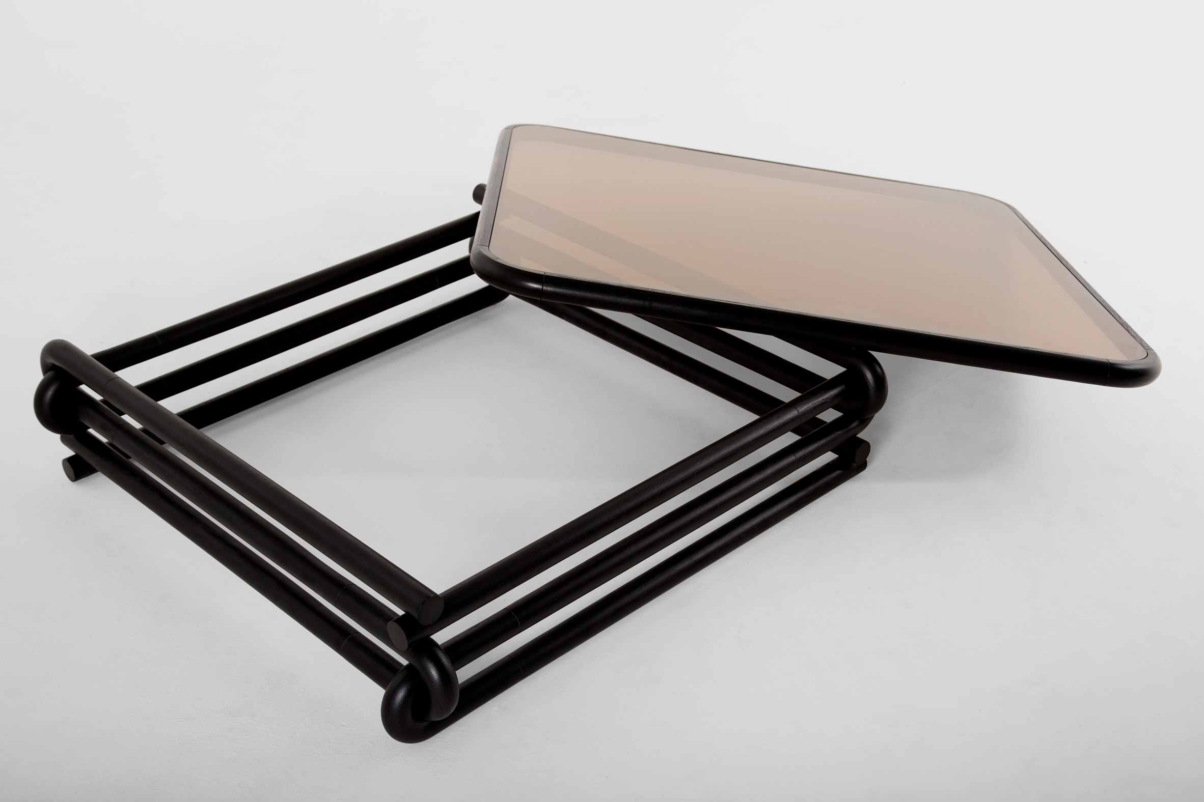
A standout piece is the bed called Docked en Rio. Rounded modules covered in cotton are placed around a walnut frame, to create rolled detailing at the headboard and the foot.
The mattress slots into this base, which then folds underneath each end – a feature that the studio said draws on "traditional Japanese furniture".
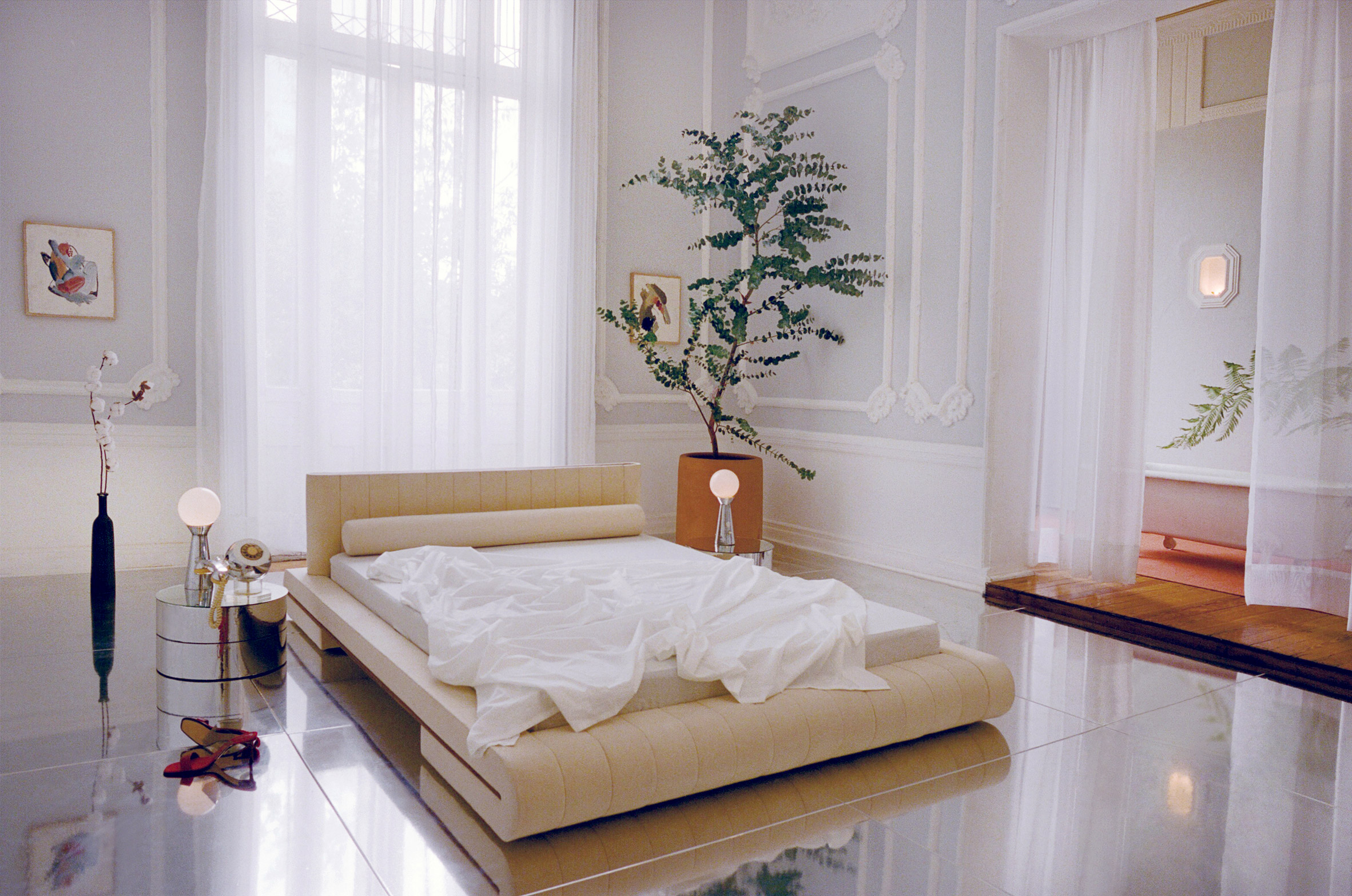
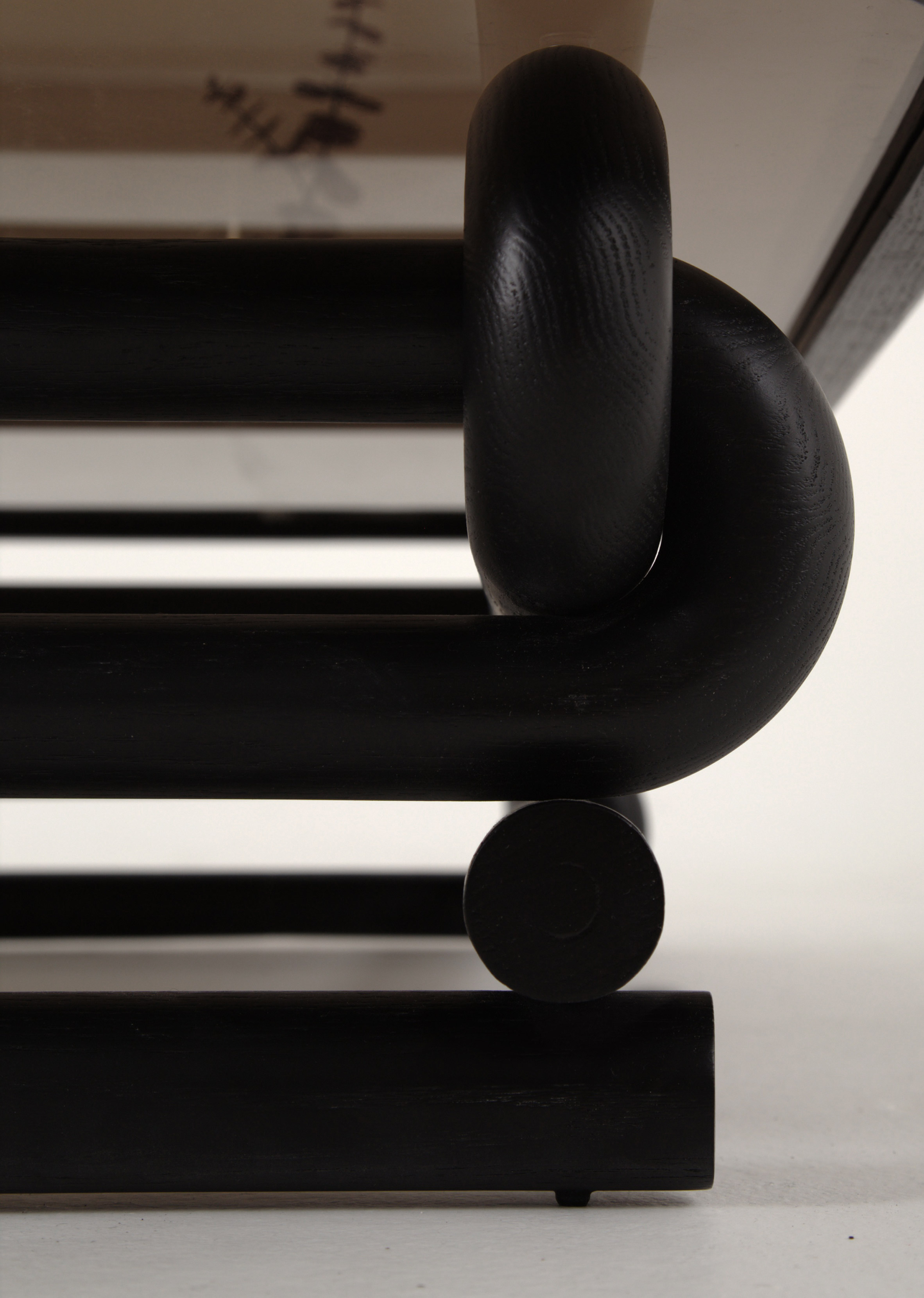
Similar tube shapes are found in the support of the square coffee table, aptly named Café Con Leche. It comprises eight U-shaped oak forms – two on each side – that interlock to bolster the structure. The wood is stained black with a matte finish.
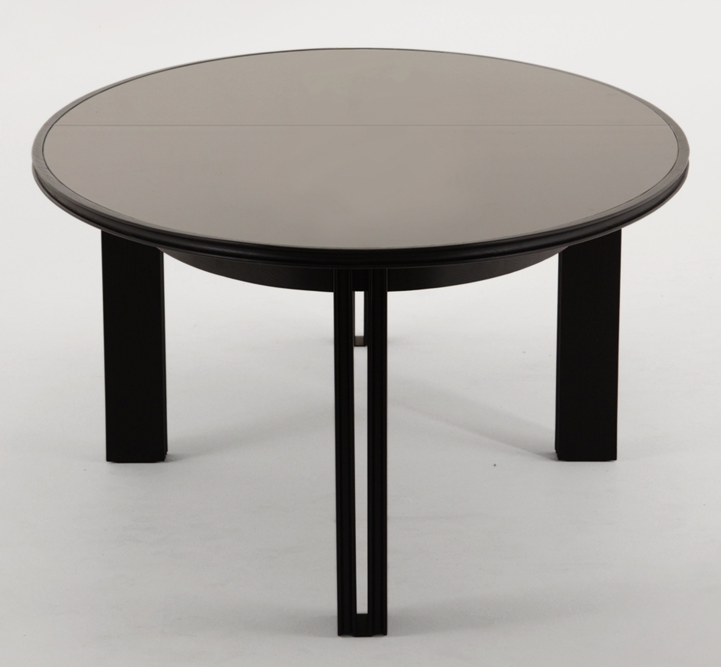
Café Con Leche's round-edged top is made of bronze glass, matching that of the circular Vivien's Table in the series. This dining table is also set on eight blackened-oak legs, although these are more chunky and vertical.
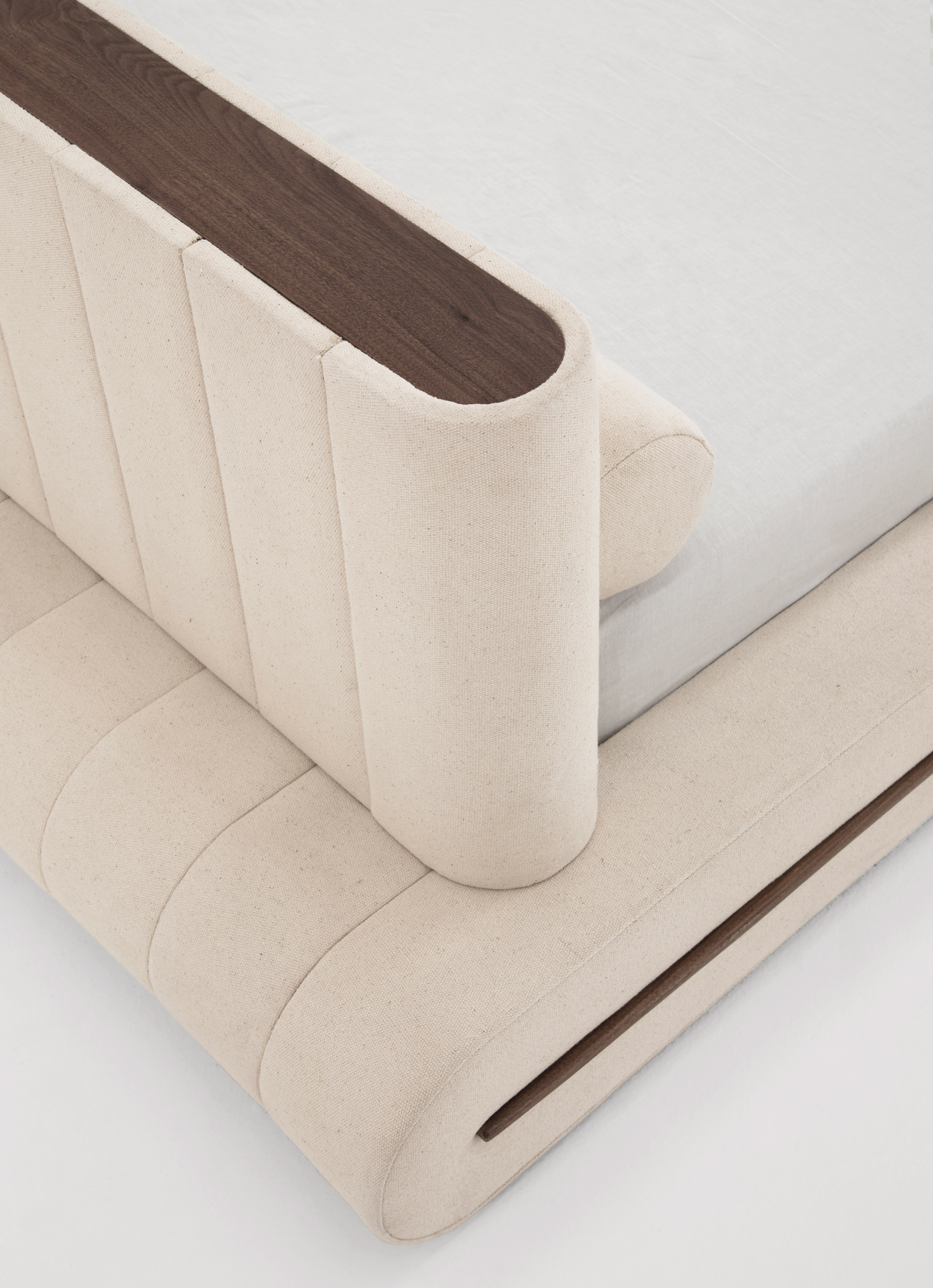
"The legs are paired and create linear negative space rotating around the elliptic apron that follows the contour of the tabletop," said Vidivixi in a description on its website.
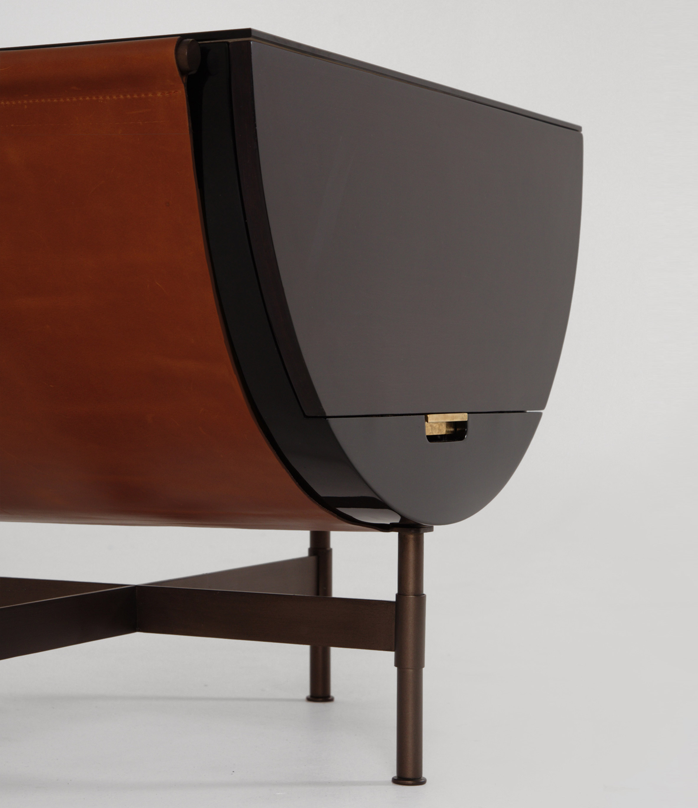
The third table in the set is semi-circular, and features a black lacquered underbelly cradled by a "hammock-like" strip of cowhide. The leather detail is reminiscent of the strap that secures a saddle bag to a horse or donkey, and gives the piece its name Packsaddle Side Table.
Half-circle dark walnut and black lacquered doors are placed on each side of the table, with bronze handles between the two materials. A bronze-coloured glass shelf can be found inside.
Vidivixi's gridded Collector's Cabinet is a departure from the circular and rounded shapes in the rest of the collection.
Open shelves are placed in the blackened steel frame, while blackened-oak drawers slot into the bottom and are lined with pink suede.
Other materials include black marble, used to weigh the structure down, and bronze-tinted glass at the edges.
Vidivixi is led by British designer Adam Caplowe and American designer Mark Grattan.
The duo recently relocated from New York to Mexico City so that they could produce the new collection free from financial stresses.
"Mexico allows you time to develop and focus," Grattan told Dezeen. "However easily distracting it can be, it really allows the design process and development to take its course without pressure of success or rent."
Another studio that transplanted to the Mexican capital belongs to Austrian-Mexican designer David Pompa.
Established in 2013, after Pompa graduated from product design at Kingston University in London, it produces furniture, accessories and tiles, along with lighting, and recently revamped its showroom in the city.
The post Japanese furniture and saddle bags influence Vidivixi's furniture collection appeared first on Dezeen.
from Dezeen https://ift.tt/2NQgZXv
via IFTTT
Trewhela Williams' Sinter House extension "celebrates the sculptural potential of brickwork"
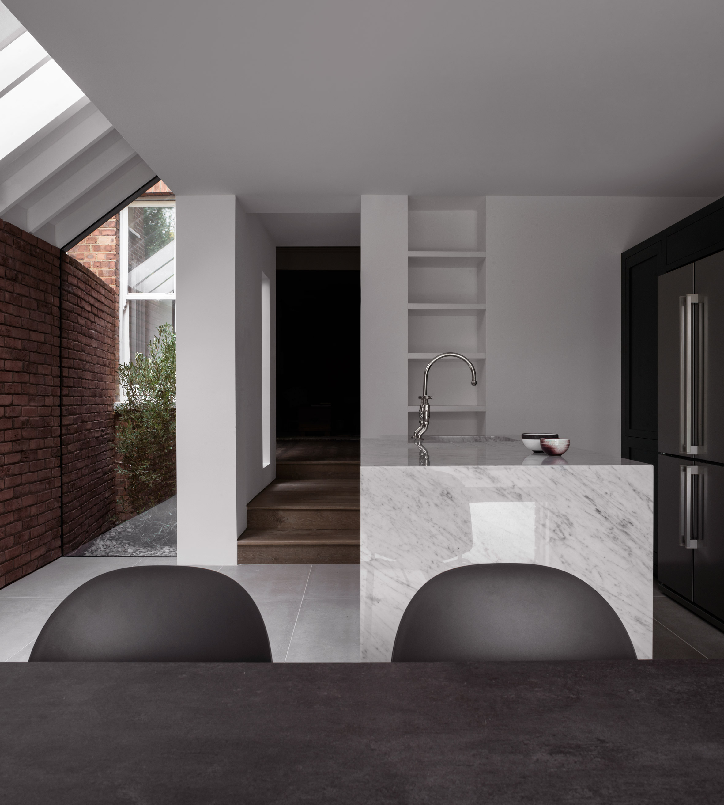
Dezeen September 29, 2018This extension to an Edwardian house in north London by Trewhela Williams features carefully detailed brick surfaces that extend from the exterior into a minimal kitchen and dining room.
The south London-based studio has modernised and expanded the ground floor of the terraced house in East Finchley to create a more liveable family home.
The clients wanted the focus of the house to be an open-plan kitchen and dining space, which necessitated the creation of a rear extension that also improves the connection between the interior spaces and the garden.
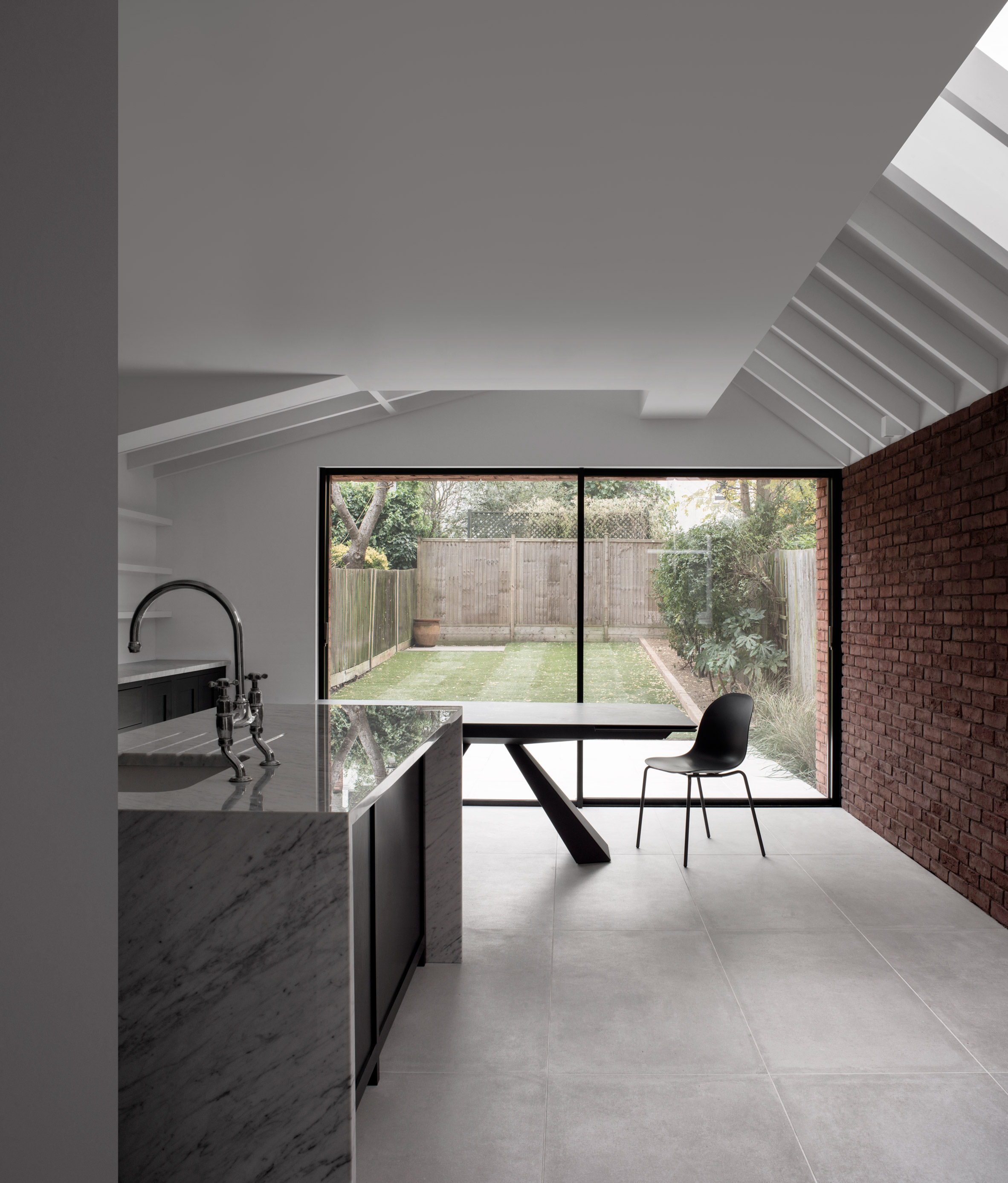
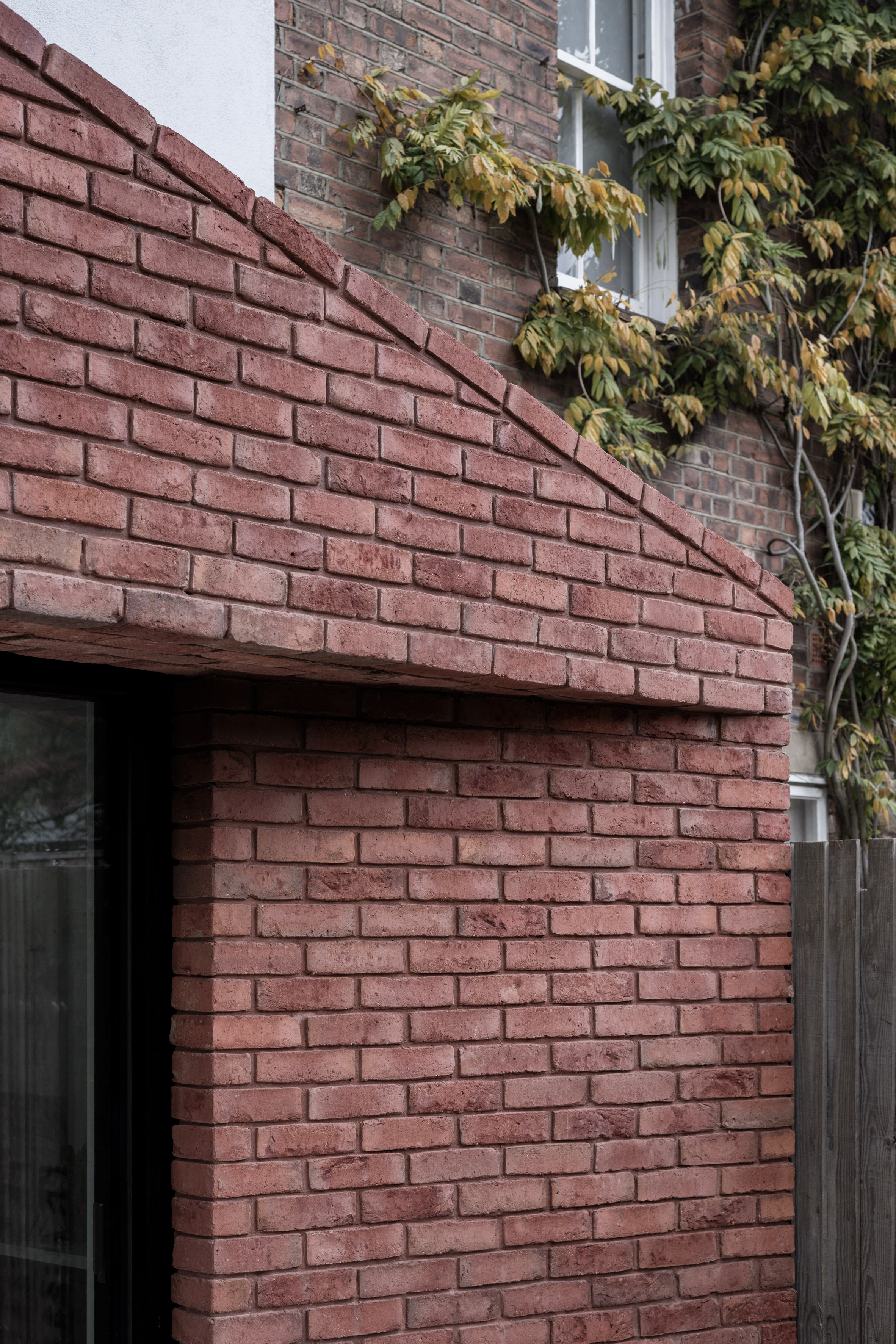
The extension features an asymmetric pitched roof and a simple form that is given a sense of uniformity by the consistent use of a clay brick from the Lower Rhine region, in Germany.
"The clients highly valued the material robustness and sense of timeless offered by brick buildings," Trewhela Williams pointed out.
"This informed the emphasis on celebrating brickwork and its craft through a sculptural approach to the overall built form."
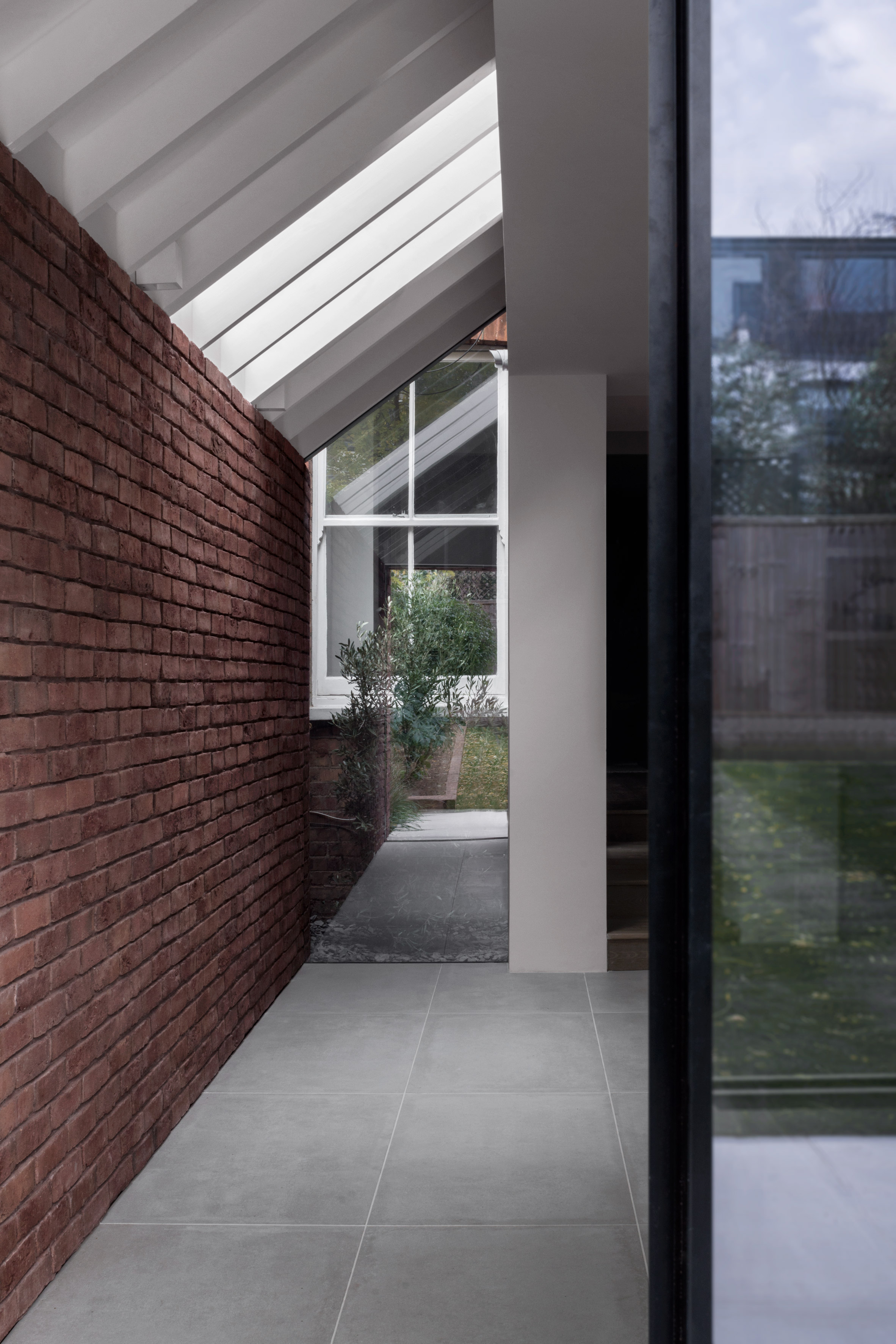
The homogenous brick surfaces lend the new addition a monumental quality that is accentuated by details such as the subtly folded facade, concealed structure and lack of extraneous details.
The extension's end facade features a seamless brick surface with matching maroon mortar. Sloped brick coping, a brick-slip soffit system and various custom-made brick specials ensure that no other materials are visible.
The bricks used for the project were carefully selected to complement the red Fletton brick of the original house. Their variegated tones result from the traditional sintering process used in their production, which also informed the project's name – Sinter House.
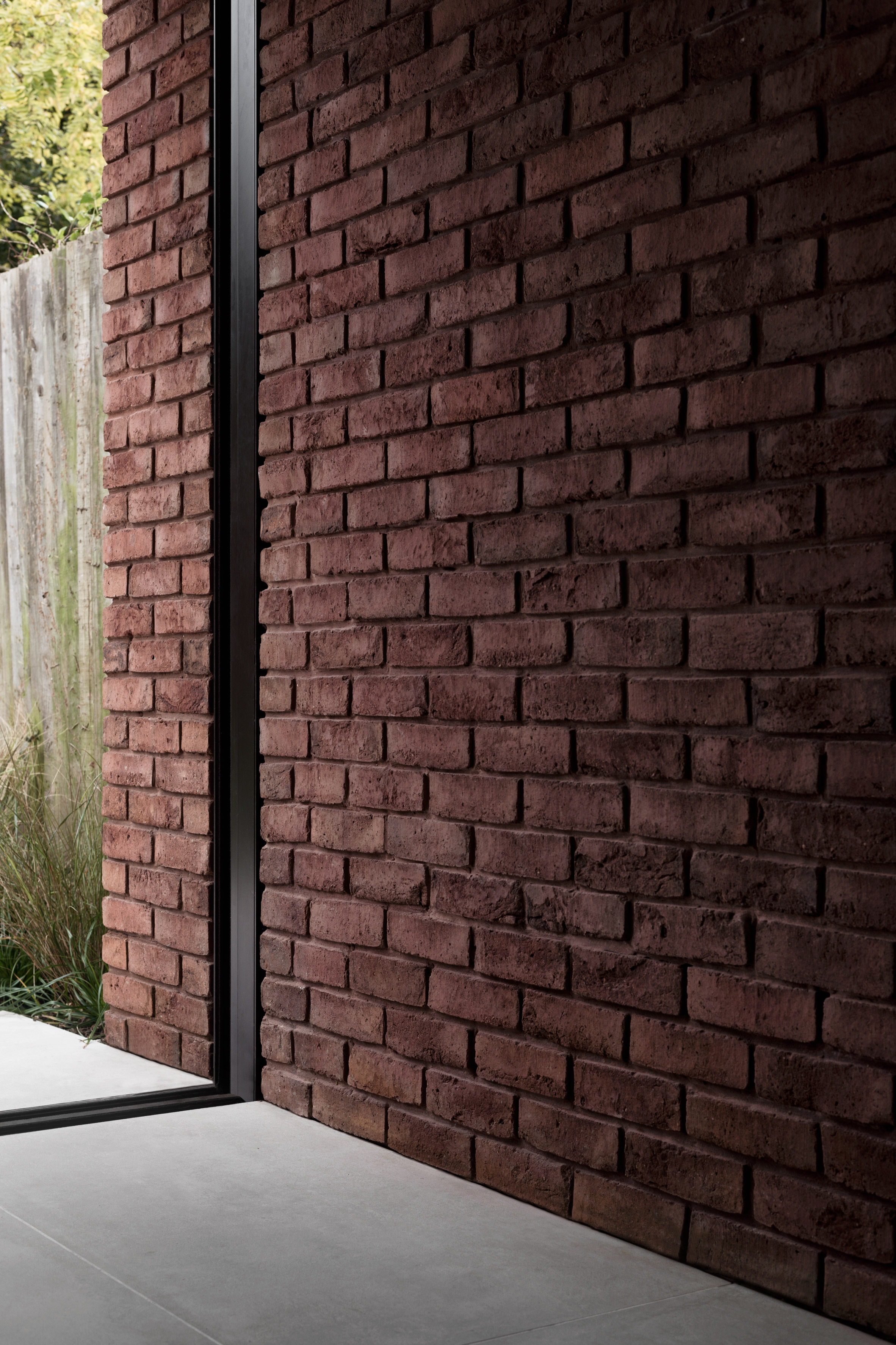
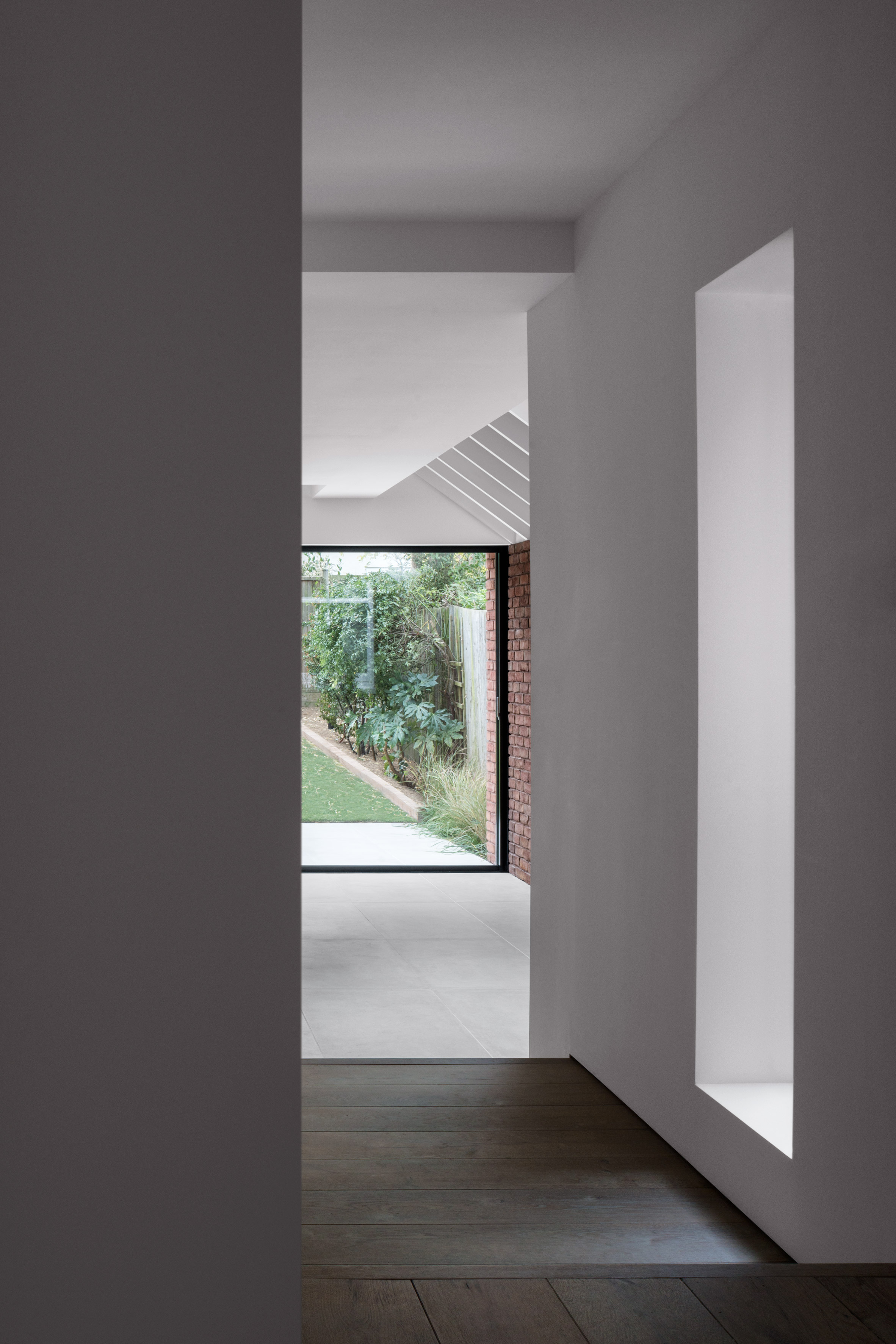
Internally, the brickwork extends along one side of the new room and helps to create a seamless transition between the exterior and interior.
The treatment of materials and the way different surfaces meet is precisely considered and is embodied in the minimal frames surrounding the openings in the brick surfaces.
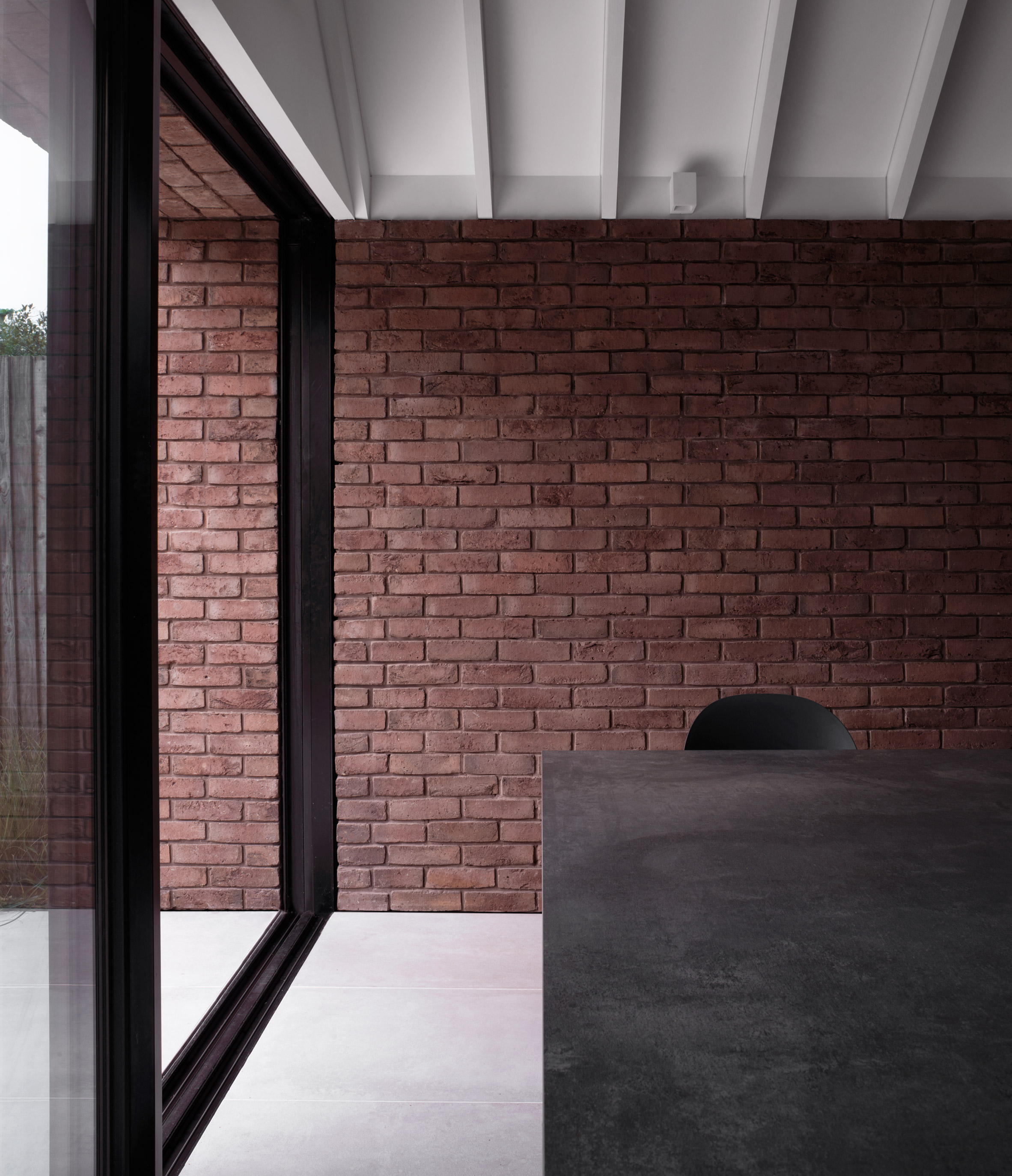
"Subtle details such as shadow gap junctions between finishes help reinforce the overall appearance of elemental simplicity, allowing the qualities of the finishes to come to the fore," the architects added.
A muted material palette including polished marble, concrete-effect floor tiles and white painted walls forms a neutral backdrop for the richly textured and warm toned brick.
The space is flooded with daylight that enters through the glass sliding doors, as well as a roof light set above a section of the brick wall.
A row of exposed rafters that extends past the roof light creates a vertical rhythm within the room that is accentuated by the play of light and shadow across their surfaces.
Additional daylight is introduced by a small, planted lightwell inserted between the old and new parts of the building. An original sash window looking onto this compact feature ensures light also reaches a reception room at the front of the house.
Also in London Matheson Whiteley added a pared-back brick extension to Sebastian Wrong's Victorian house, while Simon Astridge added a white-brick extension to a home in north London.
Photography is by Simone Bossi.
The post Trewhela Williams' Sinter House extension "celebrates the sculptural potential of brickwork" appeared first on Dezeen.
from Dezeen https://ift.tt/2y2HKxc
via IFTTT