10 of the best installations at London Design Biennale 2018
September 04, 2018London Design Biennale opens to the public today. Design editor Augusta Pownall picks the 10 installations worth spending time at, including a condensation-covered wall and a skeletal house made of white rods.
Now in its second edition, London Design Biennale is on show at Somerset House, with entries from 40 countries and territories, ranging from Saudi Arabia and Australia, to Leeds and Dundee.
The biennale's artistic director Chris Turner set the theme Emotional States.
"We obviously live in very emotionally turbulent and politically polarised times, and the choice of Emotional States as a theme was intended to reflect and confront that. What role can design play in creating, reinforcing or alleviating those conditions?" he told Dezeen.
Through this lens, the entries seek to answer big questions about sustainability, migration, pollution, energy, cities, and social equality.
"Good, socially-engaged design can help foster a sense of community and cultivate the conditions of positive well-being, and many exhibits at the Biennale explore such possibilities," said Turner. "We wanted to broaden the debate from issues of aesthetics and consumerism to look at more politically-engaged design."
The biennale is on show from 4 to 23 September 2018, coinciding with London Design Festival 2018.
See the top 10 picks below:
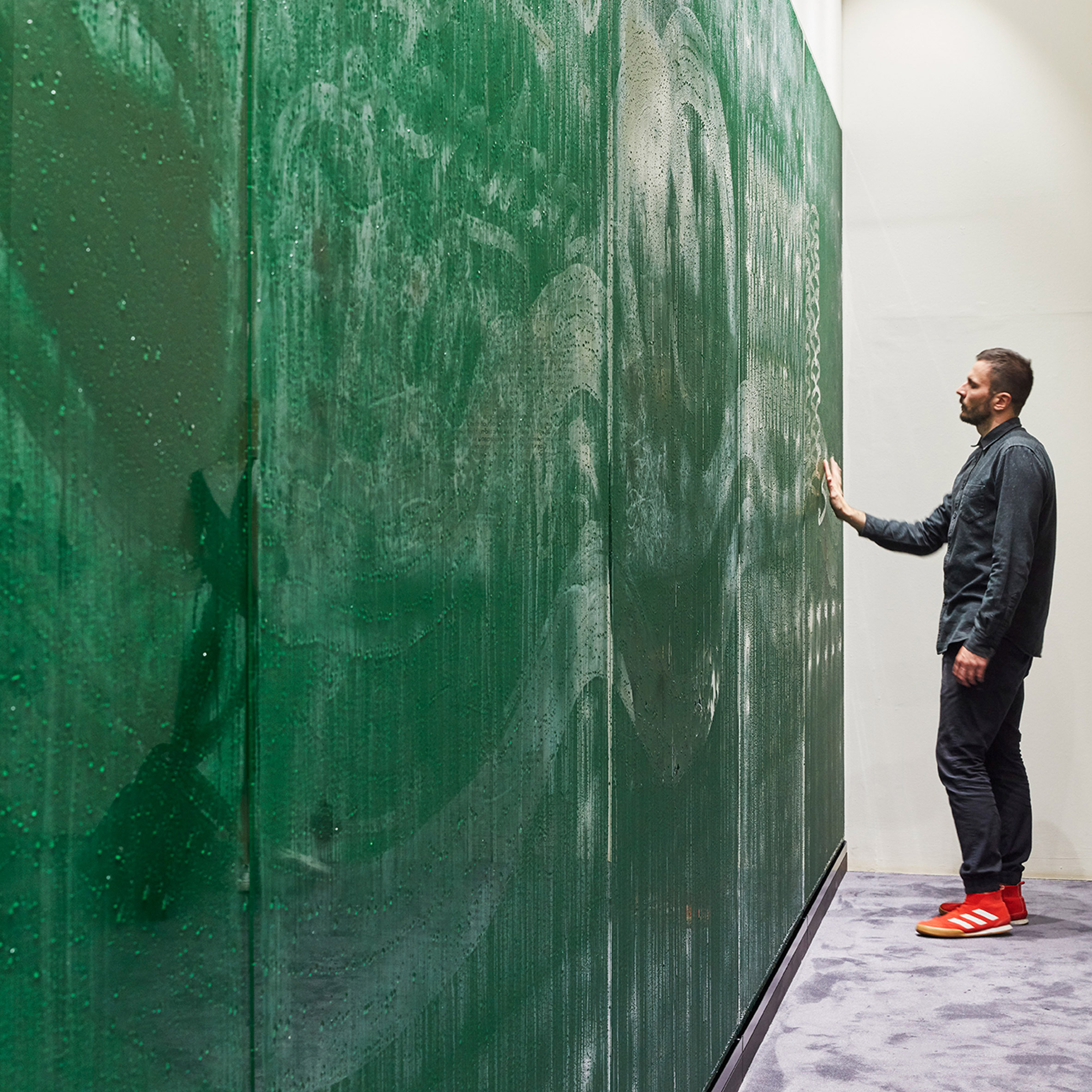
Latvia: Matter to Matter
Latvia's entry consists of two elements that together create a space for reflection, where visitors are invited to explore the relationship between people and nature.
The first is a condensation wall that visitors are invited to write on with their hands, while the second is a bench in front, made from wood grown in Latvia. The amount of each wood used is proportionate to that tree's prevalence in the country.
Latvian designer Arthur Analts, who created the project, studied at Central Saint Martins and lives in London. He told Dezeen that adults are initially cautious about approaching the piece.
"They tend to start drawing very reserved, by leaving a small mark, but when they see that it truly disappears in a couple of minutes they become more relaxed and start to express themselves more freely. Whereas kids – they just don't care – they express themselves!" he said.
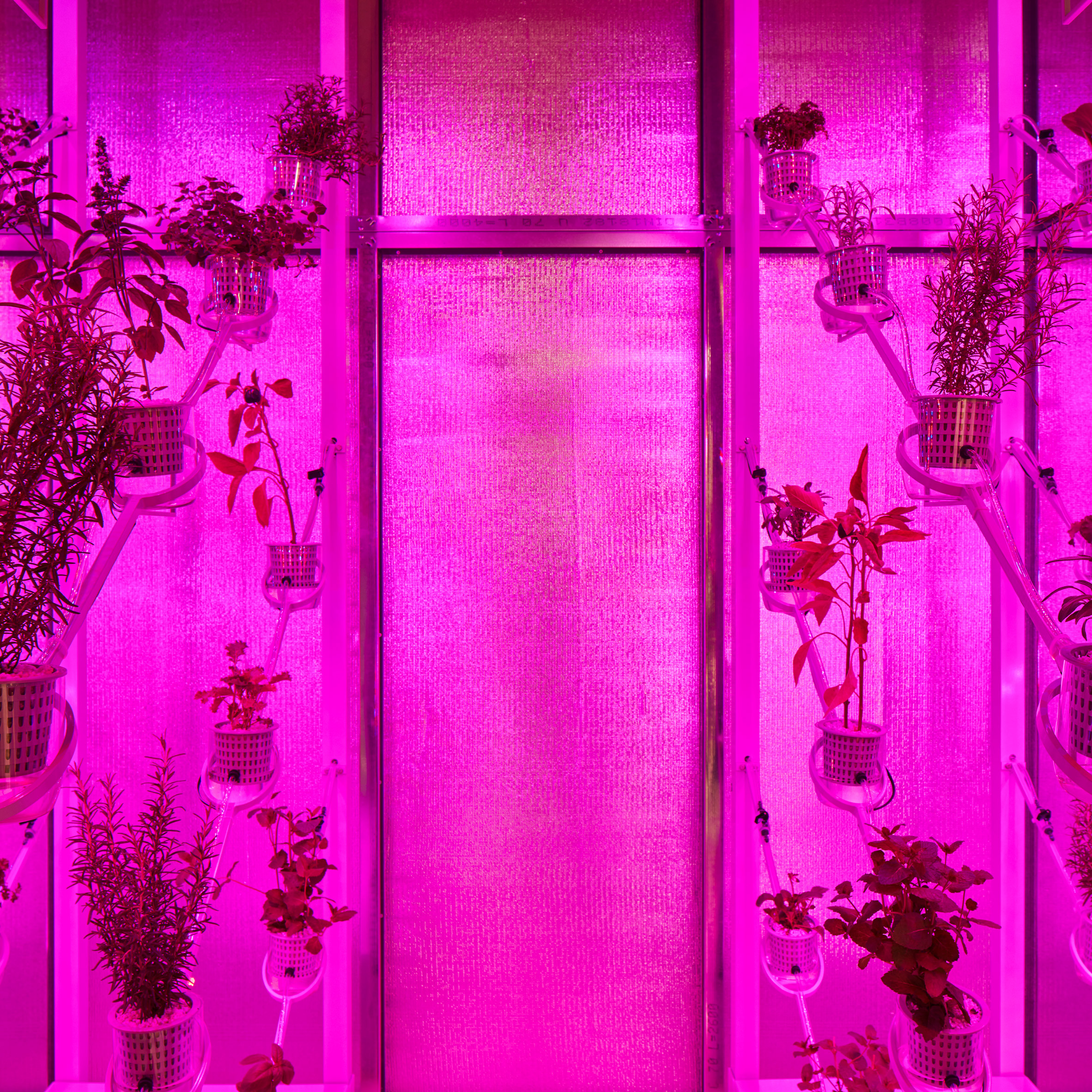
The Netherlands: Power Plant
The Dutch installation is a greenhouse of the future that uses sunlight to both produce food and generate electricity, designed by inventor and solar designer Marjan van Aubel.
With the population ever-growing and climate change reducing the available space for cultivating crops, this glass house is enhanced by a hydroponic system to circulate nutrient-rich water, and coloured LEDs to increase plant growth. The glass structure glows bright pink, as reds and blue rays are absorbed by plants in order to grow.
Though this greenhouse is firmly on the ground in the east wing of Somerset House, the curators hope that in future it will be used on city rooftops.
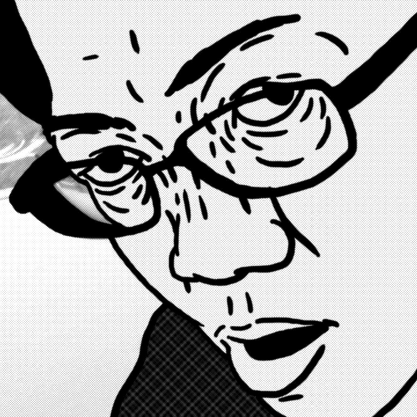
Taiwan: Invisible Calls
Taiwan presents work by two very different new media artists. The first, by Cheng-Chang Wu, plays on three tandem screens. Visitors should be sure to walk past the easy-to-miss grey curtain into the second room, where Che-Yu Hsu's film is played.
The work lays animation over real life footage to tell the story of two events that happened in the artist's hometown through his brother's reaction to them; one an incident where teenagers murdered each other, the other a severed female head being found in the river.
Drawing on the practice of animating recent news events and posting them online that is widespread in the Taiwanese media, the artist combines the memory of the forensic illustrator tasked with drawing the severed head with that of his brother.
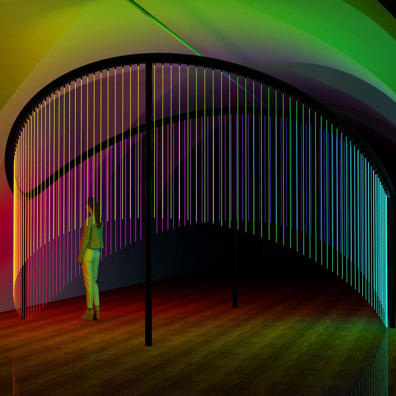
Australia: Full Spectrum
Australian designer Flynn Talbot presents an installation comprising 150 strands of coloured fibre optic lights that visitors can touch and stand within to be bathed in technicolour light.
The work is a reaction to and celebration of Australia's decision to allow same-sex marriage at the end of last year.
"There is a new wave of what love means in Australia since the vote in December last year and I wanted to celebrate with my rainbow coloured light installation and try to connect people with this feeling," said Talbot.
"I hope this is a point for discussion on the topic with other countries and that in these times, love can heal and repair all things wrong with the world. And I wanted to wow and excite people by giving them an immersive experience!"
Turkey: HousEmotion
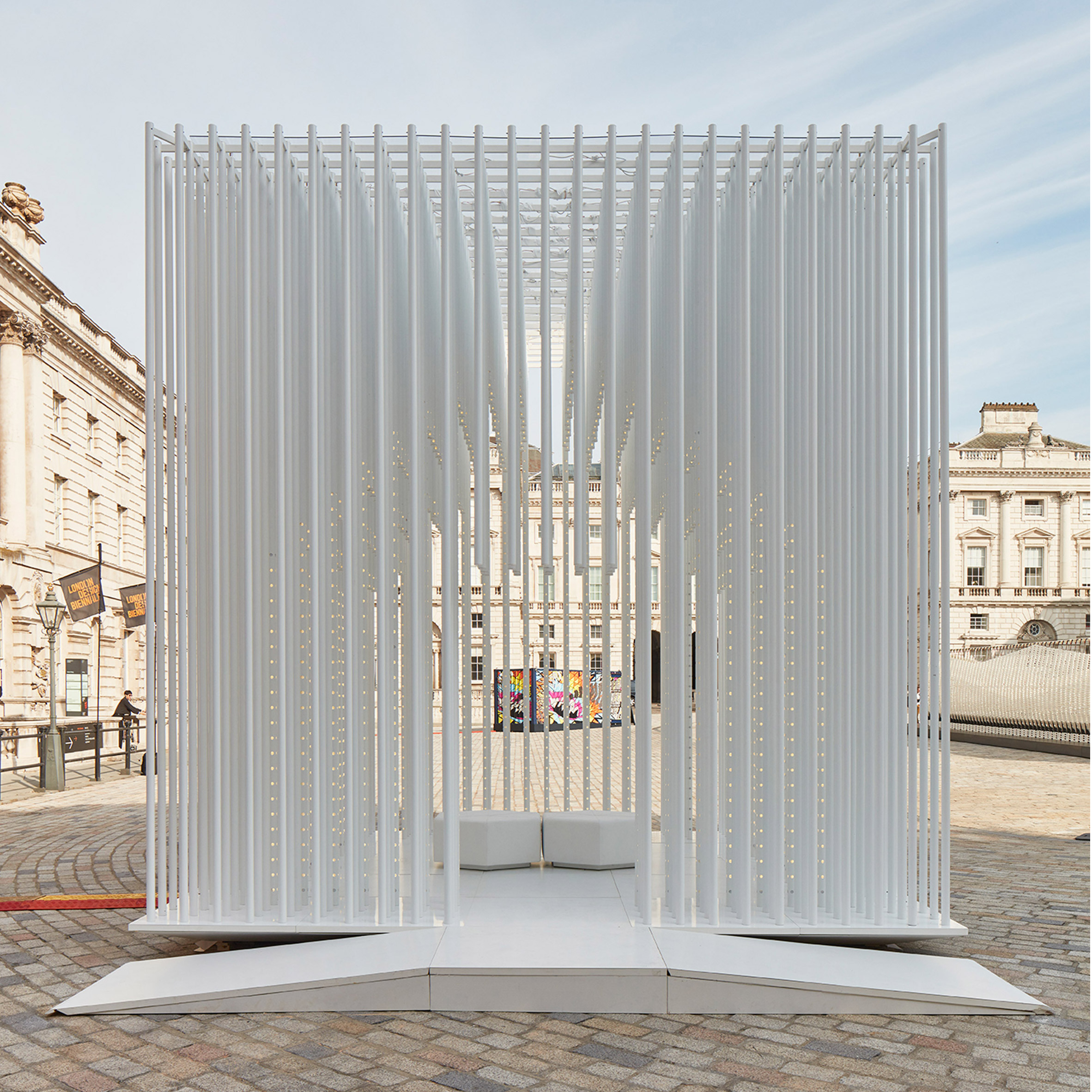
The Turkish pavilion is a cubic form made of white rods that represents the most basic form of what a home could be. Two seats at the centre of the space allow visitors to relax and chat. At night the rods light up, so the whole structure glows like a beacon and takes on a different feel.
The Istanbul-based practice behind the entry, Tabanlioglu Architects, built the first shopping mall in Turkey in the 1950s. The lead designer of this project, Melkan Gürsel, told Dezeen that scale is what defines architecture in cities, as the materials used are often similar.
"To find the right scale, and to use scale in architecture is very important," she said. "You will feel more comfortable in a structure that's not very big. You should never feel small inside somewhere."
Italy: L'Architettura Degli Alberi
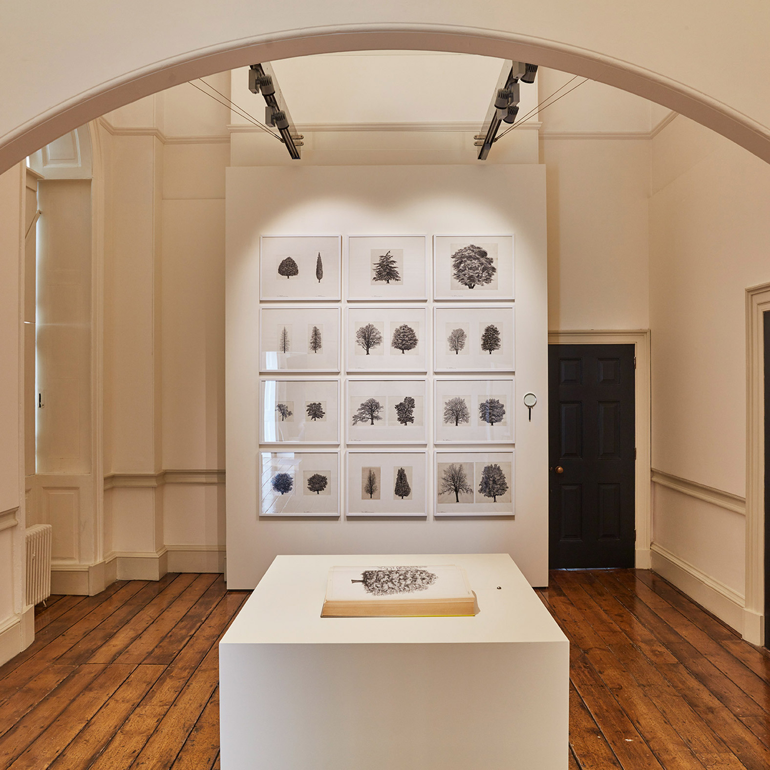
Italy's simple entry is a selection of 24 drawings of tree species, chosen from the nearly 400 original drawings in L'Architettura Degli Alberi.
The book, published in 1982, was the culmination of a 20-year-long study of trees by Cesare Leonardi, a then student architect who recalled that when looking at trees, he "felt a greater attraction than for the forms of architecture."
His photographs were redrawn in scale by architects in his and Franca Stagi's practice and the book ultimately became a handbook for the design of public parks.
UK: Maps of Defiance
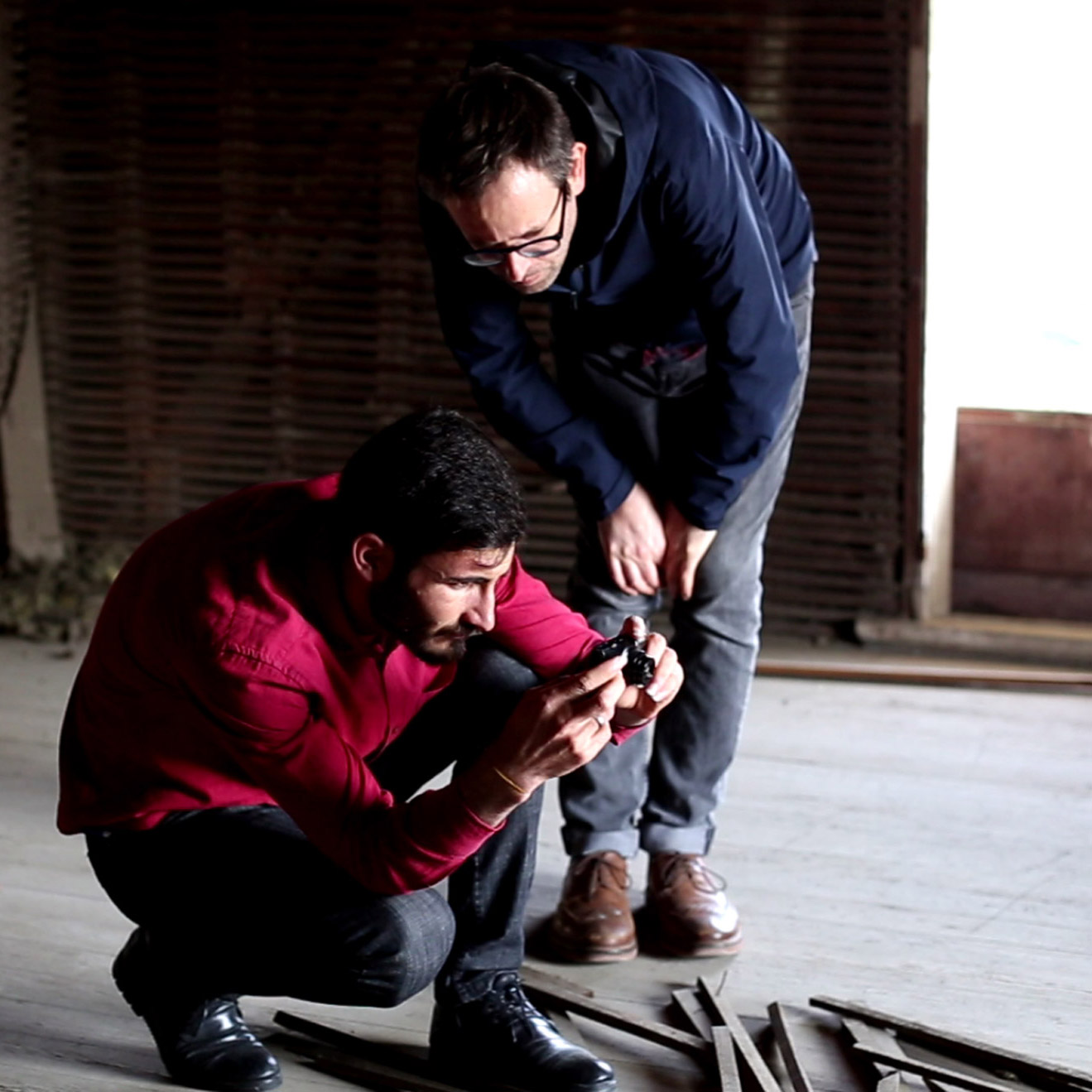
The UK entry documents efforts by Forensic Architecture alongside Yazda, a not-for-profit organisation, to record the 2014 destruction of the Yazidi people's cultural heritage by ISIS, an act they define as a genocide.
The exhibition includes a mixture of YouTube footage, photography, and an explanation of their research techniques. These include imagined reconstructions of ruined shrines and mausoleums by comparing satellite imagery and cross-referencing these with photogrammed 3D models to understand the scale of the destruction.
Survivor testimony also forms part of the entry, curated by the V&A, which makes for a sobering but necessary experience.
Refugee Pavilion: Inspiration through Creation
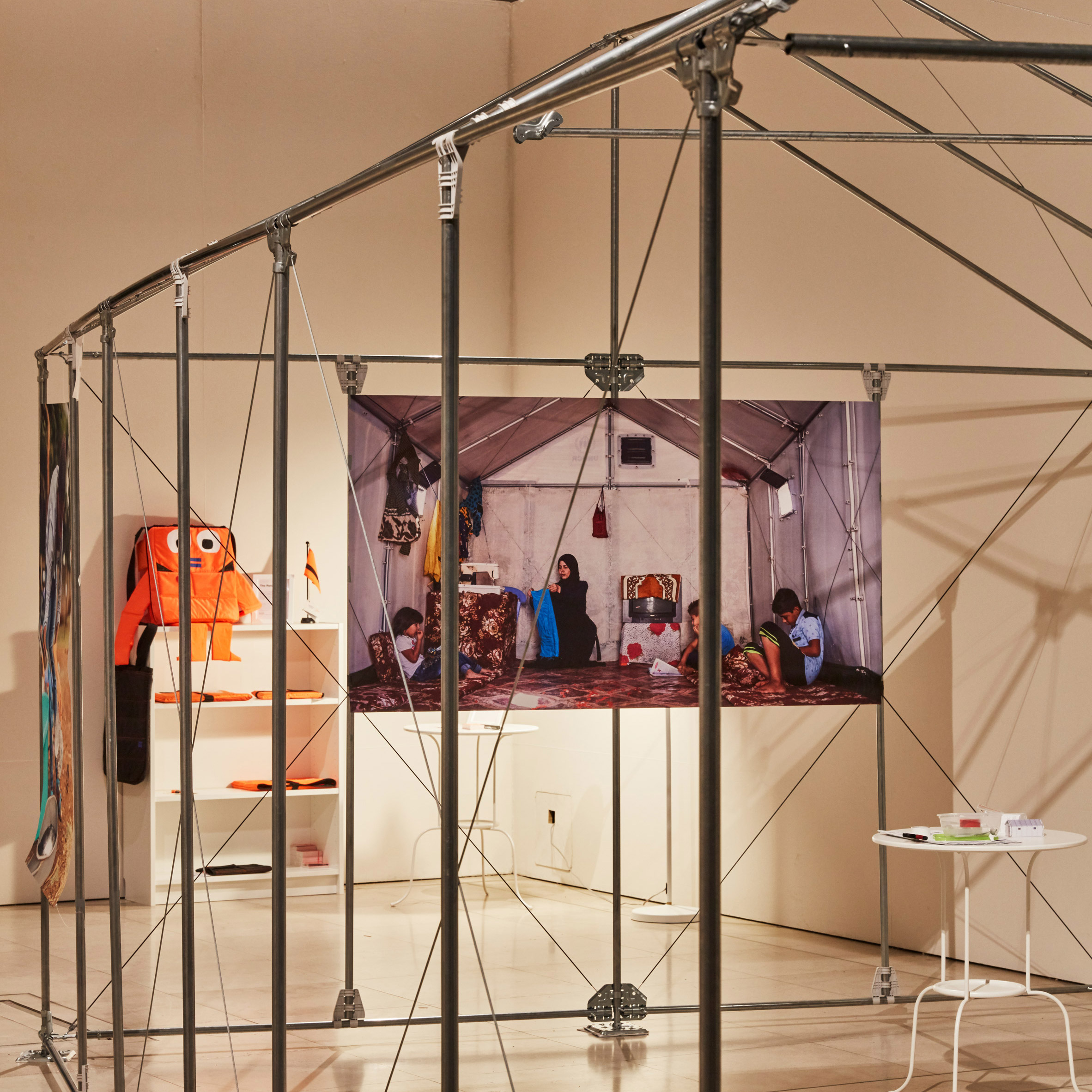
For the first time, the biennale includes a space to represent refugees, which is housed within the framework IKEA Foundation's Better Shelter, a structure that can be assembled by four people in just a few hours from the contents of two cardboard boxes.
The shelter contains a collection of objects made by refugees, and throws light on the fact that although the housing in refugee camps is necessarily temporary, the camps themselves are often anything but.
The entry is put together by Curators without Borders, an organisation with the specific remit to advocate for underserved communities worldwide.
Lebanon: The Silent Room
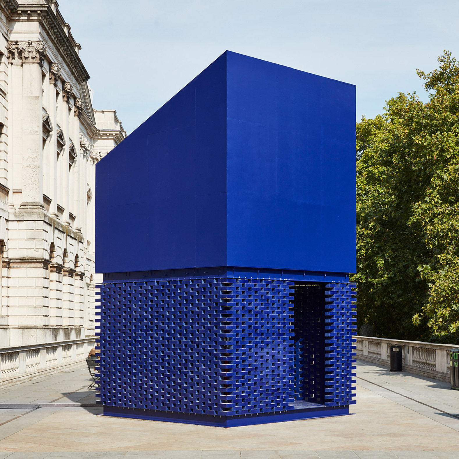
Overlooking the Thames, The Silent Room is a noiseless cocoon-like structure that offers visitors respite from the noise and relentless energy of the city.
A blue geometric wedge of a building, it also offers a critique of the politics of city planning – data mapping has shown that the poorest parts of a city are often worst affected by noise pollution.
Designer Nathalie Harb previously installed a pink Silent Room at Beirut Design Week last year, but this is the first time that visitors to London can enjoy its isolation.
China (Nanjing): The Memory Project of Nanjing Yangtze River Bridge
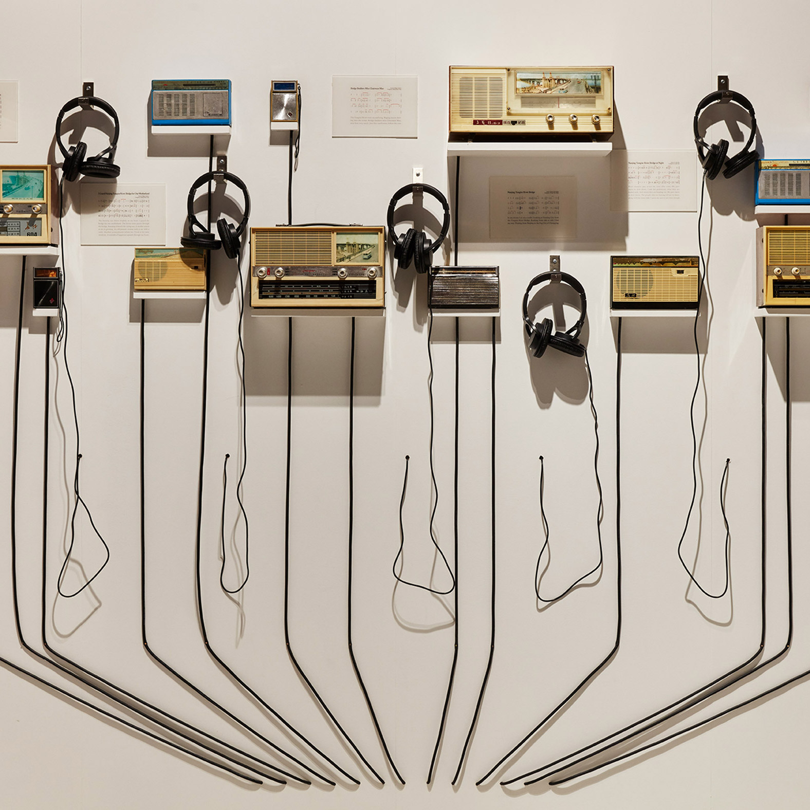
The Chinese entry shows how a bridge completed in 1968, which links the north and south banks of the Yangtze River, played an emotional part in everyday Chinese life, plastered across mirrors, bikes, bags, and hundreds of other objects, photos of which are on display.
The display also includes the sounds that were piped into trains crossing the bridge, played through period radio sets.
"Because this bridge was politically very important, it started to invade into everyday life, and to establish a very intimate relationship with everyone," said curator Andong Lu from Nanjing University.
The bridge has become a famous suicide spot, so the question remains of how to redevelop the 10-hectare area around it, to reclaim the political monument and best serve the community.
Photography is by Ed Reeve.
The post 10 of the best installations at London Design Biennale 2018 appeared first on Dezeen.
from Dezeen https://ift.tt/2oFPzVg
via IFTTT
0 comments