London townhouse updated with pared-back materials and patterns
November 18, 2018Merrett Houmøller Architects has renovated and extended a house in north London using a consistent palette of simple materials and repeated patterns.
Cornerstone House was the first commission for the studio, which was founded in 2014 by Peter Merrett and Robert Houmøller and now has offices in London and Sheffield.
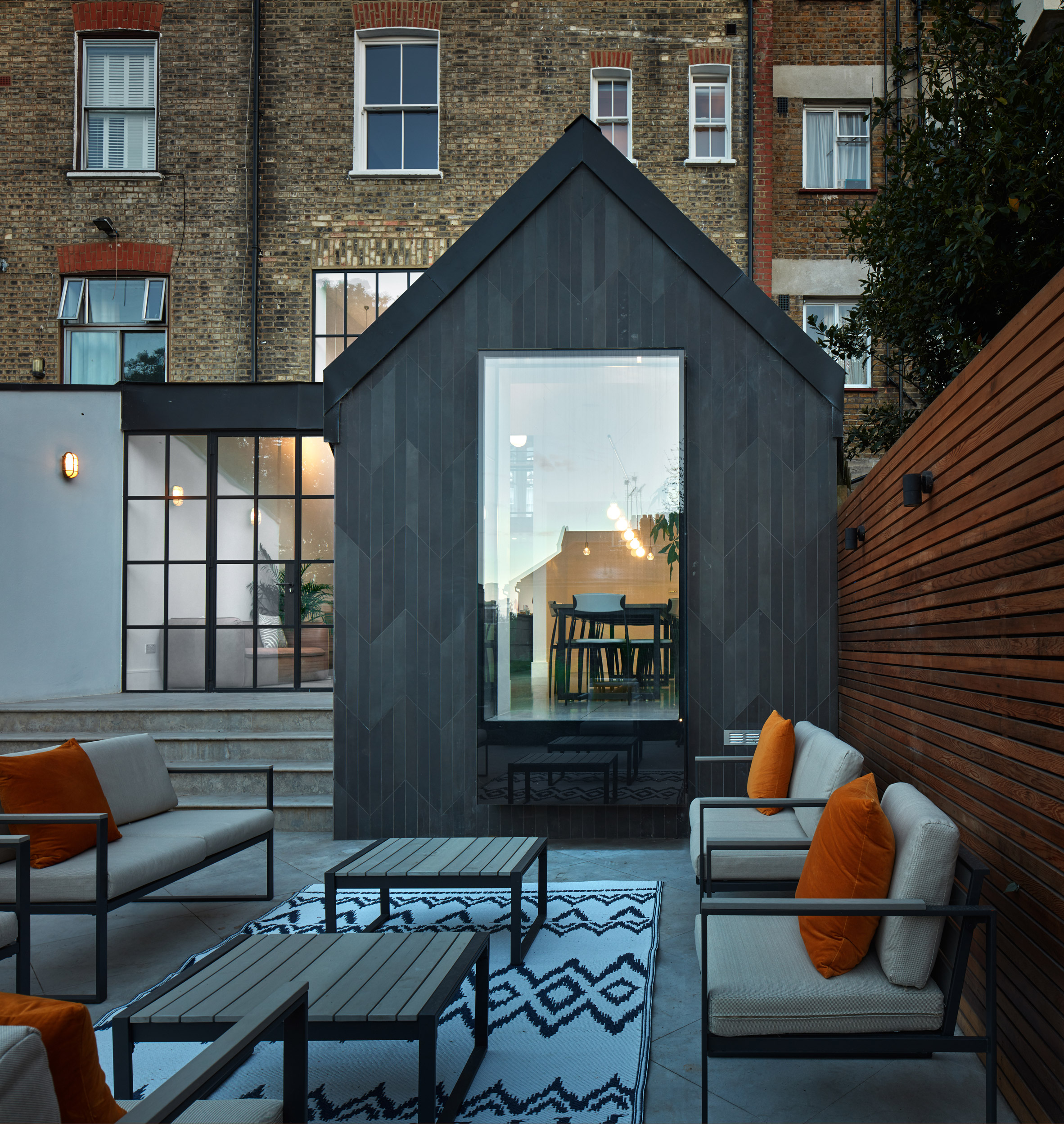
The architects renovated the historic property in Crouch End, creating a double-height space and adding a modern extension that enhances its connection with the rear garden.
The townhouse's interior previously comprised a series of dark and cramped rooms. The main aim of the project was to open up these rooms to create brighter spaces with improved circulation and visual connections.
"Carving out walls and windows in the home's new interconnected and layered spaces works both for practical purposes and to create a sense of dynamism throughout a once-stale period property," explained Houmøller.
"Rooms are visually linked but physically separated, letting in light and visual movement, yet retaining privacy and spatial divides."
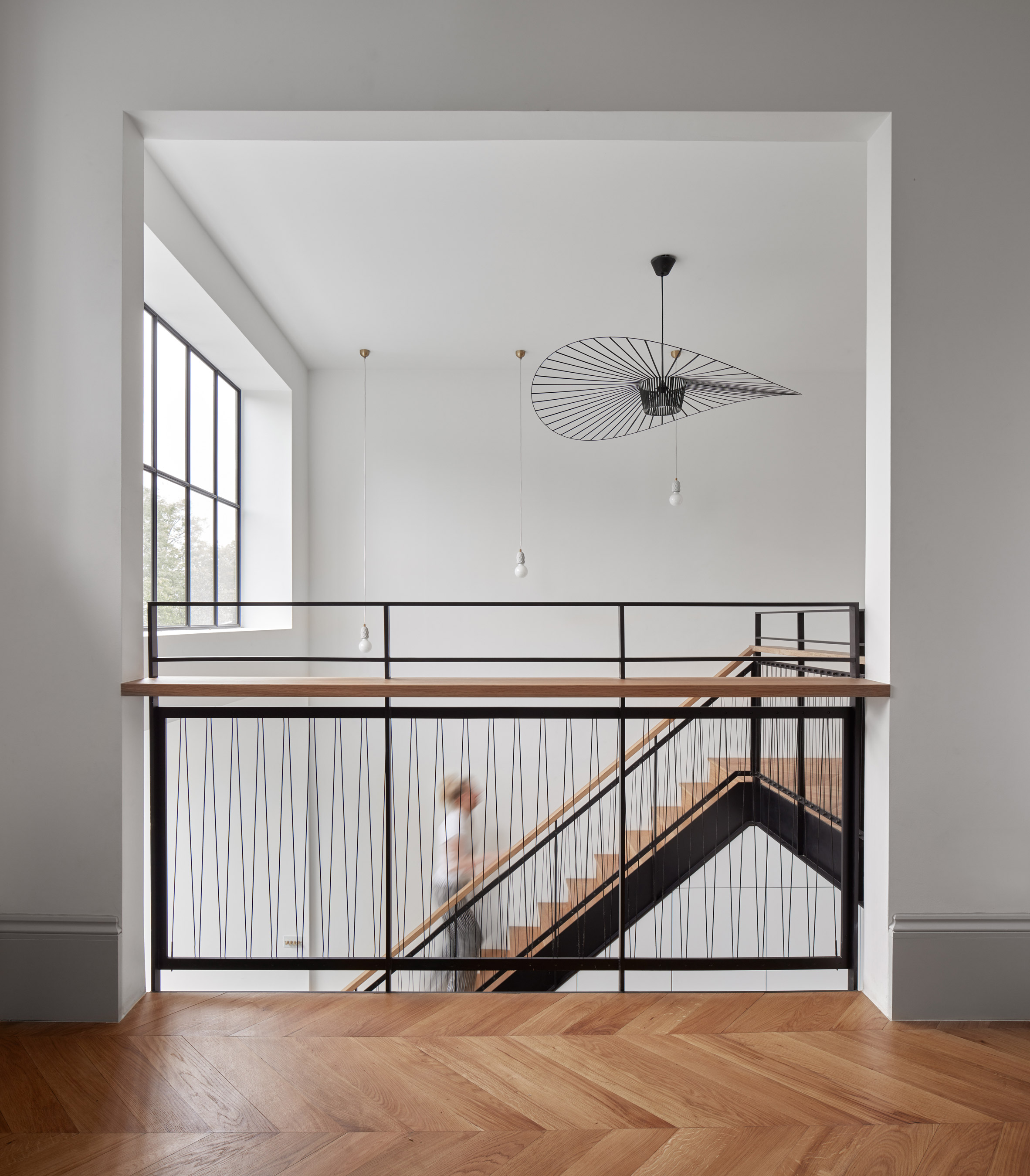
A key intervention is the creation of a double-height space connecting the entrance level with the kitchen and dining areas, which were relocated to the same level as the restructured rear garden.
A new mezzanine overlooks the kitchen and large glazed doors that can be used to open this space up to the outdoors and allow daylight to reach deep into the plan.
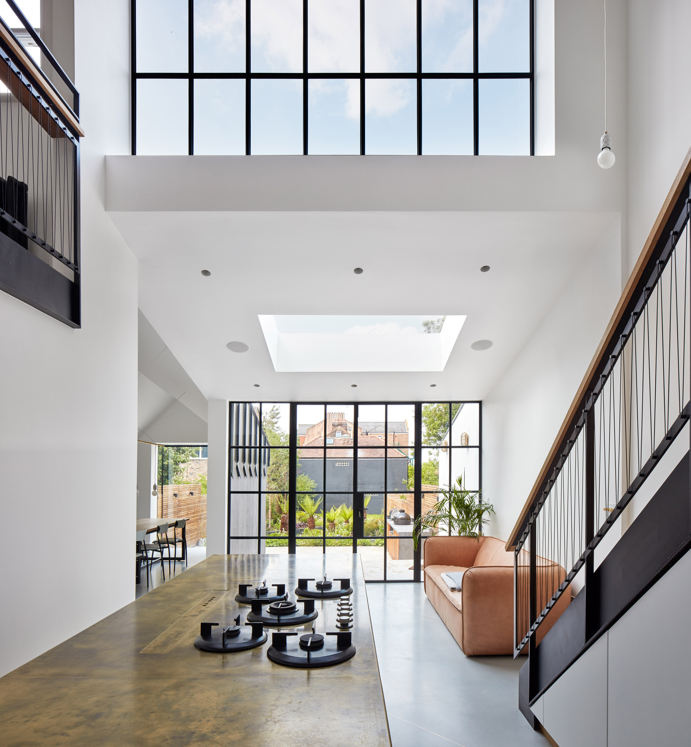
The two levels are connected by a new timber and blackened-steel staircase, which features a balustrade that extends around the edge of the mezzanine to enhance the visual connection between the floors.
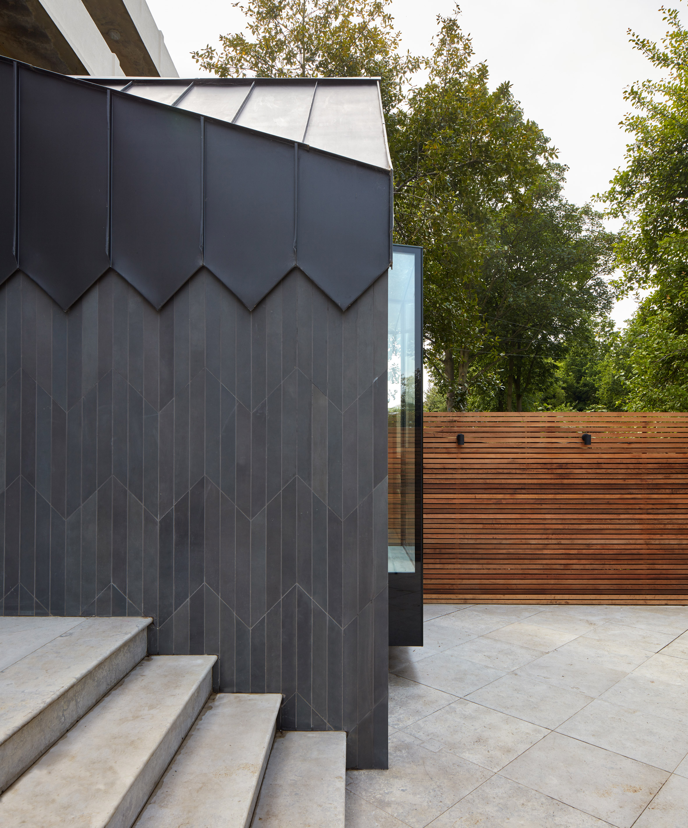
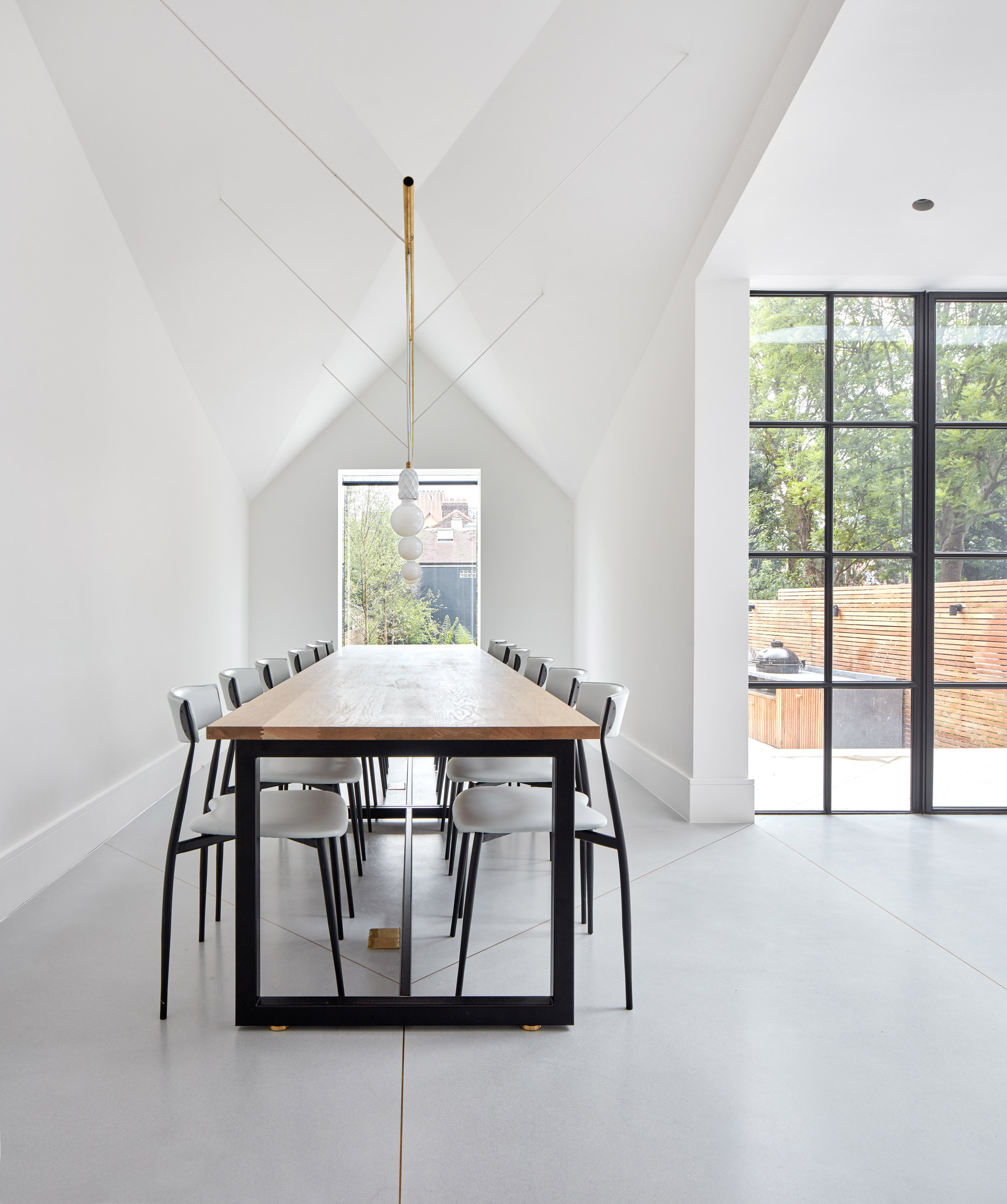
To the rear of the property, the architects introduced a new dining room contained within a gabled extension that is clad in charcoal-coloured porcelain tiles and topped with a black zinc roof.
The dining room features furniture and lighting designed in collaboration with the homeowners, and its gable end incorporates an oriel window that frames views of the garden.
At the bottom of the garden, the architects added a partially sunken studio cabin clad in dark rubber, which provides a dedicated space for home working in addition to the property's converted front basement.
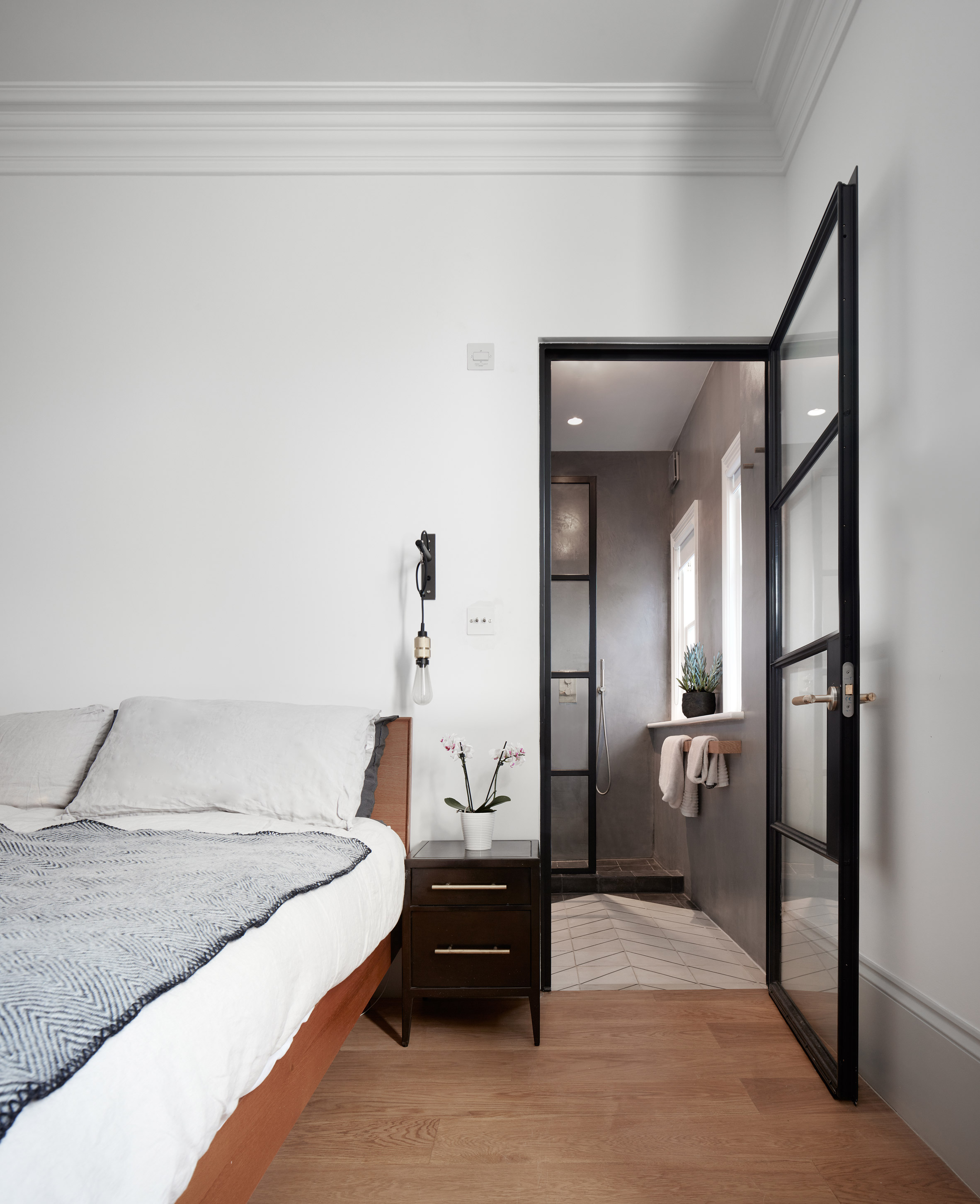
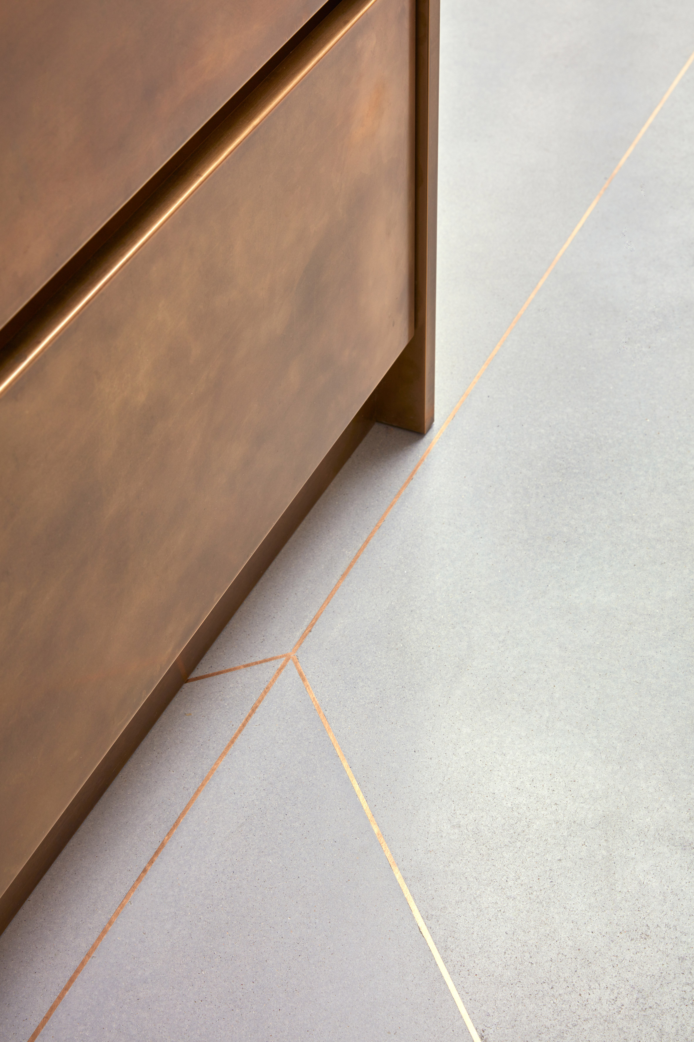
Throughout the old and new areas of the house, a variety of recurring materials and patterns ensure a sense of consistency. In particular, a chevron motif is applied in areas such as the restored parquet flooring and the brass-inlaid concrete on the lower ground floor.
"Marking tension between the existing Edwardian house and the new addition was important to us," added Houmøller.
"Using different materials, but applying them in the recurring chevron pattern allows the old and the new to have distinct identities but for the whole house to read as one entity."
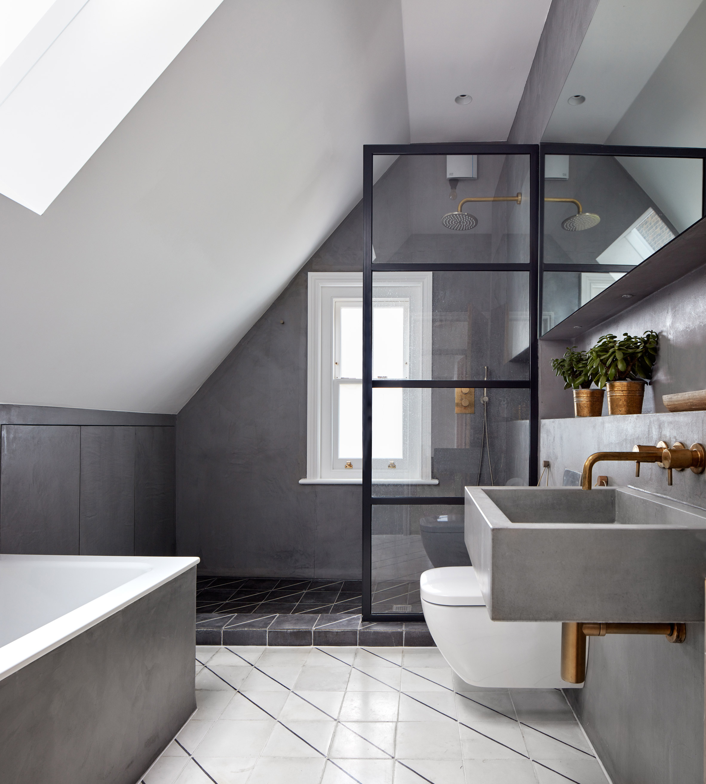
The 45-degree angle of the chevron pattern is echoed in the pitch of the rear extension's roof, as well as in the edges of the porcelain tiles and the black zinc used to clad its exterior.
The garden paths and planting are also angled, as are brass strips inlaid into the polished concrete that extends from the living areas onto the external deck. Black and white tiles in the bathrooms are bisected by diagonal stripes.
A simple palette of colours and materials applied throughout the interior provides "a nod to Edwardian design restraint". White walls combine with black steel or painted timber, with floors finished in either polished concrete or oak.
Merrett Houmøller Architects also designed a colourful pop-up kitchen for refugees and asylum seekers to share meals at as part of a project run by the British Red Cross.
Photography by Alan Williams.
Project credits:
Architect: Merrett Houmøller Architects
Landscape architect: Field & Waite Design
Structural engineer: Michael Hadi Associates
Main contractor: Aston World
The post London townhouse updated with pared-back materials and patterns appeared first on Dezeen.
from Dezeen https://ift.tt/2Kf9QdX
via IFTTT
0 comments