"This is everything that is wrong with design"
February 05, 2019
In this week's comments update, readers are questioning Nikolas and Lukas Bentel's decision to design vision-impairing Squiggle Glasses.
Blindsided: Instagram's face filters inspired New York-based brothers Nikolas and Lukas Bentel to design the Squiggle Glasses. The thin, wavy lined spectacles partially obstruct the wearer's view, disgruntling readers.
"What are the limits of the term designer? At what point does one's antics void their title of designer and earn them title of prankster," asked Catcassidy.
Taki182 went on: "No doubt this pair of millennial rascals are going to be very pleased with the attention their little stunt has got them."
Keith Dougal was particularly annoyed: "This is everything that is wrong with design. In a world grappling with plastic waste, and heading for energy and resource shortages, items like these should be illegal. The object equivalent of an oxygen thief."
"Plastic waste for our oceans! Adding rubbish to Pacific plastic island!" agreed Dario.
This reader had a physical reaction to the brother's design:
What do you think of the Squiggle Glasses? Join the discussion ›
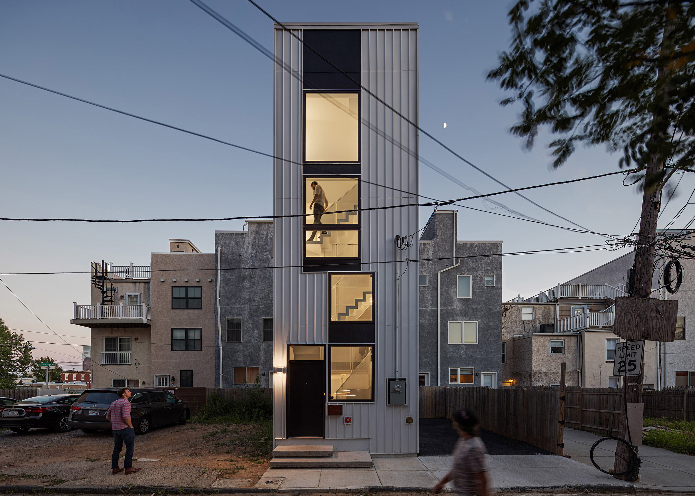
High hopes: commenters like the concept of Tiny Tower – a slender house in Pennsylvania built by ISA as a housing prototype for tiny vacant lots – but some are concerned about the project's stairs.
"I absolutely love Brian Phillips and all of the awesome work his firm is doing with less than stellar commissions, budgets, and sites," praised Archi.
Benny replied: "While this answers a need for younger folks looking to build and buy, it does not aid seniors or those with mobility issues who are wishing to downsize, relocate or buy into the inner city. Stairs tend to become the enemy as one ages."
"Imagine getting up to your bedroom and realising you left your phone in the kitchen. StairMaster!" added Katie.
Three Floating Orbs continued: "One thing's for sure, the residents are going to be fit!"
One reader had a different worry, asking:
What do you think of Tiny Tower? Join the discussion ›
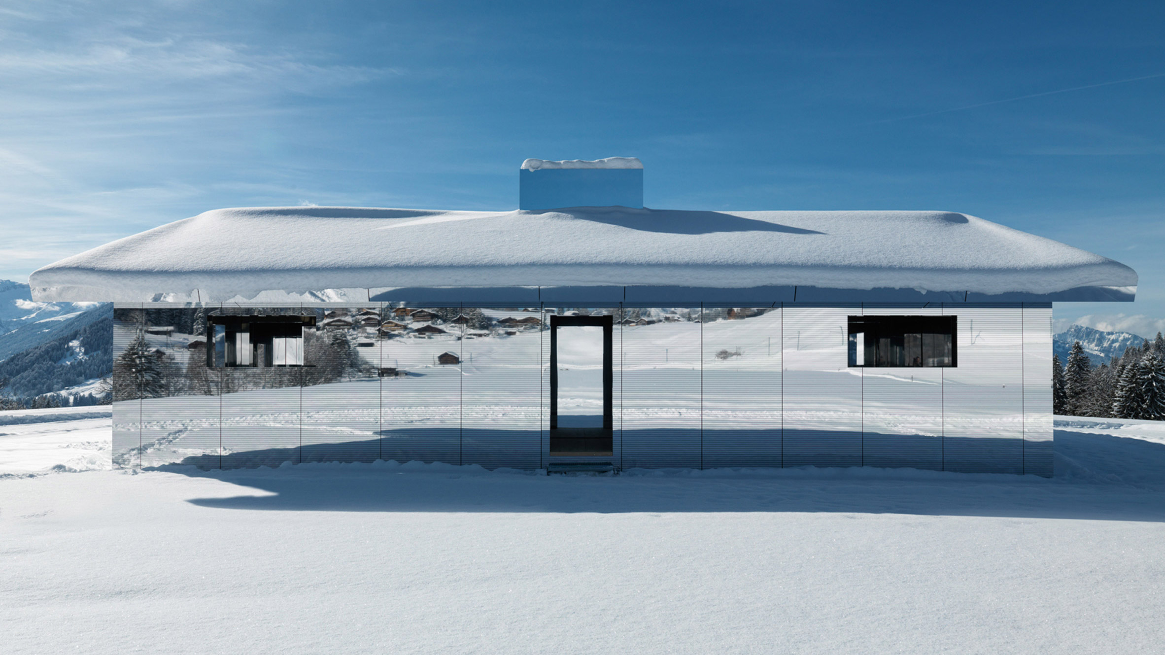
Bird's-eye view: a mirrored house installation designed by American artist Doug Aitken, has readers concerned about the welfare of local birdlife.
"It's the laziest, the most cowardly architectural move to put a mirror building in a beautiful landscape," wrote Miles Teg in anger.
Annie was worried about how the structure will affect the local wildlife: "Many birds will die in the name of this vanity."
"But the birds! Cool little structure, would be a fun visit," replied Abruce sarcastically.
Jb agreed: "Is very cool, at a funhouse level."
This commenter wasn't convinced however:
Is it irresponsible to design a mirrored building? Join the discussion ›
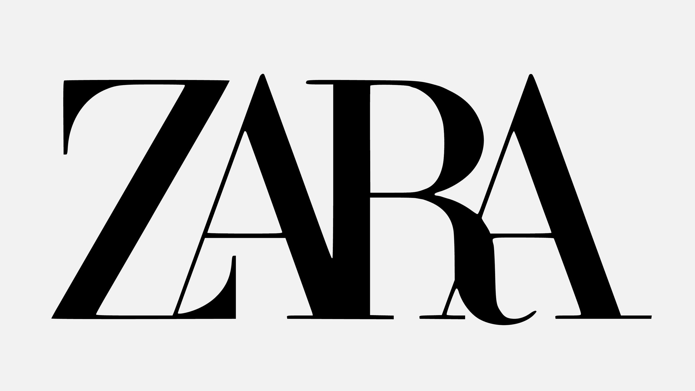
Move over: Zara caused controversy this week with its logo redesign by French agency Baron & Baron. The rebranding features a minimal typeface, similar to that previously used, but with overlapping curvy letters.
"As always with logos, what was wrong with the previous one?" quizzed Arhmatic.
Michael Wigle seemed to sympathise with the fashion retailer: "I may not find the logo as aesthetically pleasing as the former (which reminded me of an eye exam) but at least I can appreciate what it is saying about the brand."
"This is the 'no sweat' option from Baron & Baron,"explained Urban. "Check out the Diane von Furstenberg and NARS logo Baron & Baron designed some time ago (exactly the same trick with the kerning, it always works). Rewind and repeat."
Berklyn responded: "You'd think they'd be embarrassed to repeat themselves like that!"
Some commenters were appreciative though:
Which version do you prefer? Join the discussion ›
The post "This is everything that is wrong with design" appeared first on Dezeen.
from Dezeen http://bit.ly/2HQilyz
via IFTTT


0 comments